
Tyler Buffington
Senior Software Engineer

Lukas Goetz-Weiss
Product Manager

Ryan Lucht
Senior Technical Advocate
CUPED (Controlled-experiment Using Pre-Experiment Data) is a powerful tool that can reduce metric variance and help teams obtain precise experiment results with less data. However, the difference between an experiment’s CUPED-adjusted lift and raw lift can be difficult to explain, especially when an experiment uses many pre-exposure metrics and subject properties.
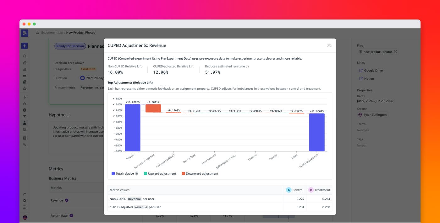
The CUPED adjustments visualization in Datadog Experiments breaks the difference into a sequence of specific adjustments. It connects each metric lookback or assignment property to an upward or downward adjustment in your estimated lift, helping you understand how CUPED made adjustments and which covariates had the greatest influence.
In this post, we’ll show how to:
Understand why CUPED changes your lift estimate
Standard experiment analysis calculates lift from metric values observed after subjects enter the experiment. CUPED augments this raw treatment-control difference with adjustments based on information captured before exposure. This is how CUPED reduces variance and produces more precise confidence intervals. But it also changes the point estimate of lift. Sometimes this difference in estimates leads to confusion for experimenters, especially since all the adjustments happen in a black box.
This can be especially tricky to understand because both metrics and subject attributes contribute adjustments. Without a decomposition, the final adjusted lift hides which of these terms changed the estimate and in which direction. The difference between raw and CUPED-adjusted lift is expected behavior, but experimenters still need enough context to determine whether the result matches their understanding of the experiment population.
Trace each adjustment in the CUPED waterfall
The CUPED adjustments visualization lets you move from a summary result to the individual statistical adjustments behind it.
From an experiment’s Metrics table, open the overflow menu for a CUPED-enabled metric and select View CUPED adjustments. Datadog opens a metric-specific view containing the raw result, the adjusted result, the estimated reduction in run time, and a waterfall of the covariate contributions.
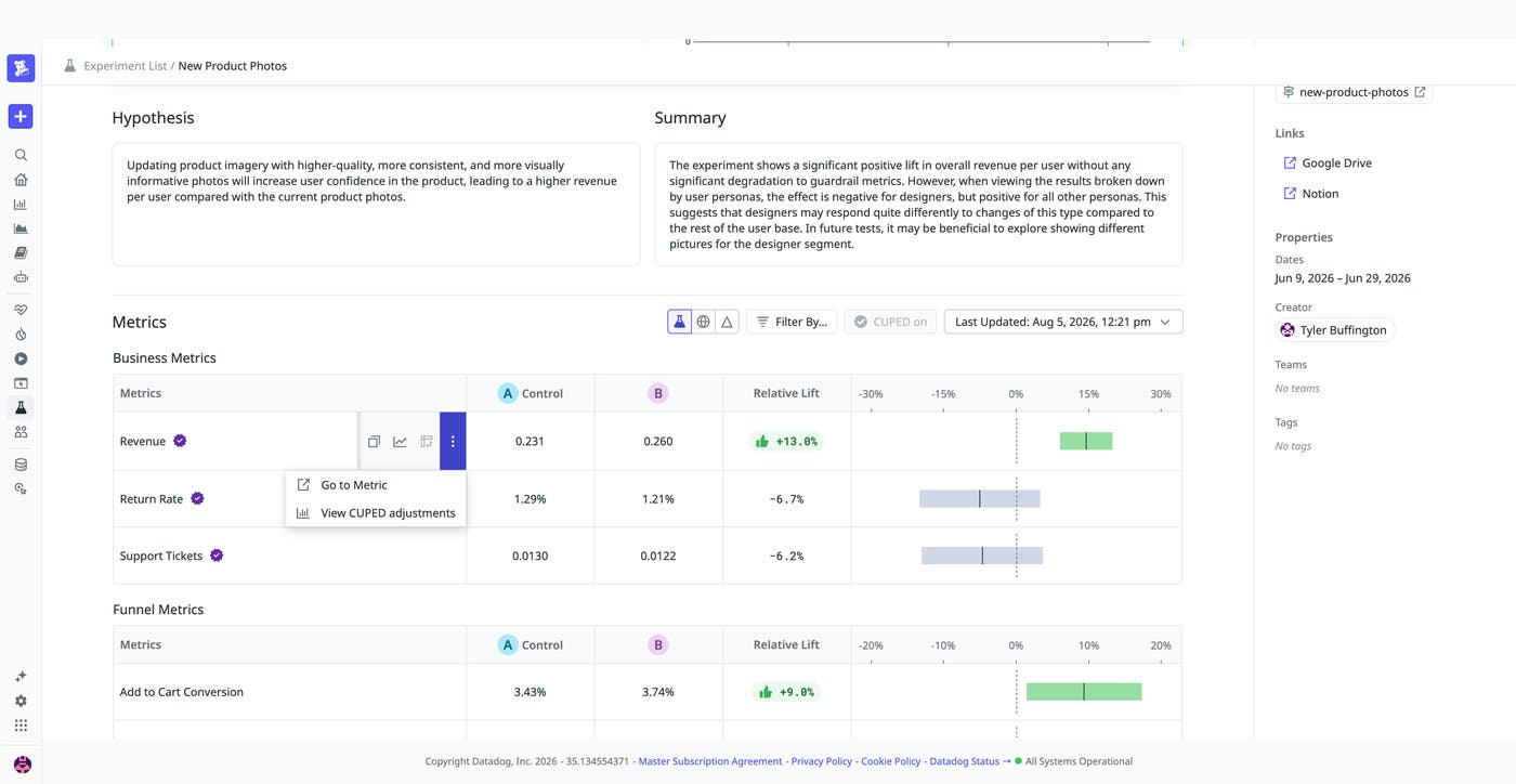
This entry point lets you investigate a surprising result without leaving the experiment analysis workflow. You can open a separate visualization for each metric and treatment comparison that you want to examine.
The top of the visualization summarizes the non-CUPED relative lift, the CUPED-adjusted relative lift, and the estimated reduction in experiment run time. The waterfall starts with the raw lift and applies each covariate adjustment in sequence. Every step represents either a pre-exposure metric lookback or an assignment property. The step’s label indicates how much it raises or lowers relative lift, and the final bar shows the CUPED-adjusted result.
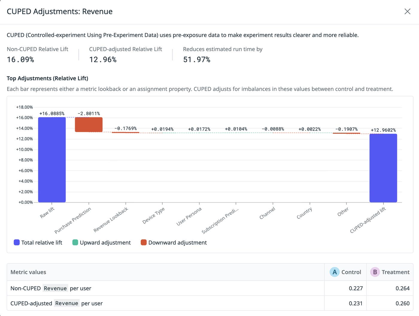
In this example, the Purchase Prediction covariate lowers relative lift by approximately 2.8 percentage points. Device Type, Revenue Lookback, Channel, User Persona, and Country make smaller adjustments. The visualization makes it clear that the gap between the two lift estimates is being driven primarily by one covariate rather than by the accumulation of several similarly sized adjustments.
A large assignment-property adjustment may reflect a chance imbalance in the types of subjects assigned to each variant, while a large metric-lookback adjustment may reflect different levels of pre-exposure activity. These contributions do not imply that a covariate caused the treatment effect. They show how CUPED accounted for the observed imbalance when calculating the adjusted estimate.
Interpret CUPED results with more context
The CUPED adjustments visualization makes adjusted lift easier to interpret by connecting the gap from raw lift to the covariates responsible for each statistical adjustment.
Use the visualization when an adjusted result looks surprising, when you need to explain an estimated reduction in experiment run time, or when you want to identify which pre-exposure differences had the greatest effect on the estimate. For details about how Datadog builds covariates, selects adjustment coefficients, and applies CUPED to different metric types, read the Datadog CUPED documentation and the Datadog Experiments documentation.
If you don’t have a Datadog account, sign up for a 14-day free trial to interpret experiment lift with per-covariate CUPED adjustments.
