Jamie Milstein

Addie Beach
To truly understand your users and ensure that your app provides them with the best possible experience, you need to conduct comprehensive, data-forward analyses from multiple angles. This quantitative foundation enables you to make meaningful product decisions—instead of merely guessing at what users want or trying to extract large-scale insights from piecemeal survey responses, you can see exactly what functionality is drawing in users or pushing them away.
With our Product Analytics offering, Datadog provides a variety of resources designed to help you explore product usage. We’ve organized these features into one centralized location where you can quickly perform multi-faceted user analysis via many different visualizations. These features enable you to explore every aspect of your user experience, from larger adoption trends to specific pain points, with insights grounded in concrete usage data from your app.
In this post, we’ll explore how you can:
- Access the product overview and summary pages, dashboards, and charts to identify friction points through user engagement overviews
- Visualize user interactions from multiple perspectives via Heatmaps and Session Replay
- Use Analytics, Segments, and User Retention to test key hypotheses with user data
Identify friction points with user engagement overviews
In order to help you identify areas of analysis that you’d like to focus on in greater depth, you often need to start by assessing the state of your UX at a high level. Product Analytics gives you access to broad visualizations to help you do just that, enabling you to quickly identify important behavioral patterns and unexpected user activity.
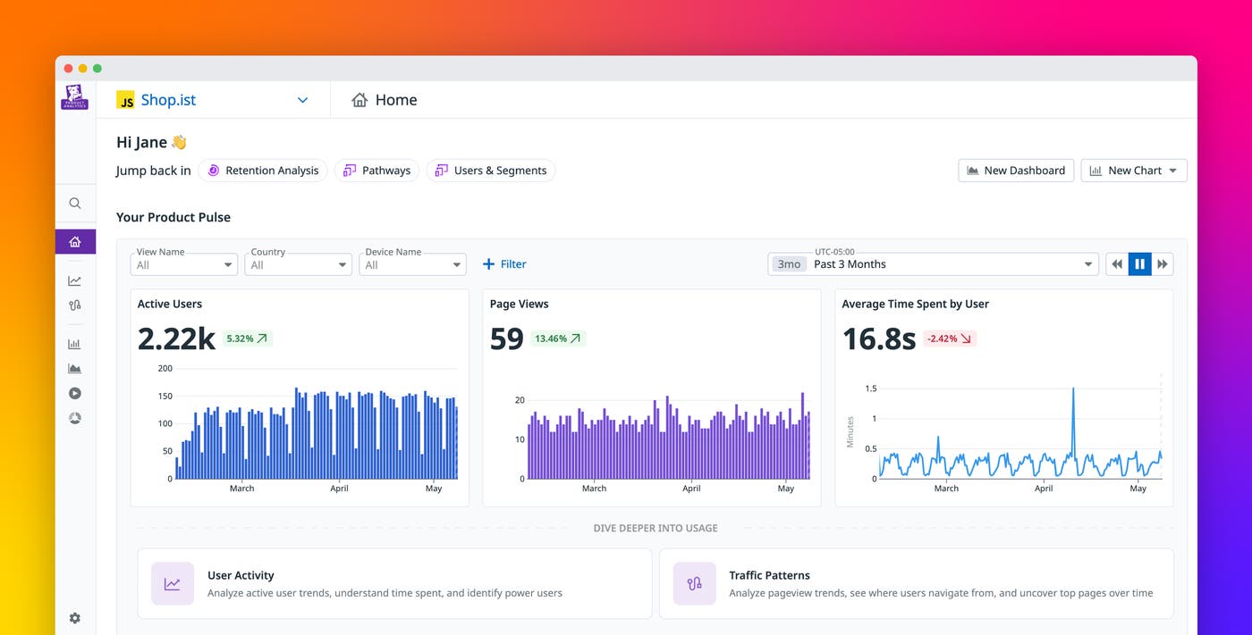
When you access Product Analytics, the product overview and summary pages provide you with a high-level picture of user interactions across your system. You can analyze various graphs and metrics related to engagement trends, including the number of active users, total page views, and average time spent by your users. Additionally, you’re able to easily access detailed breakdowns of other crucial product analytics metrics, including user activity data and traffic patterns. This home page also gives you suggested shortcuts to start your analyses, such as building a funnel, reviewing session replays, or creating a segment.
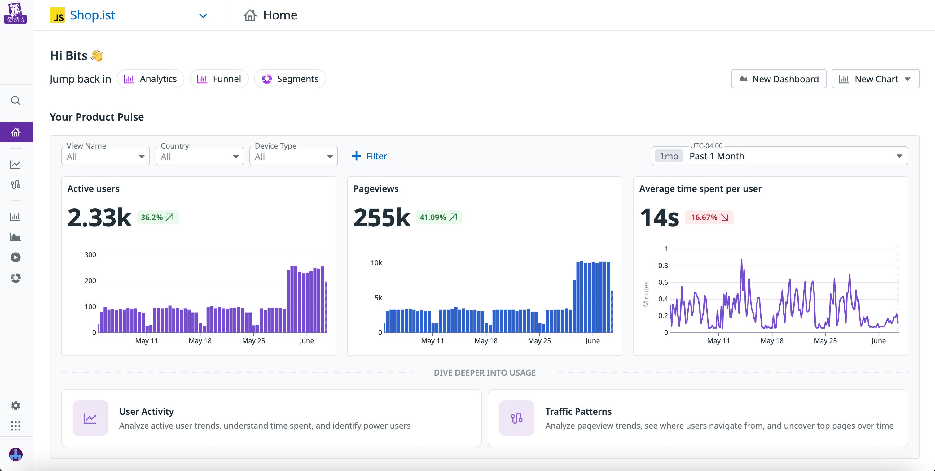
If you want a more customized view—say, to track promo code usage and loyalty program sign-ups for a specific campaign—you can also easily create your own dashboards. Together, the product overview, summary pages, and customized dashboards help you identify unusual trends that may indicate friction points in your journeys, providing you with starting points for further investigation.
To dig into these engagement trends more deeply, you can pivot to a variety of journey visualizations that help you better understand how users move through your app. When you access the Charts section, a Pathways diagram is automatically displayed, enabling you to analyze multiple journeys at once and assess which paths your users gravitate towards. For exploratory analyses, Pathways provides a convenient starting point, helping you understand overall traffic patterns across your entire application.
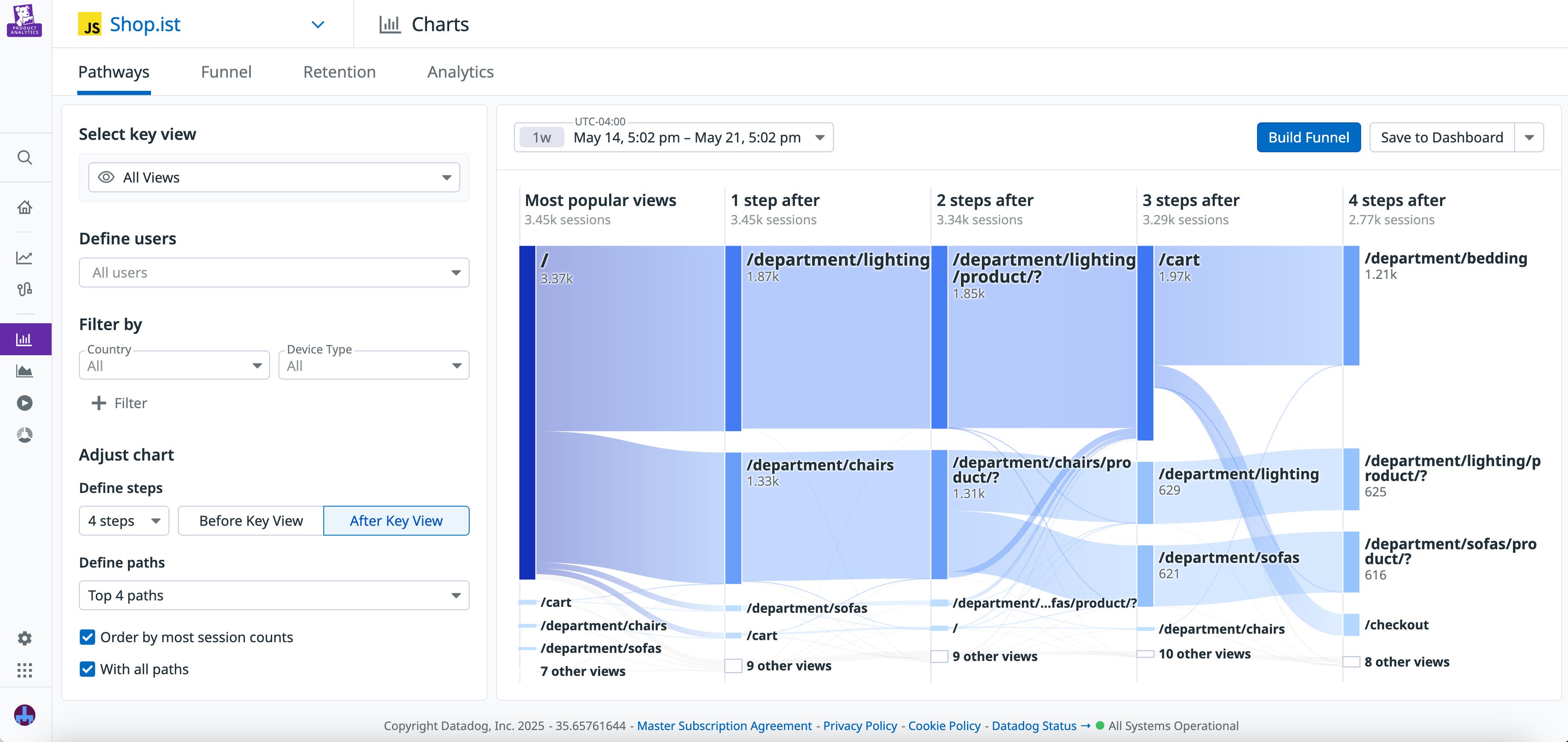
If you identify a specific journey you’d like to study in more detail, you can easily create a funnel from it. In addition to helping you visualize user drop-off and retention for a specific journey, funnels also provide you with detailed conversion metrics. You view these metrics alongside data for both successful and abandoned sessions, enabling you to quickly identify potential causes of user drop-off.
Visualize interactions to better understand user behavior
Studying user journeys can help you understand which pages your users are visiting in your app, but how can you uncover the actions that users take while they’re there? Features such as Heatmaps and Session Replay enable you to visualize your users’ actions so you can see which parts of your app are capturing their attention, giving them trouble, or being ignored completely.
For an aggregate picture of user interactions, you can access Heatmaps to see how users interact with each page of your app. Heatmaps provides visualizations tailored to a variety of actions, including a click map, a scroll map, and a map of the most popular elements. Though they focus on different aspects of your UX, each visualization ultimately helps you determine where user attention tends to be concentrated.
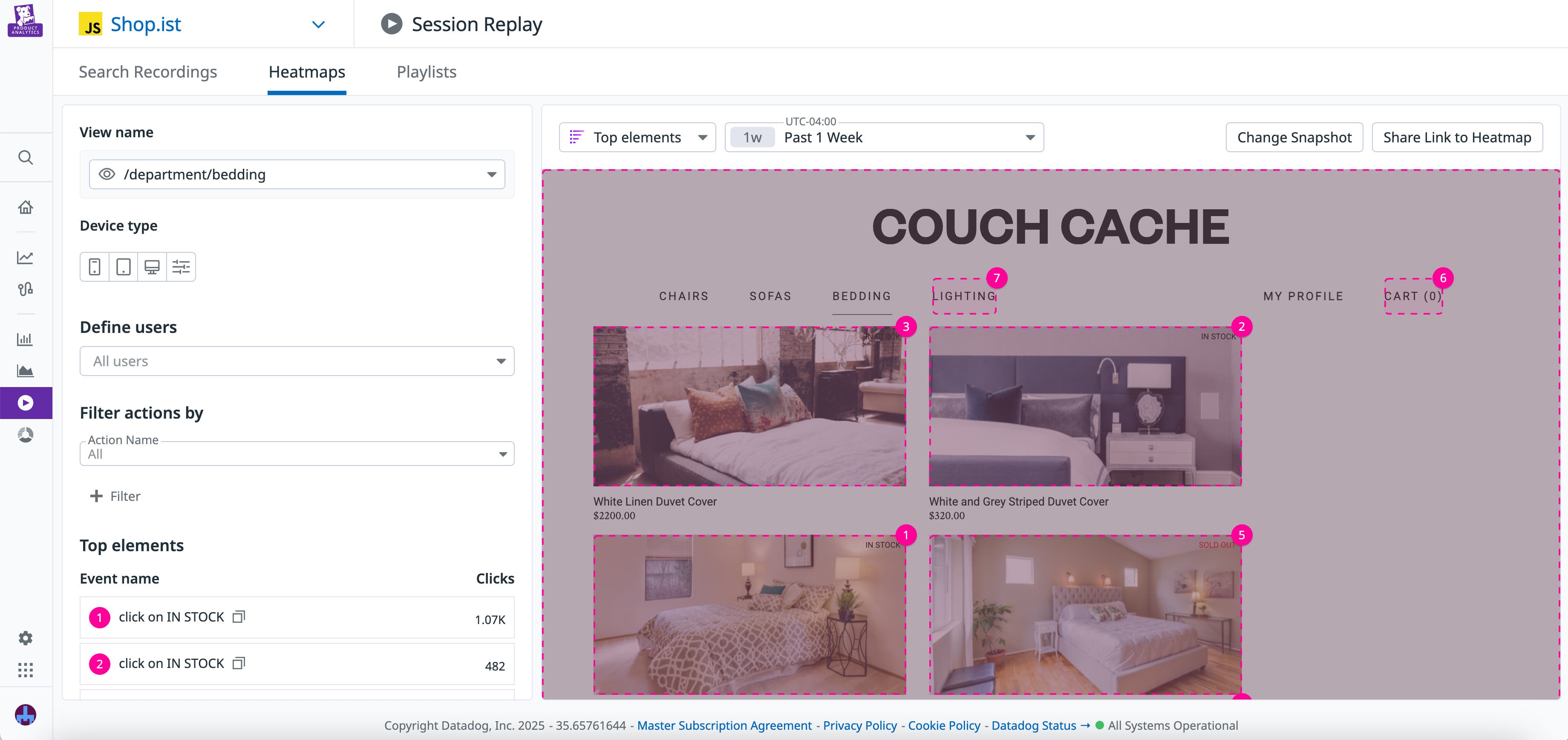
If you notice a data point that you want to investigate in greater detail, you can pivot to a recording in Session Replay that includes that view or action. Session Replay helps you complete the story—if you notice an increase in frustration clicks on a certain element, viewing an individual session enables you to see what users were trying to do and what they did next.
For example, let’s say you’re trying to figure out why sign-ups for your email list have decreased after a recent redesign. By looking at the click map for your homepage, you see a cluster of frustration signals around the sign-up link. To investigate the cause of this friction, you then decide to view a replay for a session that included one of these signals. Here, you can see the user attempting to click the link multiple times and receiving an error message in response. Now that you’ve confirmed that the issue likely stems from the application code, you can report these findings to the associated engineering team.
Cement key findings and hypotheses with granular user data
For a complete picture of user interactions within your app, you often need concrete data points that answer specific questions. Reviewing user journeys can help you explore your UX and spot areas of interest, while analyzing specific interactions can uncover details that raise key questions and support hypothesis building. Studying user analytics then helps you answer these questions and track how the answers may change over time.
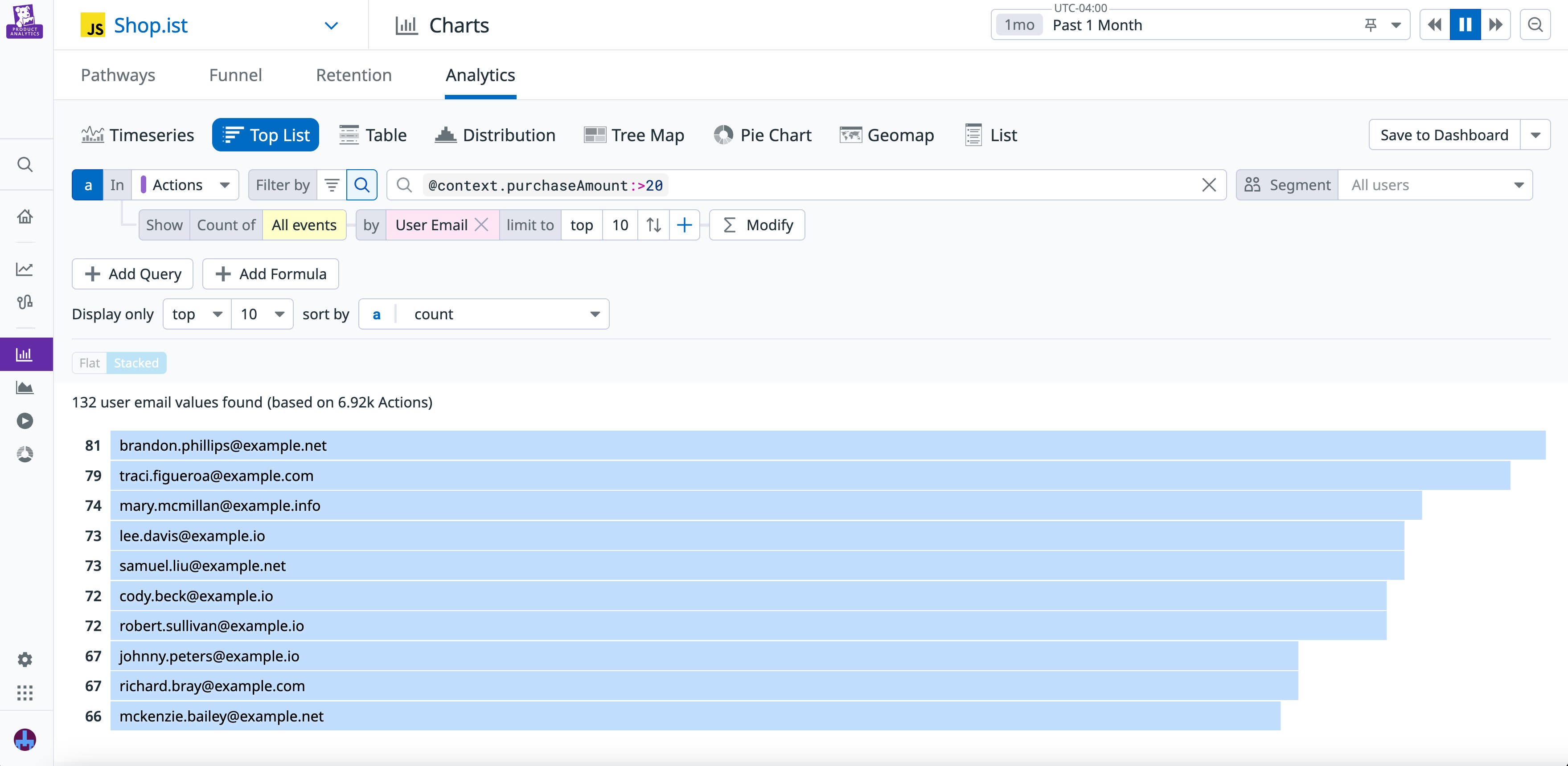
When you want to perform fine-grained analyses, the Analytics Explorer helps you quickly search and visualize critical data from user sessions. Alongside a straightforward list of sessions, a variety of different visualization formats are provided—including time series graphs, geomaps, and pie charts—and you can easily filter the data in each format by filters such as user email and customer tier. This helps you explore key questions with your user data, such as the amount of time that users spend on your website or where your most active users tend to be located. Additionally, you can perform an advanced search that enables you to input specific queries. For example, you could create a query that finds the number of users who spent more than $20 within the past month.
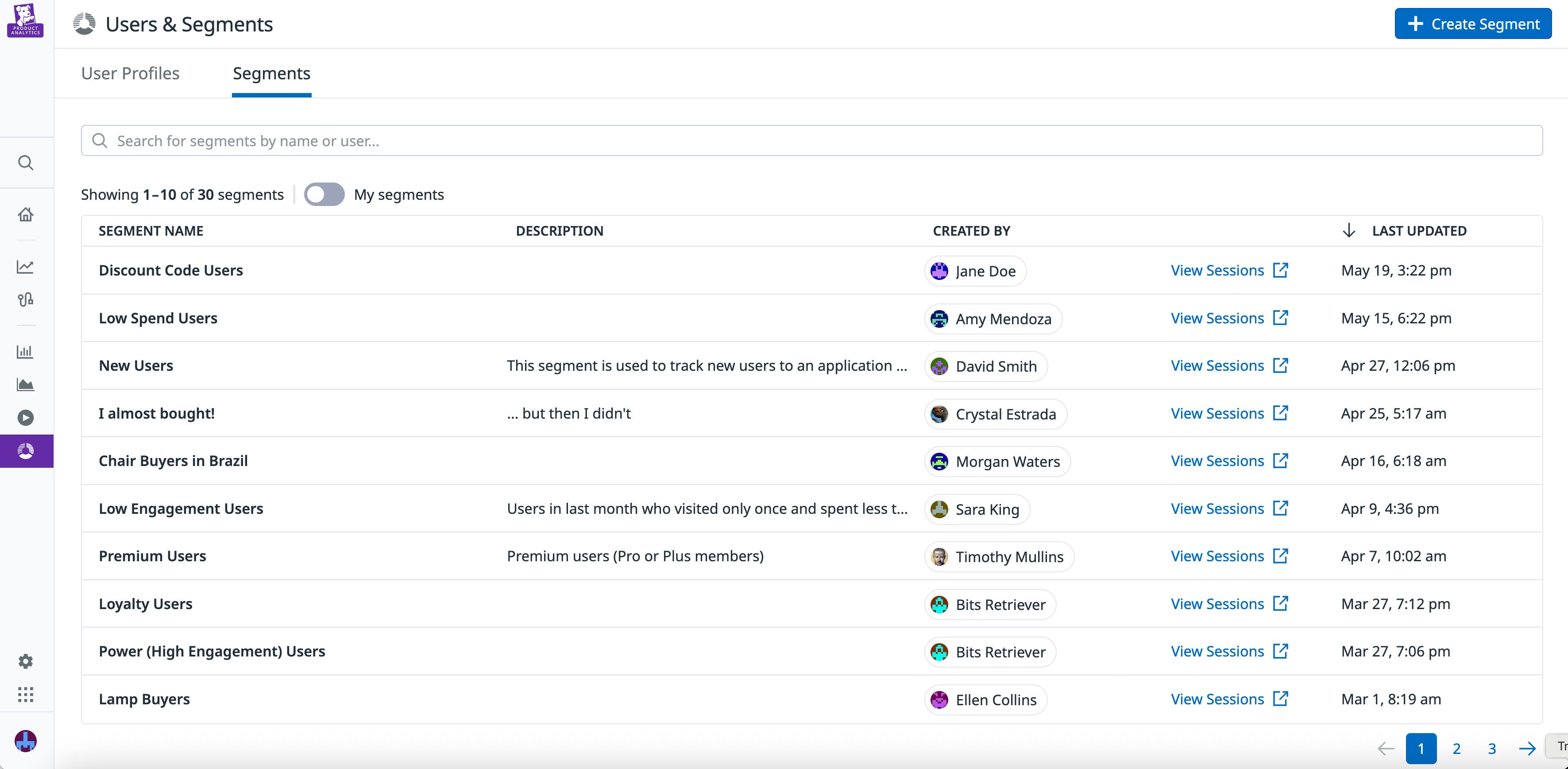
For further insight into your user base, you can also access the Segments feature to view breakdowns of your visitors by various metadata. You can define segments based on existing data from Product Analytics or quickly pull in contextual data about your users—such as their account type or industry—from third-party sources. You can then use these segments in other Product Analytics features, such as the Analytics Explorer and User Journeys, to quickly surface information related to key groups of users. For example, you can create a segment for users in your loyalty program, then use the Analytics Explorer to identify where these users are located. If, while doing so, you identify any individual users you’d like to learn more about, you can pivot to User Profiles to view their recent activity.
Lastly, to test your hypotheses based on insights from the rest of Product Analytics, you can use User Retention to track user stickiness over time. Let’s say that, based on the insights you’ve gleaned from the Analytics and User Segments features, you identify a sharp decrease in the number of purchases that German users made in your app. After viewing a session recording for a user in Germany, you realize that there’s a bug in how the translated text is appearing to these users, causing your UI to look odd to them. After fixing the bug, you check User Retention to find the percentage of German users returning to your app, confirming this was indeed the problem. When looking at cohort return rates before and after the bug fix, you see a sharp increase in long-term retention among German users.
Start exploring Product Analytics today
Product Analytics combines features designed to help you visualize user journeys and interactions, identify friction points, and investigate potential UX changes. By viewing high-level visualizations alongside granular user data, you can quickly answer critical questions about your product design no matter the scope of your analysis.
You can get started with Product Analytics using our documentation. Or, if you’re new to Datadog, you can sign up for a 14-day free trial today.
