Nicholas Thomson

Jamie Milstein
Heatmaps is now part of Datadog Product Analytics! Note that some visuals in this post may not reflect the updated UI.
When developing modern applications, product managers, designers, and website developers need to understand how users interact with web pages in order to guide those users through their desired journeys. For example, teams need to know if users ever see the content near the bottom of the page, where to place CTAs to ensure they are in high-traffic areas, and how to compare different pages based on user engagement.
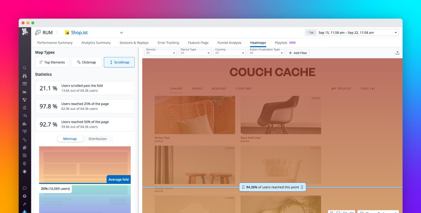
That’s why we’re proud to announce Scroll Maps, a feature of Datadog Heatmaps that leverages Session Replay data to show you how far users scroll down a page. Scroll Maps display this data in a few different ways, including:
-
Helpful metrics, such as how many users made it to the average fold for different device types (including mobile, tablet, and desktop) and what percentage of users made it to specific milestones on the page (e.g., 25 percent and 50 percent of the way through)
-
A mini scroll map that presents the page as a gradient that changes in color, based on the number of users that made it that far down the page
-
A distribution graph presenting the data in a timeseries to illustrate changing trends in page views across the depths of the page
Additionally, Scroll Maps offer new, searchable facets so that you can take the data from the map and create your own queries in [Product Analytics][https://www.datadoghq.com/blog/datadog-product-analytics/] to see how one page compares to another page (e.g., readership of release notes for a new feature versus a previously released one).
In this post, we’ll show you how to use Scroll Maps to:
- Gain insights into user interactions so that you can optimize a page
- Compare viewership trends across different pages
Gain insights into user interactions so that you can optimize a page
Scroll Maps offer a great way to investigate user experience and engagement with your application, helping you design and deploy better features that fulfill user needs. These immediate benefits for the user can in turn lead to a more popular product and, hopefully, increased revenue.
For example, say you’re a web developer at an e-commerce site, working with a product manager who wants to improve the rate of users who sign up for an account. The call-to-sign-up button is generating new accounts at a low rate—0.5 percent of visitors to your site sign up for an account, and the PM is shooting for 2 percent—so you decide to leverage Scroll Maps to investigate what percentage of users are even making it to the button.
The modal on the left-hand side shows you statistics and a high-level distribution of your page, so you can tell, at a glance, that the majority of your visitors are spending their time in the first two-thirds of the page, where the product is displayed.
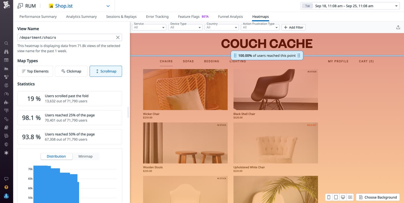
Scroll Maps offer an interactive blue scrollbar that shows you the percentage of users that read to different depths.
You scroll down to your sign-up button, which is at the bottom of the app’s home page, and see that only 30 percent of visitors to your site scrolled down far enough on the page to see the call-to-sign-up button. The distribution graph shows you the same data, but in a distribution visualization, revealing that viewership is dropping off a cliff below the fold.
In this scenario, you could bring this data to the product manager and advise them to place the call to sign up higher up on the page to ensure that most visitors will see it. This adjustment, hopefully, will result in an increased number of sign-ups.
Compare viewership trends across different pages
You can also use Scroll Maps to compare performance between different pages, providing layers of context to your analysis that can help you optimize your pages more effectively. For example, say you’re a product manager at the same e-commerce site from the example above. You want to understand what UX elements are leading to the cart page, as funnel analysis has shown that there is a high dropoff from users on the catalog page to the cart page.
To compare the two products, you navigate to the Analytics Explorer and search for the new facet enabled by Scroll Maps, @display.scroll.max_depth_pct, which measures the percent of users that reached a certain view.
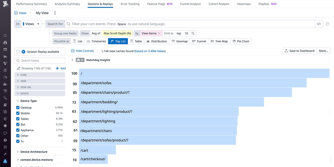
You find that a significantly larger percentage of visitors to your site are seeing the product pages as compared to the cart pages, which makes sense given the funnel analysis that showed a low conversion rate.
Using Session Replay, you watch real user journeys from your site’s home page to these two different paths and discover that users are experiencing an elevated number of frustration signals—in this case, rage clicks—when trying to click on the lighting page. Specifically, you find that users are clicking on the wrong UI element. As it turns out, there is a second element on the page that users believe is the lighting button and this problematic UI element is inadvertently misleading users about functionality. With this knowledge in hand, you can redesign the UI to ensure that customers are successfully able to navigate to the lighting page.
Use Scroll Maps to understand user interaction with your application
With Scroll Maps, you can easily visualize user engagement at different depths of your pages in a single view. You can then use these insights to troubleshoot problematic page elements and optimize your UX. A feature of Datadog Heatmaps, Scroll Maps also complement the Analytics Explorer, Funnel Analysis, and Session Replay.
If you’re already a Datadog customer, you can use our documentation to get started with Scroll Maps and Product Analytics. Or, if you’re new to Datadog, you can sign up for a 14-day free trial today.
