Addie Beach

Jamie Milstein
Funnels can be powerful tools for analyzing your UX, but figuring out exactly which user journeys you want to study can be challenging. Even if you have an ideal journey in mind, users often take steps you don’t expect. As a result, your funnels—and therefore, your optimization efforts—can easily miss the most influential pages in your application. Indeed, how do you build the best possible funnel when there are thousands of paths users can take after any given page?
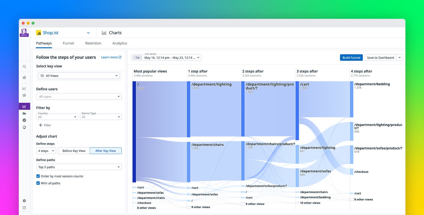
Pathways diagrams in Datadog Product Analytics give you high-level overviews of common paths users take in your app, helping you find key journeys to further analyze. You can view a graph based on your most popular views, or generate customized visualizations by selecting a page on your site to view paths to or from. With Pathways, you can identify which routes users find the most accessible, whether that’s because these paths have the most intuitive navigation or because they provide the most visually pleasing experience. When you decide on the journeys you want to study in greater depth, you can then easily create funnels directly from a Pathways diagram or pivot to Datadog Real User Monitoring (RUM) to determine exactly which factors—such as design choices or performance issues—might be driving users to choose one route or another.
In this post, we’ll show you how you can use Pathways to:
Use Pathways diagrams to find the most popular paths in your app
Pathways diagrams in Product Analytics show the flow of users throughout your system as they navigate your app. The wildcard option is selected by default for Pathways—with this option, Datadog searches through all the views in your app and automatically highlights the most popular journeys. This makes it easy to determine a starting point for your UX analyses when you don’t have a predefined sequence in mind.
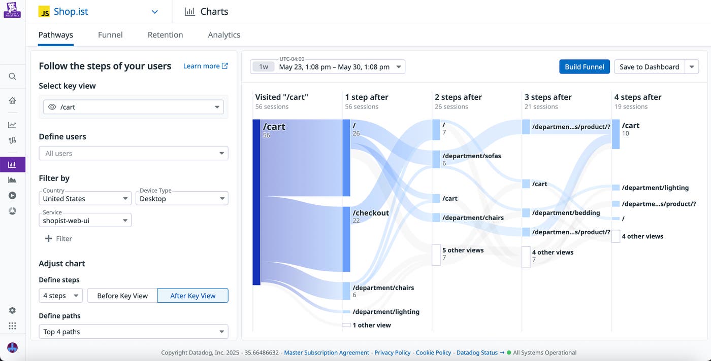
By choosing a specific view, however, you can easily customize Pathways visualizations. Simply select a page in your app, then determine whether you want this to be the starting or ending point for your diagram. To change the scope of your diagram, you can also specify the total number of steps you want to see before or after the selected page, as well as the maximum number of views displayed per step. For more in-depth analyses on certain segments of your user base, you can also filter the sessions included in your diagram by characteristics such as device type, environment, country, and software version.

Let’s say that you’re attempting to direct users to a page displaying seasonal inventory in your shopping app. You’ve set up a banner on your homepage advertising your seasonal offerings, but you want to see whether users are actually finding it useful. By creating a Pathways diagram with the seasonal inventory page as the endpoint, you can see that users are actually arriving there through the deals page instead of the homepage as you had intended. This gives you a starting point for further UX design decisions. For example, maybe you want to test out giving your homepage banner a more prominent position. Or, alternatively, perhaps you want to focus on making the deals page even more accessible and well-designed to help users more easily find the information you want them to see via the routes they already prefer.
Easily generate and analyze funnels with Product Analytics
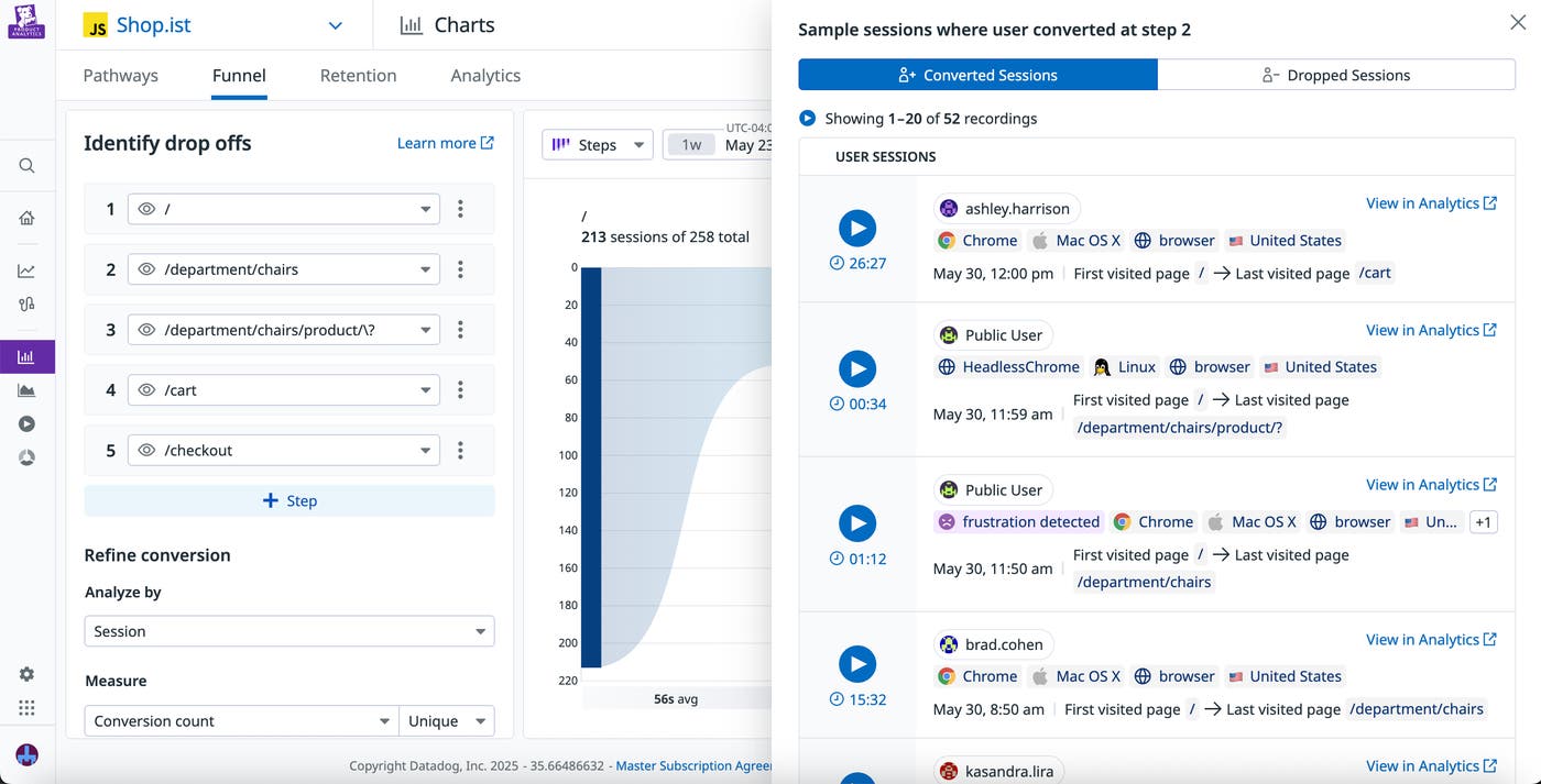
When you’ve identified the journeys from your Pathways diagram that you want to study, you can easily leverage Datadog Product Analytics for deeper analysis. For example, to take a closer look at one of these journeys, you can create a funnel directly from a Pathways diagram by clicking the Build Funnel button and then selecting the views you want to incorporate. You’re then able to look at detailed funnel data based on the journey you chose. By clicking into a funnel step, you can view a list of sessions for users who converted or dropped at this point. You can click on any of these sessions to view a replay, helping you see what your users are experiencing and better understand what might have influenced their decisions. The funnel side panel also enables you to easily query RUM Analytics for any of these sessions to view more granular metrics.

Let’s say that while looking at a Pathways diagram, you discover that the seasonal inventory page is the most popular view in your app. By clicking on the step for the inventory page, you’re able to quickly access session replays for this view. You watch a few session replays to see where on the page your users are spending most of their time, then decide to pivot to a Heatmap from one of these replays to visualize your user interactions in aggregate. Here, you can see a ranking of the top-clicked elements on the seasonal inventory page, enabling you to dig deeper into user trends.
Create useful funnels with Datadog Pathways
With Pathways diagrams in Datadog Product Analytics, you can easily explore all the different routes your users took, helping you design more relevant funnels that provide insight into your most popular paths. You can create funnels directly from the Pathways page when you want to dive deeper into a specific path, or use RUM tools to dig deeper into your UX findings.
To get started with Datadog Pathways, you can use our documentation. Or, if you’re not yet a Datadog user, you can sign 14-day free trial today.

