
Michael Gerstenhaber
When your pager goes off at 3:00 a.m. and you need to begin your investigation, where do you start? Before you can attack the problem, you need to know the lay of the land: What else is potentially affected by this failing service? What are its dependencies? Where are the probable root causes? With the new Datadog Service Map, you can visualize the topology of your application to answer these questions and more.
The Service Map decomposes your application into all its component services and draws the observed dependencies between these services in real time, so you can identify bottlenecks and understand how data flows through your architecture. The Service Map visualizes data that’s already being collected by Datadog APM, so setup is touchless—APM customers can start exploring the Service Map immediately.
From monoliths to microservices
As more organizations break monoliths up into microservices and embrace containerization, the fault domain within each application component has shrunk. But there are tradeoffs for that decoupling: application architecture has become more complicated overall, and the communication pathways and dependencies between components have multiplied. That complexity makes it difficult for anyone to form an accurate picture of the application, from new team members learning the ropes during onboarding to experienced engineers responding to a page in the middle of the night.
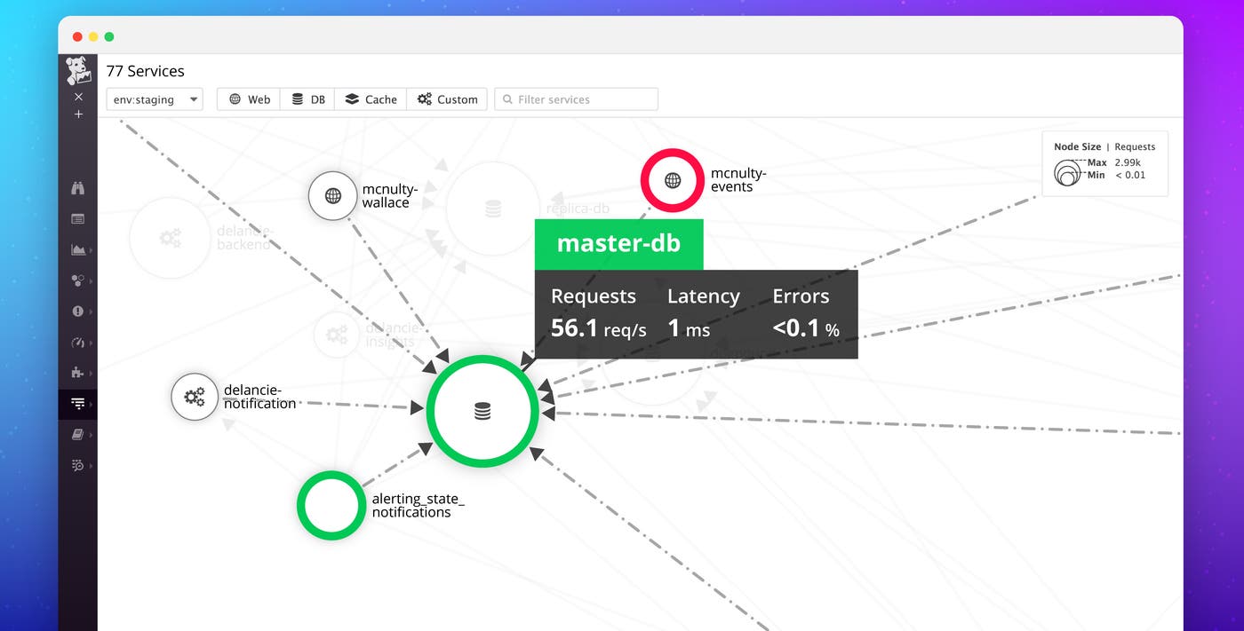
Automatically map services and dependencies in real time with the Datadog Service Map.
Isolate service affinity and dependencies at scale

Whether you have hundreds or thousands of services, the Service Map automatically captures their interdependencies. Based on the number of calls between services, Datadog intelligently clusters the map to group closely related services together. This allows you to understand immediately the functional architecture of your application. Services within each cluster rely on other services within the cluster, sometimes exclusively. Services that have dependencies inside and outside of the cluster gravitate toward the cluster’s perimeter and often represent a bottleneck for the services behind them.
Narrow your focus
By filtering on a service name or mousing over the map, you can quickly focus your view on a single service. When you click on a particular service, as in the screencapture above, the map isolates just those services that depend on your service of interest (to the left), as well as the services on which your service depends. Selecting an upstream or downstream node allows you to pivot the inspection view around that service, so you can step through the chain of dependencies one by one.
Tracing writ large
Datadog application performance monitoring (APM) allows you to trace calls across distributed services and hosts. Each distributed “trace” displays the run time of all the individual functions, methods, or calls to endpoints that were involved in fulfilling a request. Datadog visualizes traces as flame graphs, with rectangular “spans” representing each call in the stack, pinned underneath one another along a time axis.

In the trace above, you can see that the “mcnulty-query” service (blue) calls another “metric-query” service (dark green), which fulfills the query by calling the “replica-db” or “mindy” (purple) services.
By aggregating this data from all the requests in your application, Datadog can represent not just the calls that went into fulfilling individual requests, but all the higher-level dependencies between services. In the Service Map below, you can see that metric-query is a critical component that fulfills requests from many different web services and depends on a variety of datastores.
The strength of the weakest link
A pivotal service like the one above might make requests of services with different performance profiles, depending on the tolerance of the various workflows to degradation. These performance profiles usually take the form of contracts known as “service level objectives” (SLO), which measure “service level indicators” (SLI). A typical SLI might relate to availability or latency, and the associated SLOs might be 99.9 percent or 200 milliseconds, respectively. In a distributed system, guaranteeing these SLOs hinges on not just the quality and resiliency of the individual service, but on the performance of the services it depends on as well. If your SLO is 99.999-percent uptime, but you rely on data from another service that has an SLO of 99.9 percent—or worse, a completely different SLI—you’re going to lose an expensive game of chance.
Understanding the dependencies between services is vital to meeting service level objectives, and the Service Map makes these relationships immediately apparent.
What caused this alert?
Monitors in Datadog alert you when the health of your system degrades. If you tag a monitor to be associated with a specific service, the monitor’s status will then be represented in the service map. The colored ring around each node represents the most severe monitor status for that service. Knowing which services depend on other services that are in alert state can give you insight into where to start an investigation, or can guide your root cause analysis.

A single pane of glass
The service map functions as your “command view,” from which you can drill immediately into relevant data about your services to build velocity in your investigation. Datadog seamlessly integrates data from APM, infrastructure monitoring, and log management, so you have all the data you need to isolate and remediate performance issues quickly. By clicking a node in the Service Map, you can:
investigate individual traces from that service
slice and dice trace data at infinite cardinality with App Analytics
investigate processed and enriched logs from that service
or drill directly into the host map to explore infrastructure metrics for the hosts running that service
Get everyone on the same page
The new Datadog Service Map provides the insight that you need to maintain operational performance and cut mean time to repair for critical components—without the messy whiteboard diagrams that are outdated by the time you finish drawing them. By automatically mapping all your services and their dependencies in real time, the Service Map makes it easy for everyone on your team to understand your application architecture. To start exploring your own applications in the Service Map, sign up for a free 14-day trial of Datadog.
