Candace Shamieh

Amy Zhou
Datadog dashboards provide a unified view of your applications, infrastructure, logs, and other observability data—making it easy to monitor health, investigate issues, and share insights across teams. While native Datadog widgets support a broad range of visualization types, some use cases call for more customized representations, particularly when you’re working with unconventional data formats, external sources, or specific transformations. Whether you’re visualizing performance patterns, grouped metrics, or enriched datasets, having more control over how your data is displayed can help surface insights that standard charts may not reveal.
To support these advanced visualization needs, we’re proud to announce the Wildcard widget. Using the open source Vega-Lite grammar of graphics, the Wildcard widget enables you to build custom, code-defined visualizations directly in Datadog dashboards and notebooks.
In this post, we’ll discuss how the Wildcard widget enables you to create bespoke visualizations by using Vega-Lite syntax and enrich, preview, and refine your visualizations with built-in tooling.
Code custom visualizations with Vega-Lite
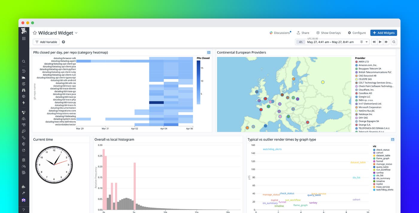
The Wildcard widget is the first Datadog widget that enables you to code your own custom visualizations. Using Vega-Lite—a declarative language for building expressive, interactive graphics—you can render visualizations that are tailored to your specific use case, including grouped bar charts, textual scatterplots, 3D geomaps, clock visualizations, and more.
The Vega-Lite integration brings the full flexibility of the grammar-of-graphics model to Datadog. You can define visual encodings, scales, axes, legends, and interactive behaviors—all through a clean JSON specification. This makes it possible to create layered or faceted charts, use multiple mark types (such as bar and line overlays), or highlight subsets of data conditionally.
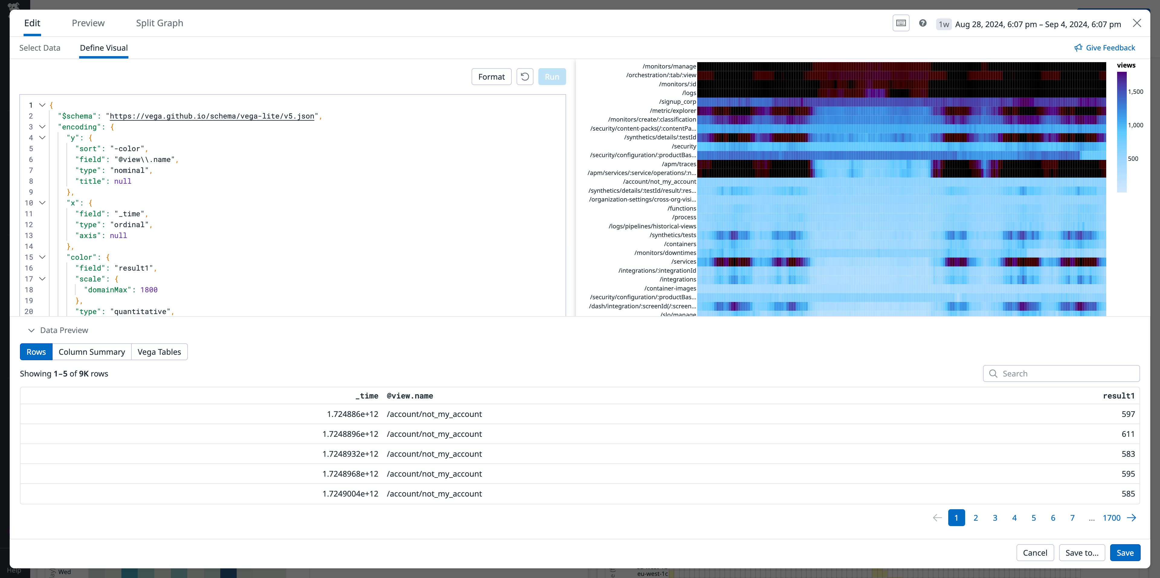
Because the Wildcard widget integrates into existing dashboards, you can supplement your out-of-the-box monitoring views with completely customized graphics. Datadog-specific visualizations can be built, like categorical heatmaps, which provide a compact, scannable view of high-cardinality data. For example, you can design a categorical heatmap that enables you to track the number of pull requests closed per day across dozens of repositories.
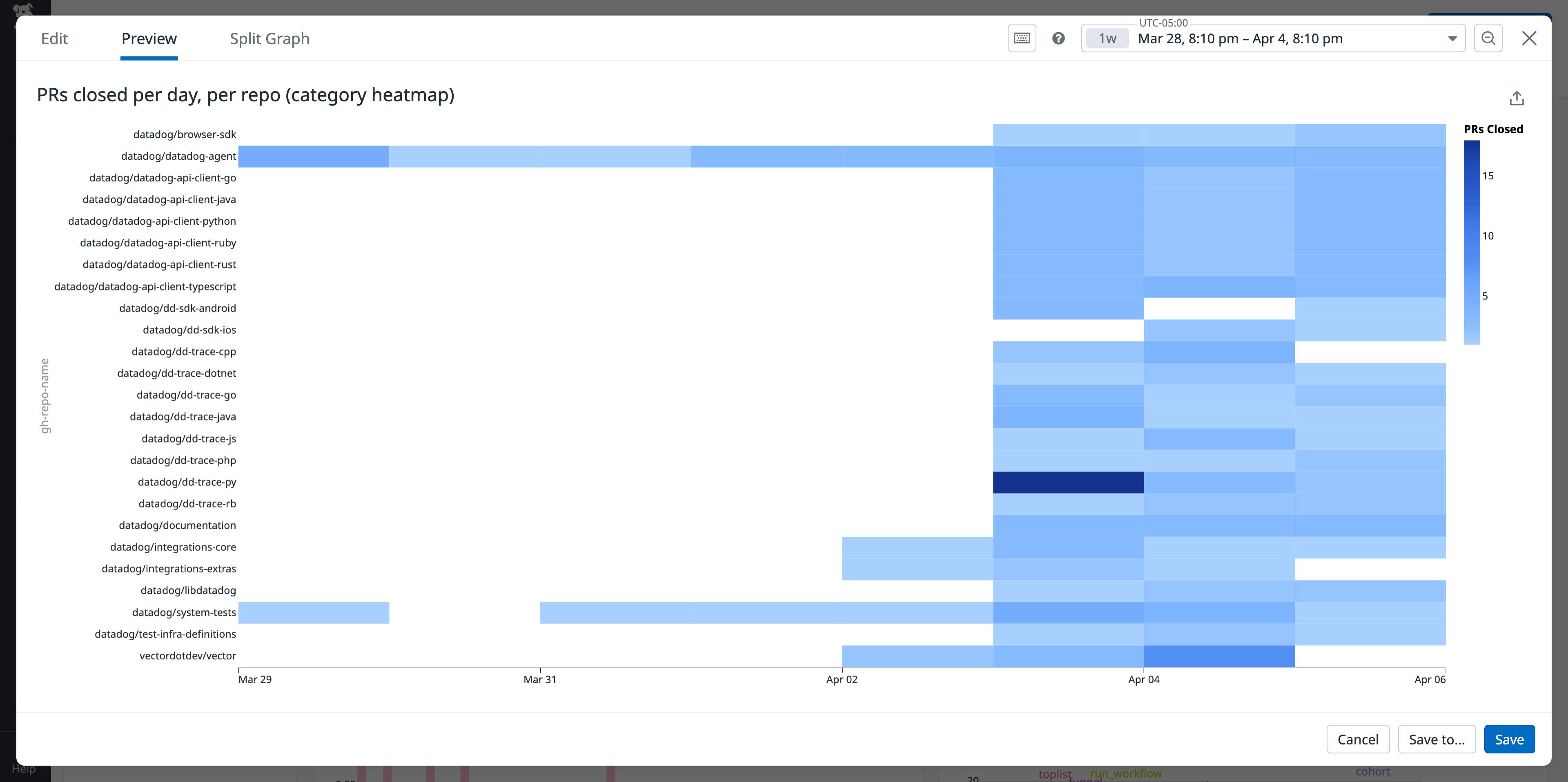
Instead of trying to analyze a timeseries containing over 20 lines, the heatmap makes it easy to compare repository activity at a glance.
Enrich, preview, and refine visualizations with built-in tooling
The Wildcard widget contains a powerful query editor that gives you full control over how your data is presented. The editor enables you to perform complex data transformations, join internal data with external sources to enrich your visualizations by using Datadog Reference Tables, and choose your preferred data format, such as scalar, timeseries, events (list), or histogram.
The query editor’s capabilities enable you to build layered, meaningful visualizations. For example, you can create interactive geomaps that visualize system health for your organization’s warehouses across the globe, combining infrastructure metrics with location data pulled from external sources.
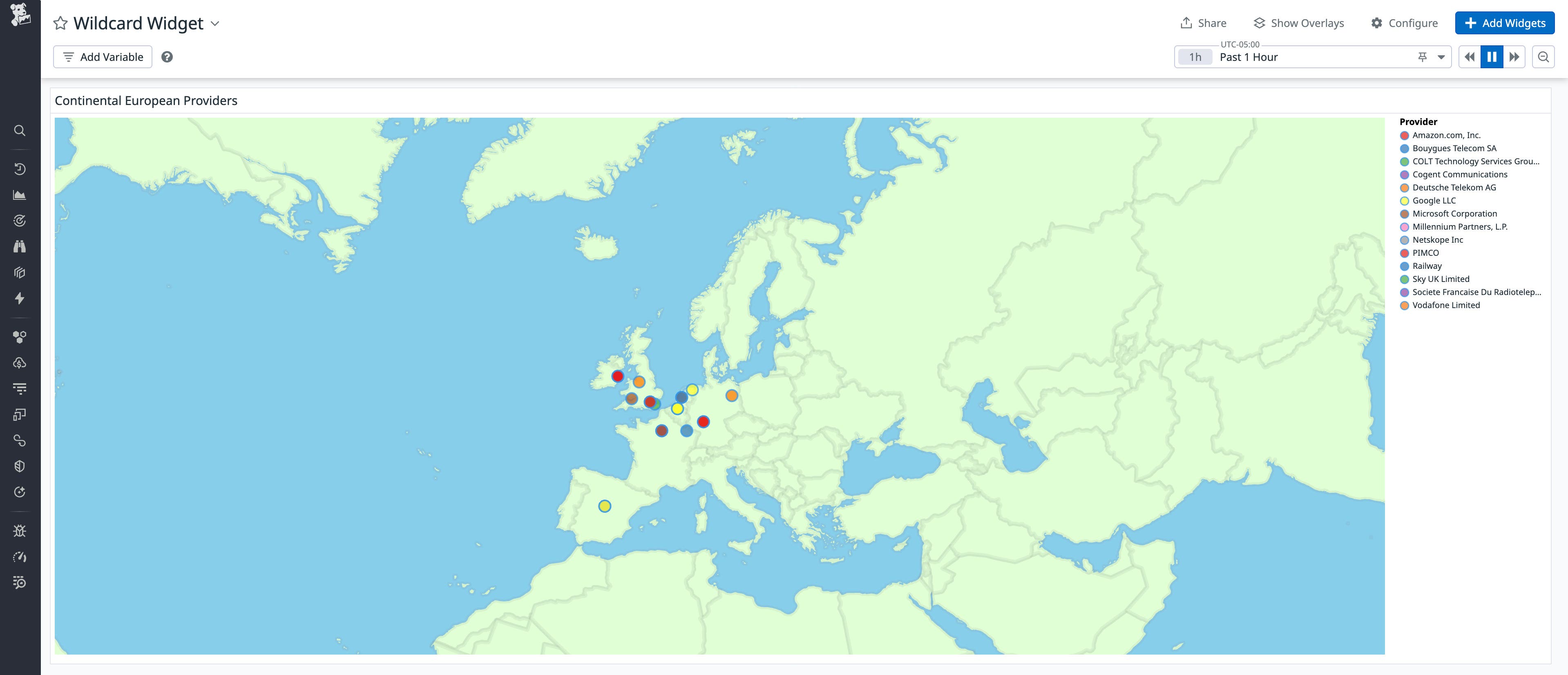
The Wildcard widget takes advantage of Vega-Lite’s conditional formatting capabilities. You can customize the format of text and numbers, making it easier for you to understand your data at a quick glance.
To help you design accurate visualizations, the query editor also includes a Data Preview feature. Data Preview enables you to validate that your data will appear in the right shape before rendering. It also includes shortcuts for quickly mapping fields to encodings, like adding a data column to a color encoding with a single click.
For example, you can use Vega-Lite layering capabilities to create a histogram that compares error durations to overall trace durations. By visually overlapping these distributions, you can quickly identify anomalies or performance outliers.
When you need to edit a visualization, you can use the Wildcard widget’s command palette, a built-in menu that provides convenient shortcuts for making common configuration changes.

With the ability to rearrange axes, modify color schemes, or add tooltips in a few clicks, you can iterate on designs and fine-tune your visualizations faster.
Build more expressive dashboards today
The Wildcard widget expands upon Datadog’s native widget capabilities, enabling you to create highly customized, code-defined visualizations by using the flexibility of Vega-Lite. Whether you’re exploring massive trace datasets, analyzing from external sources, or just taking more control over how your data is visualized, the Wildcard widget helps you turn complexity into clarity.
To get started, visit the Wildcard widget documentation. Looking for inspiration? Check out our examples gallery and Vega-Lite’s public gallery. If you’re new to Datadog, sign up for a 14-day free trial and begin building your own custom visualizations today.
