Joe McCourt

Sagar Mohite

Austin Lai
How do we surface the rich stories hidden within our users' observability data? We can use percentiles to communicate performance for a specific percentage of cases—but for the full shape of performance, we use distribution metrics.
These metrics, powered by DDSketch, aggregate data from multiple hosts during a flush interval, enabling users to analyze statistical distributions across their entire infrastructure. To visually represent this high-resolution data, we use heatmap visualizations—which provide a means to effectively convey high-cardinality point distributions.
In this blog post, we explore how we used DDSketch to build the Datadog heatmap visualization and the decisions we made in graphing distributions over time at an endless scale.
The advantages of seeing unaggregated data
The most powerful visualization in monitoring is the humble line graph. A line graph tells the simple story of a measure over time.
However, what exactly does each point on the line measure? The events that we are measuring could be happening billions of times per second, across thousands of different sources.
We can use an aggregation to transform many source events into a single value, but which one should we use? Well, that depends on what we care about.
Let's say we're measuring the latency of a network endpoint. In some cases, we may care about the typical call time, so we pick p50; in others, we care about the worst experiences, so we pick p99. (We typically want to avoid using max, because outliers can make max noisy).
It's a common pattern to view multiple percentile lines together. On the APM Service pages, one of the primary graphs is latency showing at p50, p75, p90, and p95.
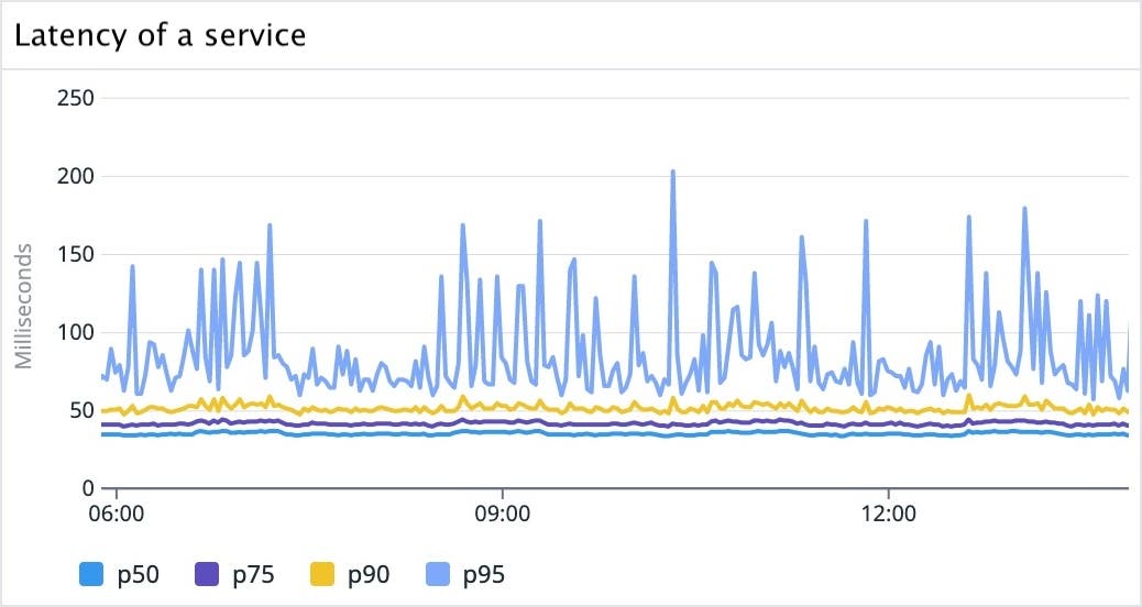
These percentiles are arbitrary choices—we could have chosen any number of lines. As we keep adding more percentiles, we get a more complete picture about what's going on.
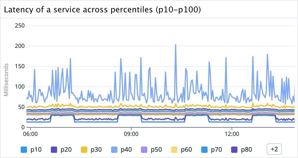
It looks like the lower percentiles have regular intervals of elevated latency every two hours for 40 minutes. We could be tempted to conclude that calls are getting slower at specific times.
Building a heatmap visualization
By visualizing this data as a heatmap, we get a full picture of what's going on in the figure below. A metric can contain multiple systems that behave differently. These can show up visually as distinct artifacts: we'll refer to these systems as modes for the remainder of this post.
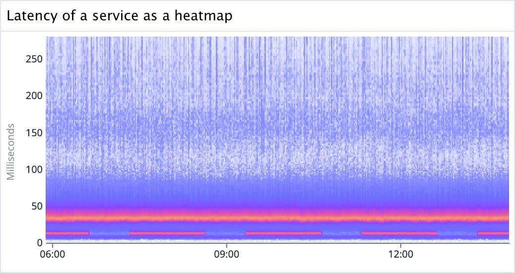
In the graph above, we can see that it's not that latency is changing—rather, there's a low latency mode of calls that is pulsing. If we investigate further, we learn that this pattern, characterized by periodic peaks, emerges from all the calls that originate from a benchmarking service that we can filter to.
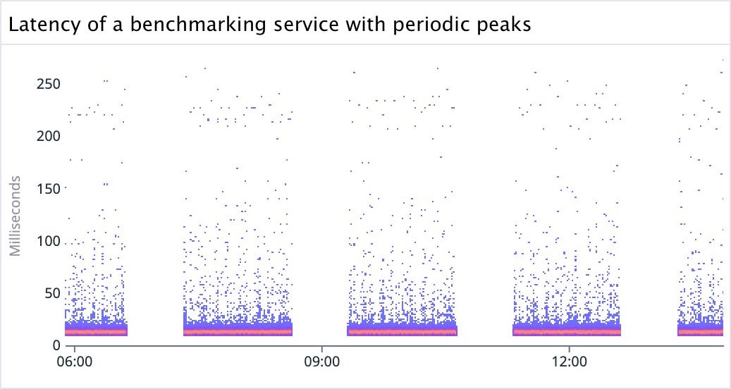
Visualizing this data as a heatmap allows us to see distinct modes without the curtain of aggregation—if these were plotted as aggregated percentile changes over time, these pulsating low frequency mode calls would distort the overall interpretation of latency.
For a different service, we can see that most percentiles have a strong daily seasonality, except for the p50, which is mostly flat:

When looking at the heatmap, we can see there's a very strong mode at 20ms, while in the background, there are higher latency daily pulses:
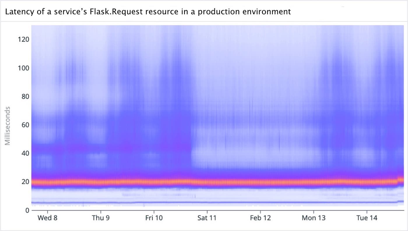
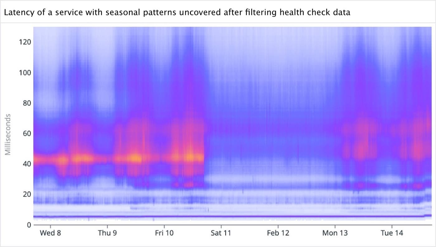
After investigating and identifying the main low frequency mode as being a specific health check, we can filter it out to surface a different story with strong seasonality:
Engineering for endless scale
One of the great strengths of DDSketch is its scalability. By sacrificing some precision, we gain the ability to represent huge numbers of source points 'close enough' to their true values.
We use a similar strategy on the frontend, sending down bins of counts rather than a full list of points. By limiting the number of bins (at a high value), we achieve a constant-sized data payload.
We're limited only by the numerical type we choose. We chose float32 as large enough (up to 3 x 1038 per bin). To put this limit into perspective, a call made once per nanosecond would take ten trillion years to hit it!
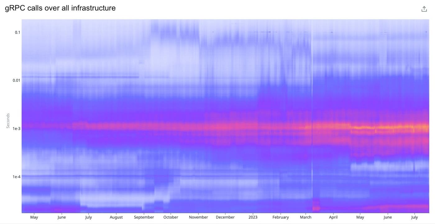
Here is a real example of high scale capability:

And on the following graph visualizing a distribution of gRPC calls over time, you can see how the infrastructure connectivity outage we experienced manifests as a tiny sliver in March:
Designing for high resolution
Basic heatmaps work well with a manageable number of datapoints. But what happens when we try to visualize over 470 trillion datapoints?
Similar to DDSketch, the data request and internal data structure of a heatmap is a collection of bins and counts. Each distribution bucket represents all the points for a given time frame. For a given request, all boundary values are aligned. We can take advantage of this and store it only once.
It's important to set the explicit boundary values, as we can't always assume they are linear. Datadog supports graphing a heatmap using a logarithmic scale, as well as the ability to hit discretization limits where the value resolution nears that of the source DDSketch resolution.
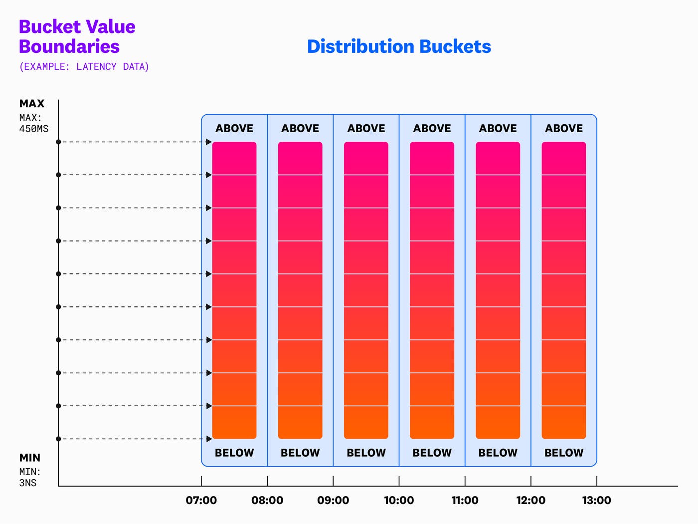
This collection of time buckets is what determines the appearance of the resulting visualization. Note that the time buckets must be aligned to the data instead of being perfect fractions of the view. If the interval is an unaligned value, aliasing occurs. For example, if we pick 7 seconds, and our data reports every 10 seconds, we'll end up with a volume pattern of [1, 1, 2, 1, 1, 2, 1, …] on the heatmap.
Designing a color scale
The logic behind the default palette is that we start with a light blue, similar to our base colors for other visualizations when there's only one series such as a timeseries or a toplist.

Then, we shift the hue to purple to match our main Datadog theme, which takes up a fair amount of total color range. We continue shifting the hue, but we quickly pass red to avoid negative alert feelings, and jump to orange to represent our max (hottest) color.
Maintaining a high dynamic range
For high-resolution cases, outliers in bin count can distort the color scale. This often results in one small bin having one color, while the entire rest of the graph has a different color, making the visualization less effective.
Customers often work with data that follows the power law distribution rather than uniform distribution. This means that distribution buckets on the long-tail end of the curve can be assigned the same color. We risk using the same color for visualizing a 75th percentile value as for a 99th percentile value.
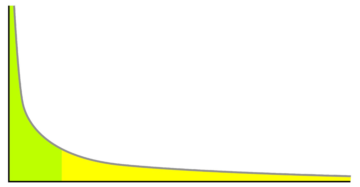
Much of the useful information about the shape of the distribution gets lost with linear color interpolation. Fortunately, we're not restricted to using a purely linear scale.
Human eyes don't perceive brightness/lightness in a linear way. Under typical lighting conditions (not too dark or overly bright), the human perception of brightness follows an approximate power law.
This means we're more sensitive to differences in darker shades than to differences in lighter ones, a phenomenon explained by Stevens' power law. Interpolating color over a power law distribution helps increase the perceived discernibility between colors.
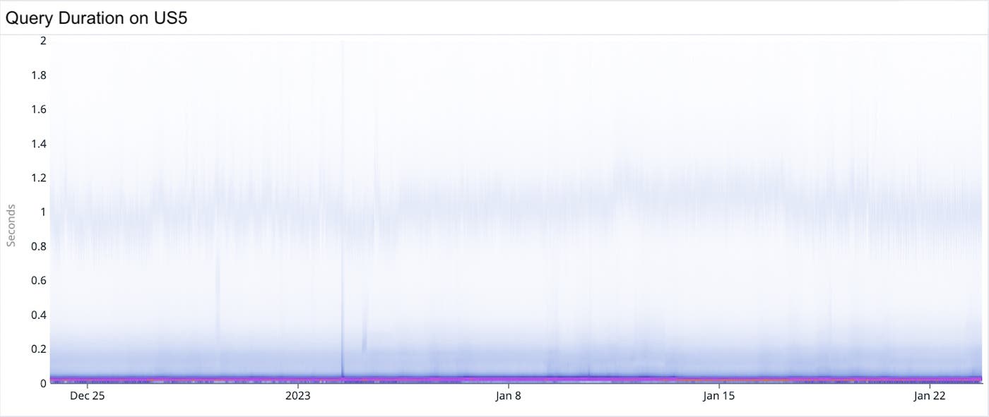
Stevens' power law and power law distributions illustrate the complexity of visual perception in data visualization. For example, a purely linear color scale in the heatmap shown below accurately shows the bulk of volume in a narrow mode at around 20 ms (where y=0.02). However, when faced with a long tail distribution of counts, this approach falls short. It's hard to see that there is another mode at around 1 second (where y=1). The distribution's extended range blows out the visual fidelity of the color scale, and we have trouble distinguishing small changes in color. The result is considerably less fidelity compared to the clear distinctions provided by bars in a histogram.
This issue demonstrates how important it is to choose a color scale that matches the data's distribution. For long-tail distributions, a non-linear color scale like logarithmic or square root can offer a more effective visualization and ensure that subtle variations in the data are visible and comprehensible.
To mitigate this, we experimented with a color interpolation that aligns with the data's cumulative distribution curve, and improves the overall contrast. We can do this by equalizing the histogram.
The following heatmap, which uses a purely percentile color scale, reveals the interesting mode at around 1 second. However, using this scale blows out the detail in the low mode, and information that the low mode is quite narrowly centered at 20 ms is lost. In this case, the variations between all the datapoints in the p95 percentile are no longer discernible.
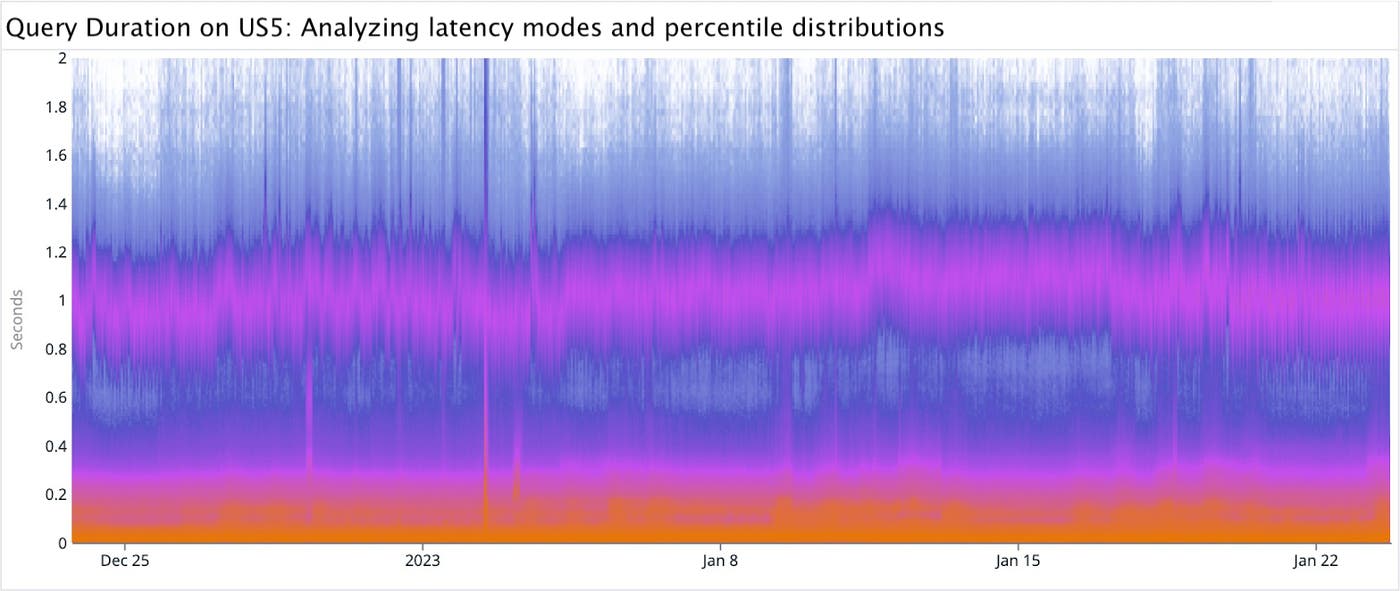
Since neither of the above pure formulas was ideal, we tried a linear weighting of the two, and heuristically chose this as a good middle ground—a hybrid of both approaches. The formula for the hybrid color scale is:
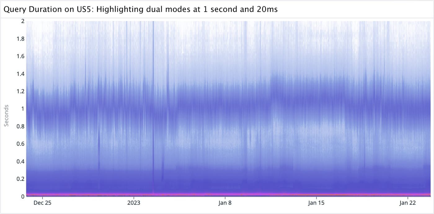
In the graph above, the mode at 1 second is fairly obvious, while the overall shape correctly gives the impression that most counts are in the bottom mode centered around 20 ms.
The video below demonstrates the heatmap visualization in several modes, including linear color scaling, a weighted average of linear and percentile color scaling, purely equalized color scaling, and purely linear color scaling.
Rendering
Rendering a heatmap is just drawing a bunch of rectangles on the screen, and a high resolution implies a large number of rectangles.
We can draw rectangles on an HTML canvas with the fillRect function. But tens of thousands of calls to fillRect can be computationally expensive. Therefore, we chose to render the heatmap per pixel, and not per data bin. With this approach, we build the associated setImageData that represents the underlying pixel data of a <canvas> element's area.
Canvas rendering by fillRect is mostly proportional to the number of bins, while setting setImageData is mostly proportional to the number of pixels. We can assume a performance improvement if our histogram resolution exceeds the resolution at which we're setting the ImageData. So for anything that's not very high resolution, it's actually better to do the simpler rectangle draw call for each bin.
Heuristically, we determined the tradeoff point to be around 4 raw pixels per bin. For a reasonably sized graph of 1000x400 raw pixels at this display resolution, the data density tradeoff is 100k count bins (or 500x200 pixels).
A possible future optimization would be implementing a hybrid rendering solution where we switch between the two approaches based on the cardinality of the data: when relative resolution is low, use ctx.fillRect commands: when resolution is high, use the existing image data manipulation.
The coarse interaction grid
For mouse interactions with a heatmap graph, we use a separate, coarser grid instead of the raw high resolution bins for a couple of reasons.
One is to maintain a consistent 'snappy' mouse-over, like the other visualizations in Datadog, as opposed to a tooltip that continuously follows the mouse cursor coordinates. Another reason is that we want to avoid high sensitivity of the mouse position. We also don't want it to be challenging to revisit a point of interest.
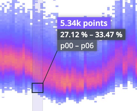
By making the grid relative to the graph size, smaller graphs give coarser interaction data, and larger graphs (think full screen) give finer grained data. This best matches what's appropriate for any given situation. It also results in intervals and counts that are more intuitive and meaningful for us to interpret the data's significance.
For example, a two day span returns time buckets with five minute durations, but the coarse grid aggregates this to around one hour.
Setting the percentile lines overlay and histogram display
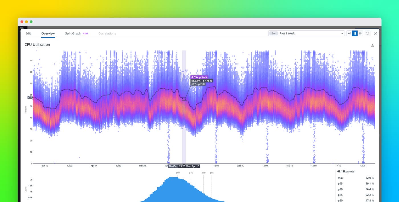
Percentile lines help us visualize a change in a particular percentile value over time. Initially, we wanted to always overlay all the commonly used percentiles like p25, p50, p75, p90, and p95, on the heatmap. However, this proved to be too visually noisy, so we only show them on a full screen mouseover.
Here is an example visualizing the nearest significant percentile, in this case, the p50 value over time.
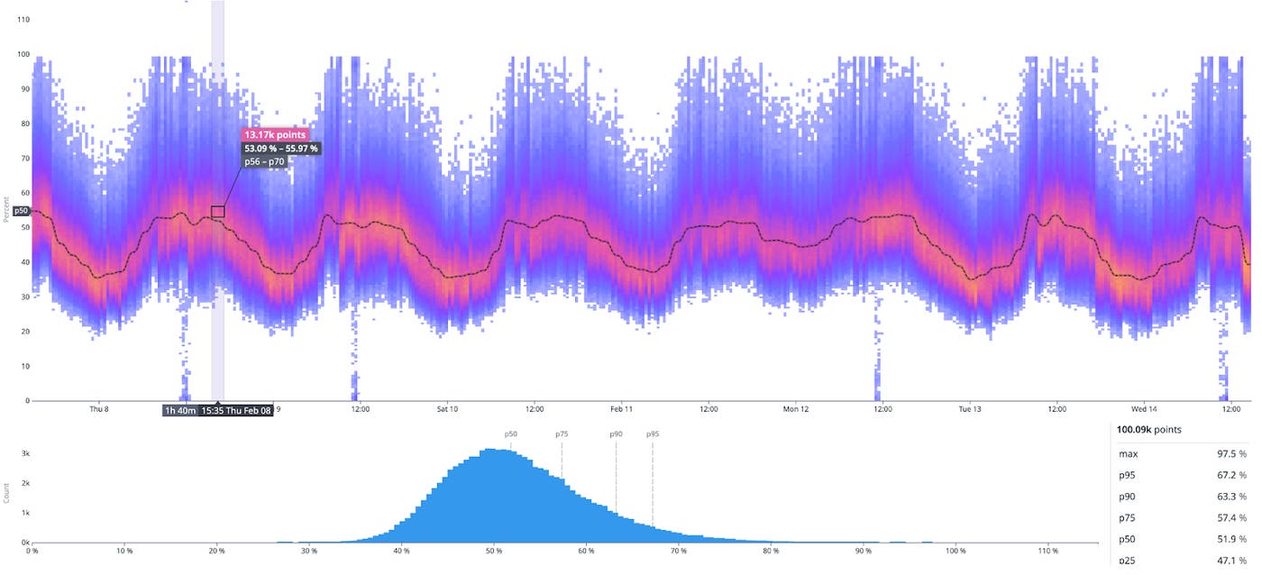
Additionally, in the full screen view, we visualize the time bucket under your cursor (in this example, the 1h 40min wide bin beginning at 3:35pm) as a histogram graph. This allows users to isolate coarser differences between the value buckets in the distribution.
Heatmap in action
Here's a real world example of how the heatmap provides unique insights into the behavior of our systems. A recent change to query scheduling retries revealed some interesting behaviors.
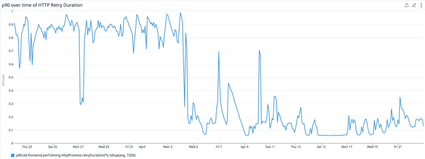
In the timeseries graph above, we see the p90 value of an HTTP retry duration metric. It demonstrates a drop around April 4th and becomes clustered in a narrow low band, which represents an improvement in the retry duration as it goes from a mostly uniform distribution to becoming faster and more consistent.
However, this metric seems spiky and it can be difficult for us to make confident assertions on spiky data. Switching to the heatmap visualization for this metric reveals a more interesting narrative—we can see diagonal lines in our heatmap!

These strong diagonal lines visible are immediately obvious in the heatmap, but they only manifest as spikes in the aggregated percentile line and in the timeseries line graph. Background noise can prevent aggregated values like percentiles from picking up on interesting behaviors.
This behavior led us to further investigate the way we were sending telemetry for this metric to Datadog, and in this case, we instrumented the retry telemetry in the setInterval method. We discovered that the diagonal lines represent the drifts on each subsequent setInterval call, which provided us the insight we needed to adjust the instrumentation.
Conclusion
The design and development process of the heatmap visualization reinforced to us that building effective data visualizations at scale requires a first-principles approach, even for fundamental tasks like coloring or drawing shapes.
Achieving the optimal solution for a given problem often comes down to making specific tradeoffs along various aspects—whether it's choosing a color scale or a rendering technique. This approach helps us deliver the most value to our customers by designing bespoke graphs that strike a good balance between the accuracy and scalability of datasets, while also uncovering insights within vast datasets.
By using the Datadog heatmap, you can visualize unaggregated distribution data of points over time. Because our approach is scaled to accommodate any size of infrastructure, the heatmap visualization can unveil seasonality and patterns in data that aggregations and sampling can often hide.
You can give it a try in our Dashboards product. And if you're not already using Datadog, get started with a 14-day free trial.
