John Matson
This is the first post in a series about visualizing monitoring data. This post focuses on timeseries graphs.
Observability is not just about having monitoring data—that data must be easily available and interpretable. Choosing the right visualization for your data is an important part of providing human-readable representations of the health and performance of your systems. There is no one-size-fits-all solution: you can see different things in the same metric with different graph types.
To help you effectively visualize your metrics, this first post explores four different types of timeseries graphs, which have time on the x-axis and metric values on the y-axis:
For each graph type, we’ll explain how it works, when to use it, and when to use something else.
Line graphs

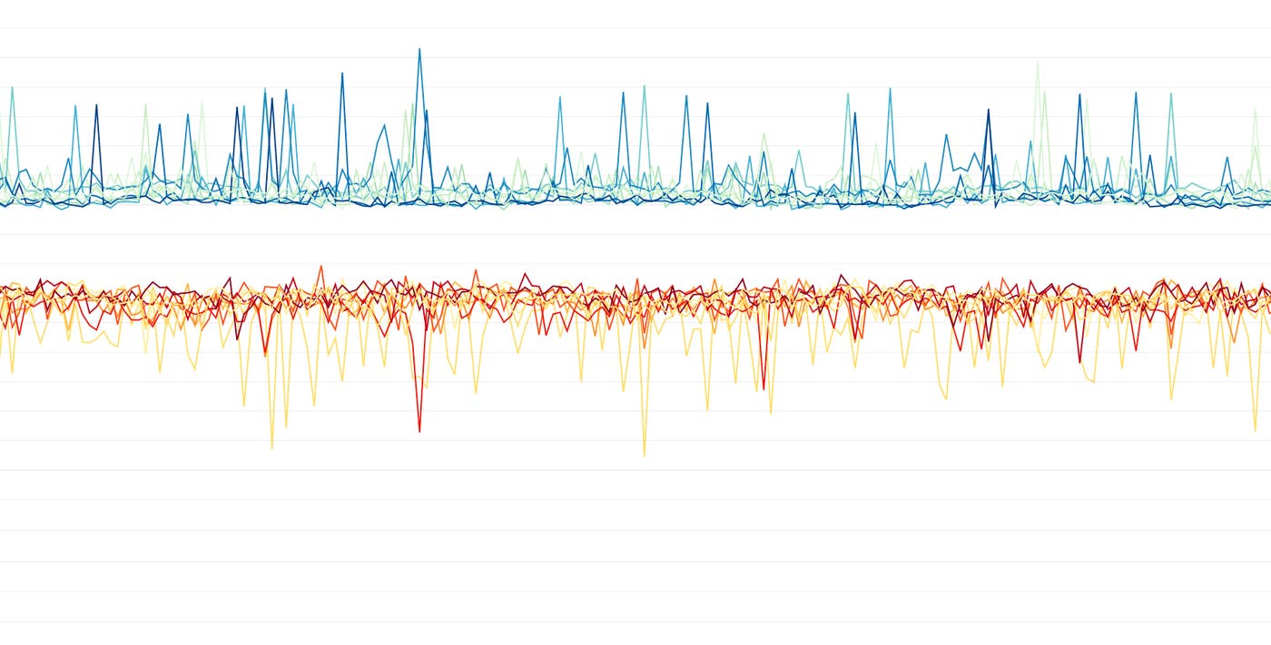
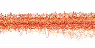
Line graphs are the simplest way to translate metric data into visuals, but often they’re used by default when a different graph would be more appropriate. For instance, a graph of wildly fluctuating metrics from hundreds of hosts quickly becomes harder to disentangle than steel wool. It’s nearly impossible to draw any useful conclusions about your systems from a graph like that.
When to use line graphs
| What | Why | Example |
|---|---|---|
| The same metric reported by different scopes | To spot outliers at a glance | CPU idle for each host in a cluster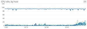 |
| Tracking single metrics from one source, or as an aggregate | To clearly communicate a key metric’s evolution over time | Median latency across all web servers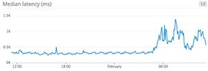 |
| Metrics for which unaggregated values from a particular slice of your infrastructure are especially valuable | To spot individual deviations into unacceptable ranges | Disk space utilization per database node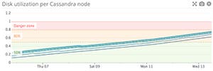 |
| Related metrics sharing the same units | To spot correlations within a system | Latency for disk reads and disk writes on the same machine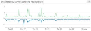 |
| Metrics that have a clear acceptable domain | To easily spot unacceptable degradations | Latency for processing web requests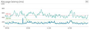 |
When to use something else
| What | Example | Instead use… |
|---|---|---|
| Highly variable metrics reported by a large number of sources | CPU from all hosts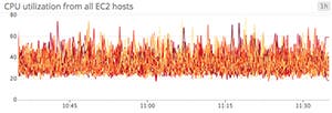 | Heatmaps to make noisy data more interpretable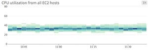 |
| Metrics that are more actionable as aggregates than as separate data points | Web requests per second over dozens of web servers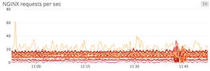 | Area graphs to aggregate across tagged groups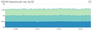 |
| Metrics that are often equal to zero | Metrics tracking relatively rare S3 access errors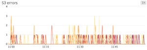 | Bar graphs to avoid jumpy interpolations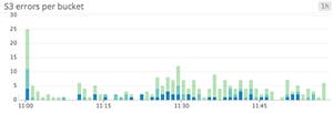 |
Stacked area graphs

Area graphs are similar to line graphs, except the metric values are represented by two-dimensional bands rather than lines. Multiple timeseries can be summed together simply by stacking the bands, but too many bands makes the graph hard to interpret. If each band is only a pixel or two tall, the information conveyed is minimal.
When to use stacked area graphs
| What | Why | Example |
|---|---|---|
| The same metric from different scopes, stacked | To check both the sum and the contribution of each of its parts at a glance | Load balancer requests per availability zone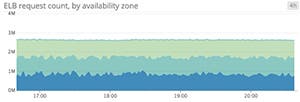 |
| Summing complementary metrics that share the same unit | To see how a finite resource is being utilized | CPU utilization metrics (user, system, idle, etc.)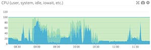 |
When to use something else
| What | Example | Instead use… |
|---|---|---|
| Unaggregated metrics from large numbers of hosts, making the slices too thin to be meaningful | Throughput metrics across hundreds of app servers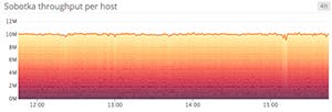 | Line graph or solid-color area graph to track total, aggregate value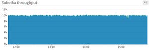 Heatmaps to track host-level data 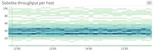 |
| Metrics that can’t be added sensibly | System load across multiple servers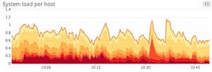 | Line graphs, or heatmaps for large numbers of hosts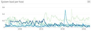 |
Bar graphs

In a bar graph, each bar represents a metric rollup over a time interval. This feature makes bar graphs ideal for representing counts. Unlike gauge metrics, which represent an instantaneous value, count metrics only make sense when paired with a time interval (e.g., 13 server errors in the past five minutes).
Bar graphs require no interpolation to connect one interval to the next, making them especially useful for representing sparse metrics. Like area graphs, they naturally accommodate stacking and summing of metrics.
When to use bar graphs
| What | Why | Example |
|---|---|---|
| Sparse metrics (e.g., metrics tracking rare events) | To convey metric values without jumpy or misleading interpolations | Blocked tasks in Cassandra’s internal queues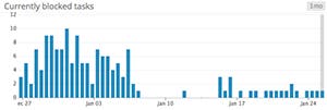 |
| Metrics that represent a count (rather than a gauge) | To convey both the total count and the corresponding time interval | Failed jobs, by data center (4-hour intervals)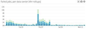 |
When to use something else
| What | Example | Instead use… |
|---|---|---|
| Metrics that can’t be added sensibly | Average latency per load balancer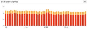 | Line graphs to isolate timeseries from each host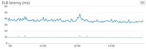 |
| Unaggregated metrics from large numbers of sources, making the slices too thin to be meaningful | Completed tasks across dozens of Cassandra nodes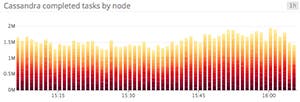 | Solid-color bars to track total, aggregate metric value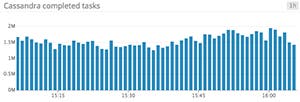 Heatmaps to track host-level values 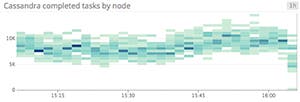 |
Heatmaps

Heatmaps show the distribution of values for a metric evolving over time. Specifically, each column represents a distribution of values during a particular time slice. Each cell’s shading corresponds to the number of entities reporting that particular value during that particular time.
Heatmaps are essentially distribution graphs, except that heatmaps show change over time, and distribution graphs are a snapshot of a particular window of time. Distributions are covered in Part 2 of this series.
When to use heatmaps
What | Why | Example |
|---|---|---|
Single metric reported by a large number of groups | To convey general trends at a glance | Web latency per host 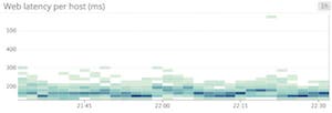 |
To see transient variations across members of a group | Requests received per host 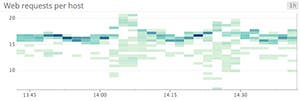 | |
When to use something else
| What | Example | Instead use… |
|---|---|---|
| Metrics coming from only a few individual sources | CPU utilization across a small number of RDS instances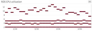 | Line graphs to isolate timeseries from each host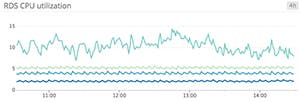 |
| Metrics where aggregates matter more than individual values | Disk utilization per Cassandra column family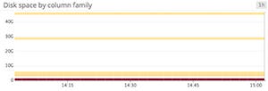 | Area graphs to sum values across a set of tags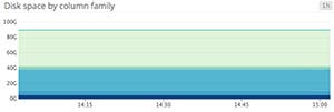 |
Conclusion
By understanding the ideal use cases and limitations of each kind of timeseries graph, you can present actionable information from your metrics more clearly, thereby providing observability into your systems.
In the next article in this series, we’ll explore other methods of graphing and monitoring metrics, including change graphs, ranked lists, distributions, and other visualizations.
Source Markdown for this series is available on GitHub. Questions, corrections, additions, etc.? Please let us know.
