
Addie Beach

Rachel White

Roman Komarov
When to use JavaScript or CSS in frontend projects is a matter of continued debate among many frontend developers. JavaScript is often the default choice for frontend development, as it offers a robust collection of libraries custom-made for creating advanced UI features, such as data-based visualizations or complex animations. But JavaScript also comes with tradeoffs, particularly when it comes to performance, accessibility, and code complexity.
While CSS may not offer the same depth of functionality, it comes with more built-in features designed to work with browsers’ native rendering processes for better performance. As a result, developers can rely less on libraries, enabling them to optimize their apps through cleaner, more effcient code.
In this post, we’ll explore a few situations where using CSS instead of JavaScript can lead to a better UX, including text styling, transitions and animations, and layout. We’ll also touch on how web content rendering impacts performance, as well as a few strategies for improving code performance using Datadog.
How web content rendering affects performance
Many of the differences between CSS and JavaScript performance can be explained by how browsers render web content.
To ensure that webpages are built cleanly and consistently, browsers render content in a set order, called the critical rendering path. When the browser loads a webpage, it first generates a Document Object Model (DOM) tree from the HTML that serves as the template for further rendering and manipulation. Separately, the browser also fetches the CSS styles and builds the CSS Object Model (CSSOM). The CSSOM maps CSS styles for each element and builds the foundation for later style manipulation via APIs. Creating the CSSOM is a render-blocking process, meaning the browser can’t move on to layout and paint until the CSSOM is ready. However, it can still parse HTML and continue building the DOM in the background while rendering is paused.
Once these models are finished, any JavaScript code that manipulates the DOM or the CSSOM is applied. This step is parser blocking, i.e., the browser can’t run any other processing activities while JavaScript code is being parsed and executed. Only once the JavaScript code is done being parsed does the browser combine the JavaScript-enhanced DOM and CSSOM to create a single render tree. The browser reads this render tree to create the CSS box model, which defines the layout of each element, and paints each element accordingly.
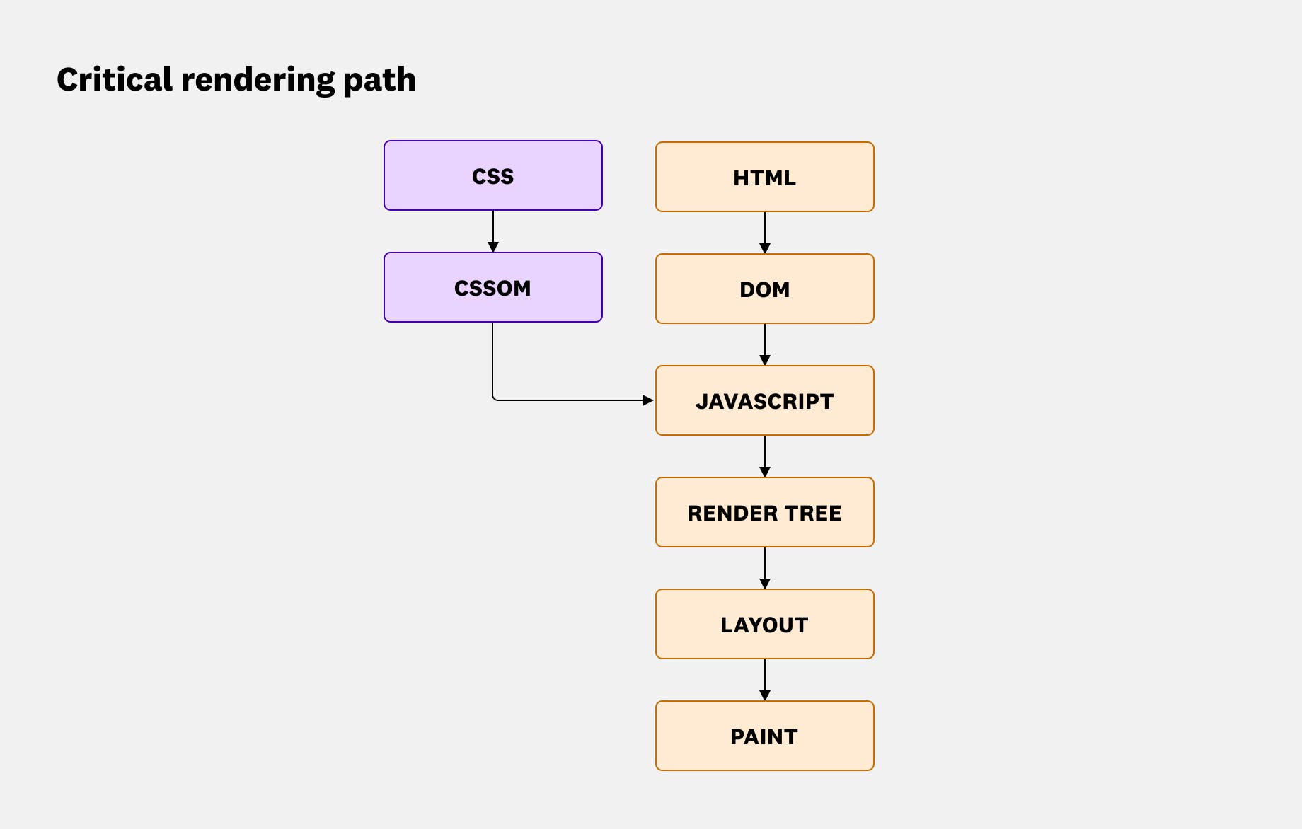
What does this mean for performance? Because JavaScript is parser blocking, you’ll want to limit the amount of JavaScript you use for key elements that you need to generate in the initial page load. Otherwise, large files may take longer to process, potentially leading to janky animations, poor Core Web Vitals, and low search engine rankings. And, as an added disadvantage, some AI crawlers have difficulty reading JavaScript. This means that overrelying on JavaScript may limit the AI searchability of your app.
Instead, to improve page loading speeds, boost SEO, and provide a better overall UX, you can convert critical elements of your app to CSS. In the next section, we’ll go over the benefits of doing so in greater depth and discuss a few situations where using CSS may make the most sense.
Substituting CSS for JavaScript
Compared to JavaScript, CSS has lower processing needs and a simpler syntax, making it ideal for optimizing slow-loading pages or long-running scripts. While JavaScript can accomplish more complex tasks, doing so often means relying on frameworks or libraries that can introduce bloat, which further impacts rendering time.
Additionally, many modern browsers are built with CSS in mind, enabling developers to easily take advantage of features like hardware acceleration without needing to bring in third-party resources. As a result, shifting straightforward, high-priority tasks from JavaScript to CSS can lead to optimized performance as well as code that’s easier to write and understand.
A few common use cases where developers often see the greatest benefit from making this shift include:
Text styling
Text is critical for user navigation. It helps users orient themselves and understand what your app is about. Robust text is also important for accessibility, as this is the content most easily parsed by screen readers. Therefore, it’s important to have text load as quickly as possible for the best possible UX.
CSS text styling is applied as part of the browser’s normal rendering pipeline, meaning it will load faster than text that must be processed via JavaScript. Additionally, CSS has built-in properties to handle text formatting that are simpler to use than their JavaScript counterparts.
For example, the text-wrap property can help you style automatic line breaks. Setting text-wrap to balance can distribute text more evenly across lines, which is often best suited to headings and other short blocks of text. This helps you maintain a consistent UX, as font rendering and line breaks can vary based on the browser, viewport size, and zoom level. When comparing the performance of text-wrap: balance against a JavaScript equivalent—which involves using an external balance-text library—the CSS approach typically performs better. Using text-wrap: balance also helps you implement graceful degradation. This balance value is supported by most major browsers, but in case of a rare exception, the text will still wrap properly using the default settings.
Managing font loading with JavaScript often involves libraries like Web Font Loader or the next/font module in Next.js, which can contribute to project complexity and bloat. By contrast, CSS can load both web-hosted and self-hosted fonts through built-in rules. CSS’s ability to handle self-hosted fonts through the @font-face rule can potentially help you improve loading times even further, as this type of font can be faster when implemented with technologies like content delivery networks (CDNs) and caching.
Alternatively, if a CDN strategy doesn’t make sense for your servers or you want to use some of optimizations that come with web-hosted fonts, you can apply fonts from web sources through an HTML <link> tag or CSS @import rule. When combined with @fontface, you can configure properties such as font-display to control how web fonts render for faster page loads and a better reading experience. For example, font-display:swap enables you to temporarily use a default font while your web font loads—useful for critical text like company headers—while font-display:fallback will display only this default font if your browser detects extended load times for uninterrupted reading of large text blocks.
Transitions and animations
While text forms the foundation of many web apps, animations help make them dynamic and engaging. JavaScript can help you create intricate, physics-based animations through the use of libraries such as three.js, p5.js, and GSAP. For many apps, however, this approach introduces unneeded complexity. Instead, you can use native CSS to easily create animations that can take advantage of hardware acceleration without adding unnecessary resources to your code.
CSS often shines when it comes to creating transitions. You can apply animations to nearly any CSS property, making it easy to add fades, slides, bounces, and pulses to text, images, or dialog boxes. Additionally, you can trigger these animations in a number of ways, such as scrolling, to create features like progress bar indicators, image reveals, and carousel effects. Note that not all CSS property animations have the same performance cost. Animating layout-affecting properties such as width, height, top, or left can trigger extra layout and paint work. On the other hand, using compositor-only CSS properties, including transform and opacity, allows you to offload rendering tasks from the main thread, avoid re-running the layout and paint steps every time the animation plays, and further shorten the rendering timeline.
CSS also enables you to easily adapt your animations based on user preferences. For example, with the prefers-reduced-motion media query, you can serve users who have enabled motion-based accessibility settings a version of your page with fewer visual effects. This enables you to accommodate users who may have conditions such as vestibular disorders. In CSS, you only need to add this query to the relevant elements and the browser will dynamically adjust the page in response. While you can use this query in JavaScript as well, doing so is much more complex, requiring you to listen for preference changes in the browser and manually stop animations.
All of these features can be especially useful for sites that make extensive use of data visualizations, as querying and caching this data can often lead to long processing times. You can offset this effect by using CSS to animate the actual visualizations themselves. In addition to limiting the bundle size of your code by eliminating the need for more libraries, CSS allows you to define keyframes that set critical style points for your animations and let your browser fill in what happens in between them. This helps you create complex yet performant animations.
Layout
Optimizing how your page elements are laid out is key to improving your Core Web Vitals, particularly Cumulative Layout Shift (CLS). Slow processing times can lead to layout thrashing, which is common when JavaScript forces the browser to recalculate layout repeatedly (for example, by reading layout values immediately after DOM updates).
CSS provides properties that help you create lightweight, dynamic layouts that cleanly render critical content. Flexboxes enable you to automatically resize content along different axes. You can also use grids to align content in two dimensions, which is useful for controlling layout across the entire page instead of element by element.
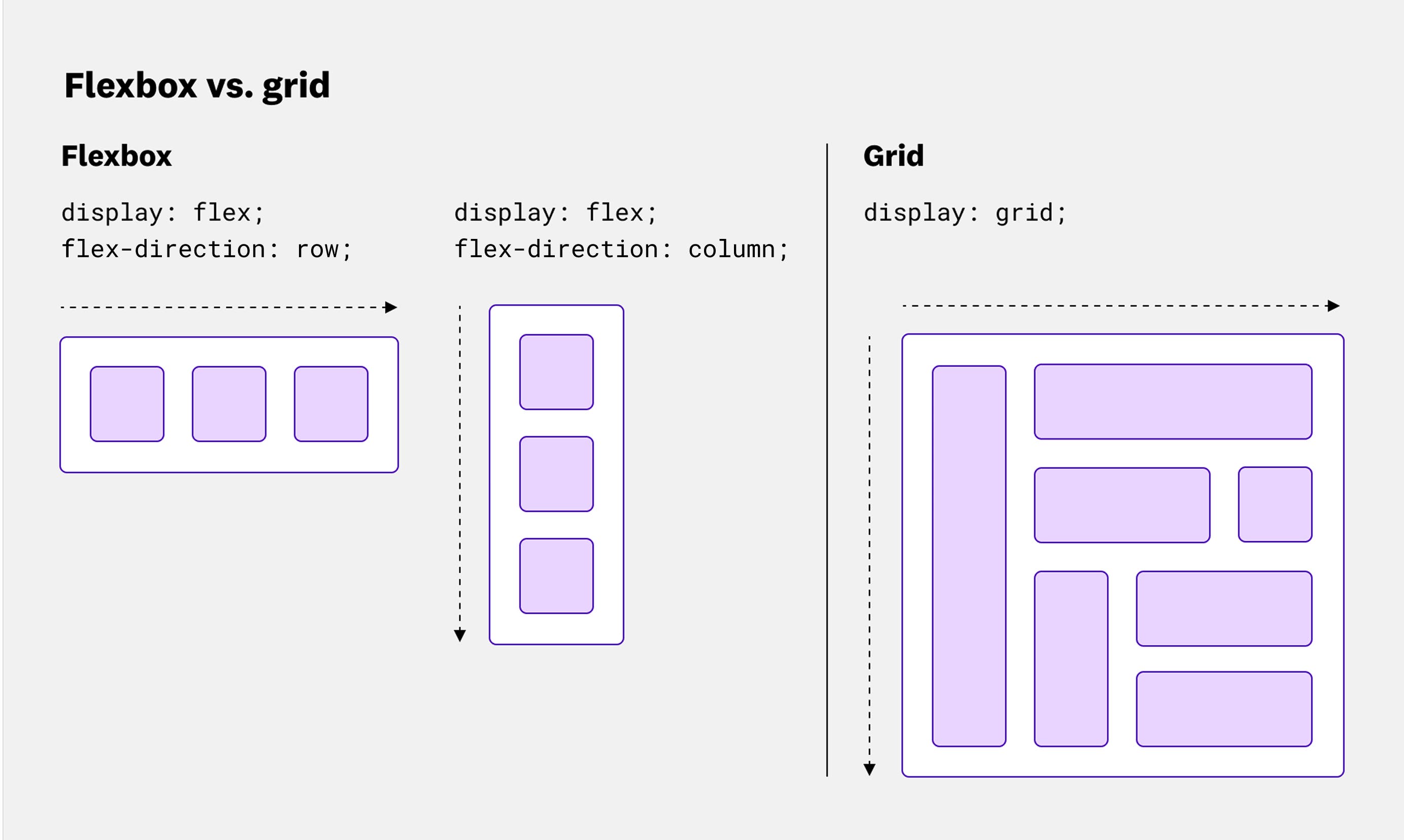
To help make your layouts more responsive, you can use CSS container queries that adjust components based on the size of their container rather than the viewport. These queries help you create features such as cards that resize independently of each other. They also help you keep page titles visible even as other elements shrink. Doing the same in JavaScript can require the Resize Observer API, which watches for changes in an element’s size. Because the ResizeObserver interface runs right before the browser performs rendering work, it can be prone to issues like layout thrashing if not implemented carefully. While older CSS properties like media queries could encounter these problems as well, container queries are often able to avoid them by preventing parent elements from dynamically resizing based on their children, leading to more predictable rendering.
The CSS approach is also much simpler to write. Let’s say you’re trying to dynamically resize the attributes of product page elements based on their containers. Here’s how you could do so using container queries in CSS:
.productCardWrapper { container-type: inline-size; container-name: productCard;}
@container productCard (min-width: 200px){ .productCardBox{ font-size: 2rem; line-height: 2.5rem; }
.productInfo{ font-size: 1rem; line-height: 1.5rem; }}Meanwhile, here’s how you would do so using the Resize Observer API in JavaScript:
const WIDE_MIN_ASPECT_RATIO = 1.2;
const productObserver = new ResizeObserver((entries) => { for (const entry of entries) { const wrapper = entry.target; const { width, height } = entry.contentRect; const isWide = width / Math.max(height, 1) >= WIDE_MIN_ASPECT_RATIO;
const productBox = wrapper.querySelector('.productCardBox'); if (!productBox) continue;
const infoElements = productBox.querySelectorAll('.info');
if (isWide) { productBox.style.fontSize = '2rem'; productBox.style.lineHeight = '2.5rem'; for (const info of infoElements) { info.style.fontSize = '1rem'; info.style.lineHeight = '1.5rem'; } } else { productBox.style.fontSize = ''; productBox.style.lineHeight = ''; for (const info of infoElements) { info.style.fontSize = ''; info.style.lineHeight = ''; } } }});
document.querySelectorAll('.productCardWrapper').forEach((wrapper) => { productObserver.observe(wrapper);});In general, when layout or visibility affects how content is interpreted, CSS is often the better choice. This is especially true from an accessibility angle, as CSS layouts provide robust acccessibility support. For example, CSS grid can work with absolute positioning, which enables you to visually hide content from users without hiding it from screen readers. Users can also easily override problematic CSS layouts on their own devices using custom style sheets. By contrast, screen readers often struggle with JavaScript content. Mouse-specific JavaScript events also make it harder for keyboard users to interact with your app.
Frontend performance monitoring and optimization with Datadog
Not every line of code needs to be rewritten into CSS to see significant UX improvements. Instead, you’ll want to focus on areas where your performance is currently impacted the most. This saves you from wasting effort on projects that users will barely notice.
You’ll often want to start by analyzing which of your most visited pages are performing poorly and in what metrics. With the Optimization page in Datadog Real User Monitoring (RUM), you can view critical metrics—including each of the Core Web Vitals, loading time, and First Contentful Paint (FCP)—for each page in your app, sorted by popularity. To investigate a poor score, you can click on any metric to view a detailed breakdown of possible causes and impacts. This includes an event waterfall for the page, a timeseries of page performance metrics, and a list of the most affected elements on the page.
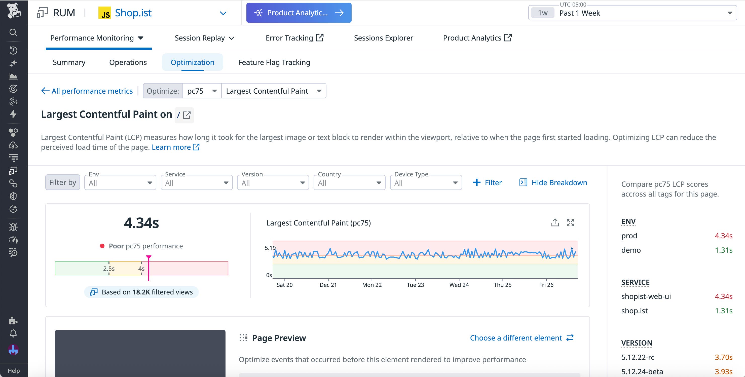
Once you’ve identified the slow interaction, look for UI work that can move from JavaScript to CSS, such as transitions, layout, or text rendering.
For example, let’s say you notice a long INP score for your app’s enrollment page. Looking at the INP breakdown for this page, you notice that the element with the longest render time was an animation and quickly identify a long animation frame in the event waterfall. From here, you can jump straight into troubleshooting by viewing the source code for the script associated with this frame. Alternatively, for a high-level view of how this animation is impacting your UX, you can also pivot to a Session Replay to visualize the issue from a user’s perspective.
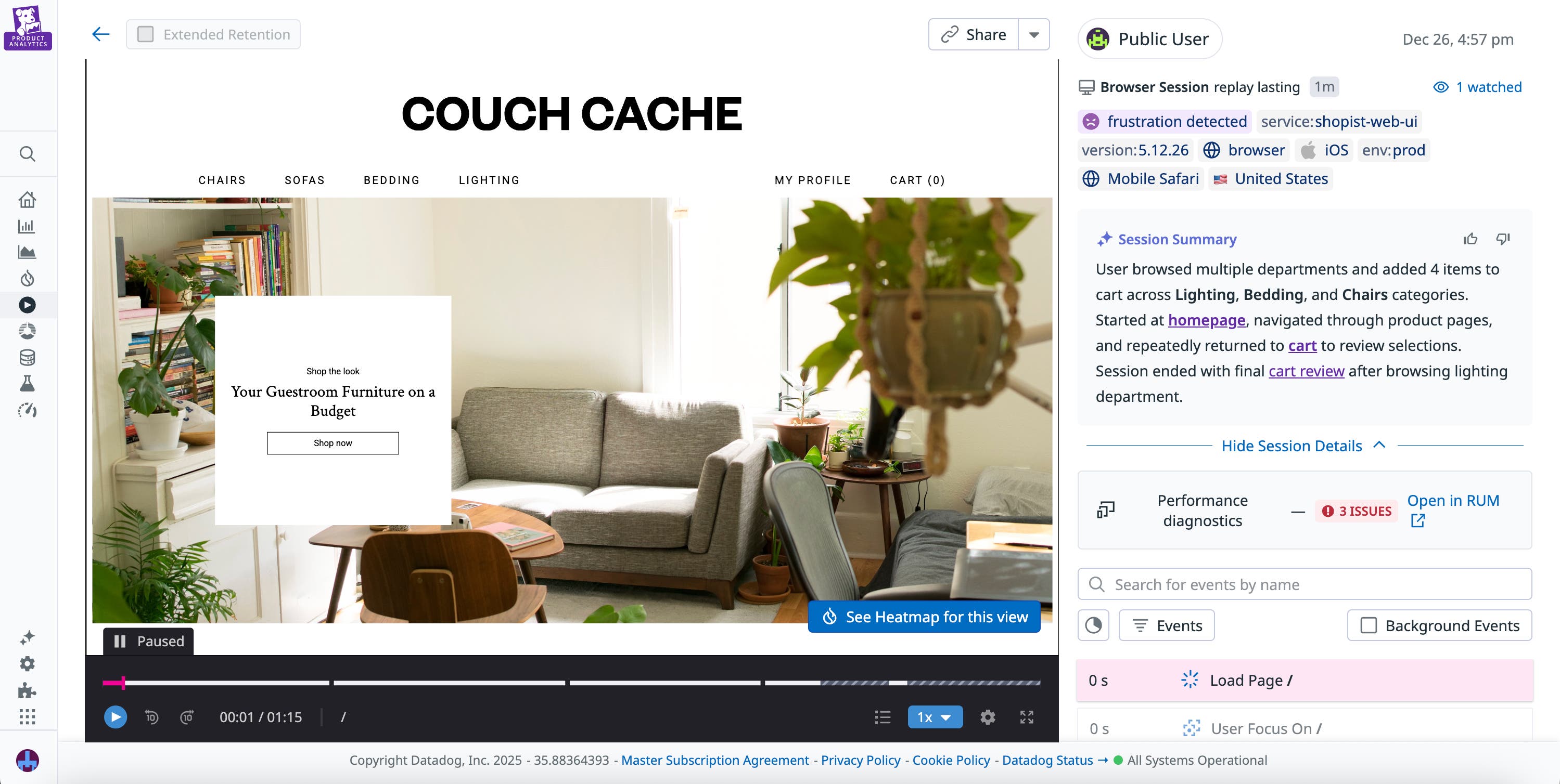
In this case, by viewing the source code and the Session Replay, you determine that this is a relatively simple transition animation that currently uses unnecessary JavaScript libraries and event listeners, contributing to the long render time. After rewriting the animation in CSS, you revisit performance metrics for the enrollment page and confirm that your changes have led to an improved INP score.
Simplify your code and improve UX with CSS
JavaScript and CSS both come with their own advantages and drawbacks. In many cases, the most effective approach is to use a combination of both, deploying each strategically based on the tasks they’re best suited for. By doing so, developers can provide a better user experience through faster performance and improved accessibility.
You can read our RUM documentation to learn more about optimizing your apps with Datadog. Or, if you’re new to Datadog, you can sign up for a 14-day free trial.


