Anatoly Mikhaylov

Nick Hefty
This guest blog post is authored by Anatoly Mikhaylov, a Principal Engineer at Zendesk and Datadog Ambassador, and by Nick Hefty, a Senior Engineer at Zendesk.
At Zendesk, we rely heavily on observability data to detect and resolve issues across our platform and connected services, and we have expanded our use of Datadog in recent years to support that work. We began by centralizing our metrics and monitors in Datadog, and then adopted APM and Log Management as more teams needed deeper visibility. These investments have delivered clear value, including faster incident response, better performance, and greater confidence in infrastructure decisions. But as usage grew, we recognized the need to keep costs predictable and aligned with that value, prompting us to launch a cost-optimization initiative. Our goal was to reduce expenses without reducing the visibility engineers rely on to detect and resolve issues.
This post shares how we approached and resolved that challenge. We’ll explain how we identified areas for cost optimization, improved tracing efficiency with targeted changes, and optimized log usage to manage volume. Finally, we’ll review the impact of our cost optimizations by looking at selected metrics we have been tracking. Overall, we’ll show that our initiative reduced observability expenses and improved cost transparency while causing minimal disruption to engineering workflows.
Identifying areas for cost optimization
Our cost optimization initiative began with an observability audit that was guided by the Pareto Principle (also known as the 80/20 rule). That is, we assumed that a small percentage of observability data provided most of the value, and that a similarly small share was driving the bulk of the cost. This principle helped us define practical, measurable criteria to look for.
Specifically, we planned to:
- Identify the 20% of traces that deliver 80% of the value
- Locate the 20% of logs that account for 80% of total cost
- Determine which 20% of metrics are used in 80% of engineering dashboards and monitors, and evaluate what to do with the rest
Creating dashboards for cost and usage visibility
To assist our audit, we created cost attribution dashboards based on standard Datadog billing metrics for tracing and logging. In a dashboard for tracing, we grouped services by criticality and severity, and gave each service an observability weight based on how essential its observability data was for debugging and operational decisions. For the logging dashboard, we started by cloning the built-in Log Management – Estimated Usage dashboard provided by Datadog. We then customized it by removing all but three core metrics: log ingest bytes, log ingest events, and log index events. To make cost patterns easier to interpret, we added new pie charts that visualized volume and scale by index and service.
With support from our Datadog Technical Account Manager (TAM) and Customer Success Manager (CSM), we further customized these dashboards to our needs and removed components that did not contribute to cost insight. As part of this process, we configured the dashboards to track costs by service and team by linking monthly billing figures to usage metrics through widgets and formulas. This allowed us to isolate specific usage patterns across metrics, traces, and logs, and to evaluate them side by side.
Improving tracing efficiency through targeted changes
After the audit, we began by targeting cost optimization opportunities we had identified in tracing. To support our effort, we created a new tracing dashboard that allowed us to monitor the impact of changes as we implemented them.
Reducing cost with single-span ingestion
One of the first patterns we saw in the tracing data was that not all services produce trace information at the same volume. For example, our monolith (i.e., our largest and most central service) acts as an entry point for most requests, handling tasks like authentication, authorization, and accounting. Within that service, the root span for each request already generates hundreds of key:value pairs, many of which carry enough context to troubleshoot issues without ingesting the entire trace hierarchy.
We realized that if we could enrich these root spans with a carefully chosen set of additional performance and diagnostic fields, we could switch to single-span ingestion and retain only the root spans without sacrificing our ability to troubleshoot. This would allow us to capture far less data overall (thus reducing tracing costs) while still providing engineers with the insights they needed to investigate incidents.
Using custom facets to track performance and regressions
To make this approach work, we focused on adding fields that would cover our most common and most costly sources of production issues. Because database performance is a frequent cause of slowdowns and errors, many of these custom facets and metrics focus on the database layer. For example:
@zendesk.db.timemeasures the time spent waiting on the database, which, when paired with the total request duration (@duration), helps identify bottlenecks.@zendesk.db.cluster_nameidentifies which database cluster was involved, making it easier to spot hotspots and direct troubleshooting to the right team.@zendesk.db.cluster_versiontracks which database engine version is running on each cluster, allowing us to detect performance regressions after upgrades.@zendesk.search.timemeasures time spent in our search service, which we use when offloading expensive queries from the database.
By embedding these high-value metrics into the root span, we preserved the ability to detect slowdowns, pinpoint resource bottlenecks, and confirm whether a change introduced a regression—all while storing far fewer spans than before. In short, these performance fields make single-span ingestion viable, delivering cost savings without undermining observability.
Next, let’s review several examples of how you can use Datadog APM to surface troublesome query patterns and understand their impact on a system.
Example: Isolating and resolving a database bottleneck
This example shows how the custom facets in our root spans allowed us to quickly isolate a specific performance problem, identify its cause, and confirm that our fix worked—all while using single-span ingestion.
The following APM query filters for a very precise set of slow, failing requests:
@zendesk.db.cluster_name:1.1 @zendesk.account.id:1 resource_name:"Api::V2::Tickets#index" @zendesk.db.time:>10s status:errorIn plain language, this filter looks for:
- Only requests handled by database cluster 1.1
- Only requests for account ID 1
- Only calls to the Tickets API endpoint
- Only requests where database time (
@zendesk.db.time) exceeded 10 seconds - Only requests that ended with an error
By narrowing the search in this way, we were able to find costly queries and address them one by one. For example, we noticed that one customer with millions of archived tickets was occasionally triggering costly SQL queries. With the help of Datadog APM, we were able to determine that in these cases, the large dataset made running the queries in a relational database slow and resource-intensive. Although adding indexes is a common fix, at this scale it would have helped only a small subset of the costly queries and have led to important trade-offs, including slower Data Manipulation Language (DML) operations and higher buffer pool memory usage. Instead, we offloaded the common query pattern to Elasticsearch, which is designed to serve large-scale filtering efficiently and reduce time spent in the relational database. Another way we sped up the queries was by serving data from Elasticsearch to the API endpoints that could accept this source. Datadog APM tracing capabilities helped us to make this process reliable and efficient.
To verify impact, we added @zendesk.search.time to the root span and compared it with database time. We saw @zendesk.db.time drop for customers with large datasets, and the improvement was clearer when isolating database time since overall @duration can be influenced by many factors. We also observed a significant improvement in @zendesk.db.time on the affected clusters, confirming reduced database load.
Example: Adding trace-level context for regression monitoring
In another example, we sought to improve database performance in a cost-efficient way and monitor our database engines for regressions after version updates. To do so, we enhanced root-level traces with the @zendesk.db.cluster_version facet.
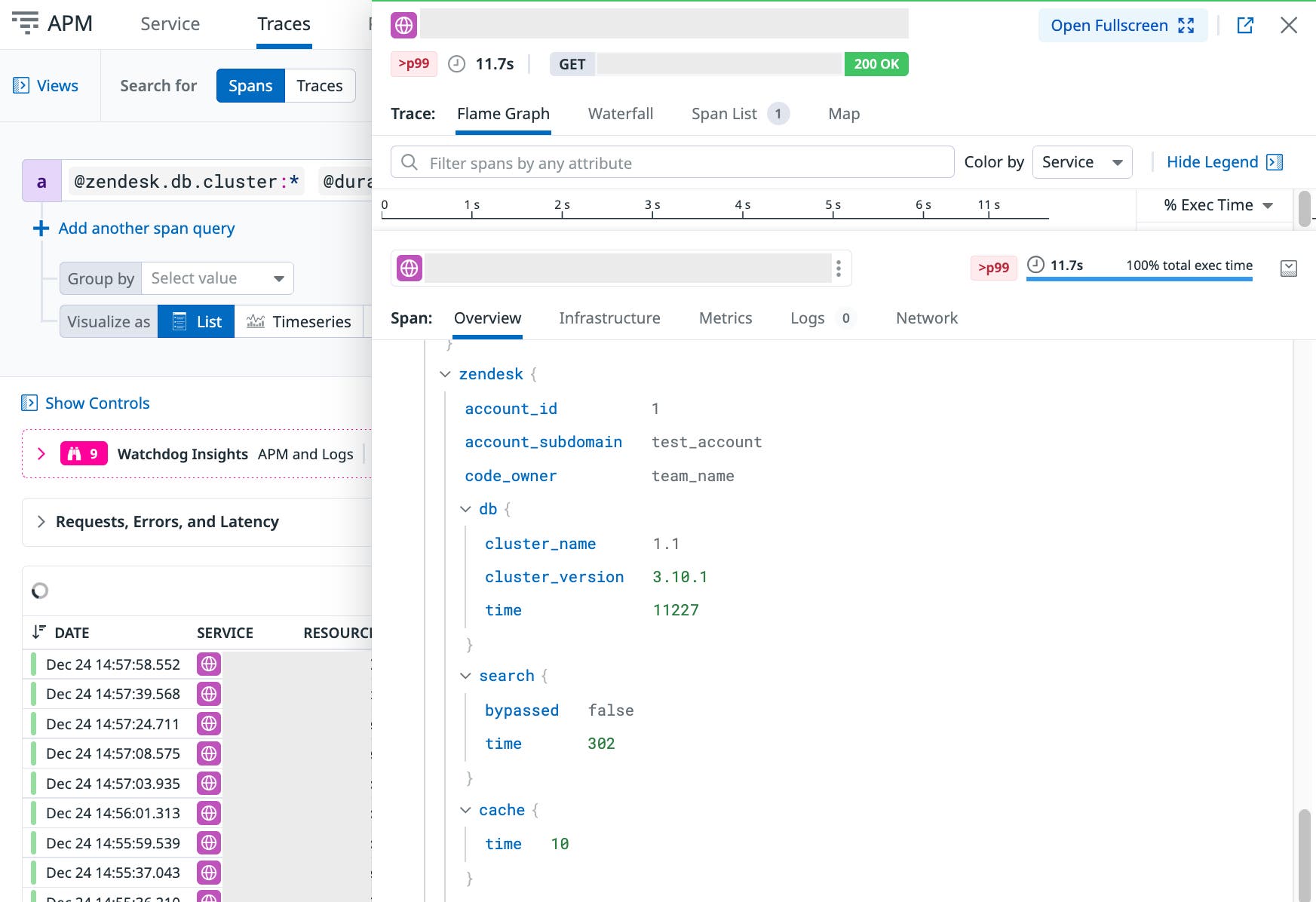
The new level of detail available in the root span also allowed us to verify that there were no regressions in object allocation or CPU time. If regressions had occurred, the enriched spans would have made it easy to isolate them by account ID, user ID, API endpoint, or DB cluster. The enriched spans thus allowed us to keep storage costs low while still maintaining precise diagnostic capability. We now maintain more than 100 custom facets to support this level of trace analysis.
As a result of this change, we reduced the total cost of ownership of our core databases by half while improving overall performance. We can now also successfully monitor database-time regressions, for example, after Zendesk’s recent upgrade to Amazon Aurora.
Balancing full trace ingestion with targeted sampling
Traces that contain only a single top-level span are relatively inexpensive to ingest compared to full hierarchies of spans. We still collect some full traces, but we sample those at a lowered rate and keep the rest as single spans. This approach helps us control ingestion costs while ensuring we have enough detail in the traces we do retain. By focusing on the traces that deliver the most value, we improve the signal-to-noise ratio and reduce cost without losing meaningful observability.
Tuning sampling based on service-level trace volume
To guide sampling adjustments, we analyzed trace volume for each service in every index. The chart below shows how this volume changed over time for different parts of our environment, including the monolith, and everything else. This step helped us see where increases were occurring and identify opportunities to adjust sampling without affecting coverage of critical paths.

The visualizations revealed that trace volume from our monolith had doubled, which was expected due to higher API traffic. Rather than reduce coverage in the monolith, we lowered sampling ratios for other high-volume services. Because we understood the dependencies between services, we could make these reductions confidently, knowing they would not affect trace coverage for critical paths.
We also created a separate dashboard focused on tracing volume from non-monolith services. The chart below shows this dedicated view, which we used to adjust sampling rates based on throughput and the tier level.

Services with higher throughput received less frequent sampling rates, while lower-tier services could be sampled more aggressively without impacting signal-to-noise ratio. This approach linked cost decisions directly to usage patterns and service criticality, giving us a transparent framework for cost attribution. Over time, these targeted adjustments helped keep the cost trendline flat while maintaining reliable observability for troubleshooting.
Optimizing log usage to manage volume and cost
At Zendesk, logs serve a wide range of use cases, from validating hackathon prototypes to supporting complex chains of independent services. These logs often connect with web server request traces through shared dd.trace_id values, even when background jobs run asynchronously, fail, retry, and eventually succeed.
We also use logs to track the state of circuit breakers by relying on high-cardinality tags like allowed failure count and reset timeout. Logs play a crucial role in monitoring our email infrastructure, especially during system migrations that lack tracing coverage. In these cases, structured JSON logs from standard output help keep troubleshooting workflows consistent and reliable.
Although logs are essential, they also represent a major cost driver if left unmanaged. The challenge is keeping their diagnostic value while controlling ingestion and indexing volumes—a key goal in our cost optimization strategy.
Exploring logs through experimentation
One internal project used logs to visualize queueing theory in action, making complex behavior easier to understand. We later expanded this work into experiments with performance schema monitoring, also powered by log data. Early results were featured in the USENIX ;login: publication. The later iterations helped us trial Datadog DBM and give the product team early feedback on the value of connecting client-side traces with server-side performance schema data by passing a trace_id as a SQL comment.
While logs tend to be less expensive than traces, they are more susceptible to unpredictable spikes. In one case, a service in our staging environment repeatedly failed to create an S3 bucket due to a permissions error. It retried hundreds of times per second, driving up log volume and cost. This incident made it clear that without careful controls, log-based observability can quickly shift from valuable to noisy and expensive. Tools like log quotas and exclusion filters helped reduce volume, but at our scale they were not enough.
Getting started with log optimization
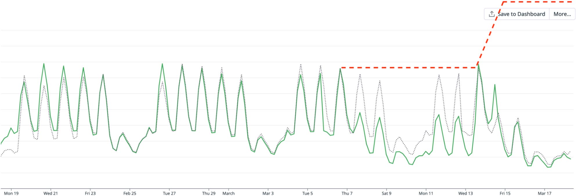
We began our log cost optimization effort in February 2024. The anomaly detection graph below illustrated how quickly log volume, and therefore cost, was trending upward. It shows how far we needed to go to flatten the trendline while maintaining observability:

With help from our Datadog TAM, we reassessed our logging approach. Our goal was to reduce unnecessary log ingestion and indexing while keeping the critical logs needed for troubleshooting and performance monitoring.
At that time, our log configuration looked like this:
- Ingestion-to-indexing ratio: 10:1
- Total exclusion filters: 1,435
- Most common exclusion filter: exclude 99–100%
As a result of our assessment, we learned some lessons and identified a few principles that were key to controlling log costs at scale:
- Log spikes rarely correlate with feature rollouts. Most spikes in fact come from accidental behavior and reflect a single underlying issue, so the additional logs add little engineering value—while increasing costs sharply.
- Logs are more difficult to manage than metrics or traces. Their volume and fields can change unexpectedly across many code paths, which makes cost and data hygiene harder to control.
- Logging configurations are harder to roll out and roll back cleanly. Logging behavior is spread across services and deployments, so changes propagate unevenly and reversions often lag.
Applying log reduction strategies
We focused on a few targeted steps that would both improve signal quality and cut cost:
- Keep the number of exclusion filters to a minimum. Even with up to 88% of logs excluded from indexing, we still paid ingestion costs, while the excluded logs made spikes harder to spot.
- Use Live Tail to review excluded logs and estimate their contribution to ingestion volume.
- Use the Log Patterns view to bucket similar logs and identify low-value patterns to remove at the source.
- Audit logs with no pipeline association (
datadog.pipelines:false).
We tested these strategies on our most expensive log index. Live Tail quickly revealed we were accidentally duplicating every log. To confirm, we temporarily cleared the relevant exclusion filters. We also built a self-serve cost attribution dashboard so that the owning team could investigate asynchronously.
After agreeing to remove the code paths responsible for the duplication, we saw a visible drop in log volume on March 7.
Identifying the cause of unexpected spikes
On March 13, log volume rose again, but this time from a different source. We discovered that during a service replacement, the old and new services were running in parallel. Although they were distinct services, they shared the same logging configuration and index, creating duplicate logs. Without the earlier optimization work and visibility tools, this spike could have doubled log volume.
The chart below shows the drop in log ingestion volume after removing these duplicates. By March 17, we not only flattened the rapidly growing cost, but we also achieved a fourfold reduction in volume for this high log volume service. This was a direct cost optimization win, proving that the Pareto principle works well for observability optimizations.
Controlling log indexing behavior
Log indexing trends revealed a slightly different challenge. There was no indexing spike on March 7 because exclusion filters had already been applied to the original service, but not to the new one. When the replacement service was deployed, we realized those filters needed to be replicated to prevent an upward cost trend.
The chart below shows log indexing volume over time. While the volume stayed stable on March 7, the missing filters for the replacement service created the potential for a steady upward climb in indexing costs. By applying the same filtering and duplicate-removal strategies used for ingestion, we prevented this growth and kept indexing costs flat.

This early win provided the momentum to apply the same duplicate-removal and filter-alignment techniques across other high-volume log indexes. Each time, the goal was the same: preserve the logs necessary for critical observability while removing redundant or low-value entries that drive up ingestion and indexing costs.
Measuring the impact of our optimizations
We have been able to successfully flatten cost trends for both APM and log usage while maintaining the level of observability needed for engineering teams to work effectively. In the following section, we walk through the key metrics we tracked during this effort, explain why each one matters for cost, and show the targeted actions we took to influence them. Each metric directly reflects a component of our Datadog bill, and each accompanying chart illustrates the impact of our optimizations over time. The section concludes with visualizations that bring these metrics together, showing how we translated usage patterns into a clear view of cost distribution for both engineering and finance stakeholders.
Tracking trace volume
Metric: datadog.estimated_usage.apm.ingested_bytes
What it measures: The total number of bytes ingested by Datadog APM for all traces.
Why it matters for cost: More ingested trace data means higher APM costs. Controlling this metric helps keep spend predictable while still preserving the traces needed for troubleshooting.
What we did: We anticipated a spike in trace volume from the monolith, and when that spike occurred, we offset it by increasing the use of single_span traces and adjusting sampling rates for other high-volume services. Dashboards breaking down trace volume by service and team helped us target where to make these changes.
What the chart shows: A clear spike from the monolith followed by stable overall trace volume as other services were optimized, demonstrating that we held this cost driver flat despite growth in one area.

Reducing log ingestion
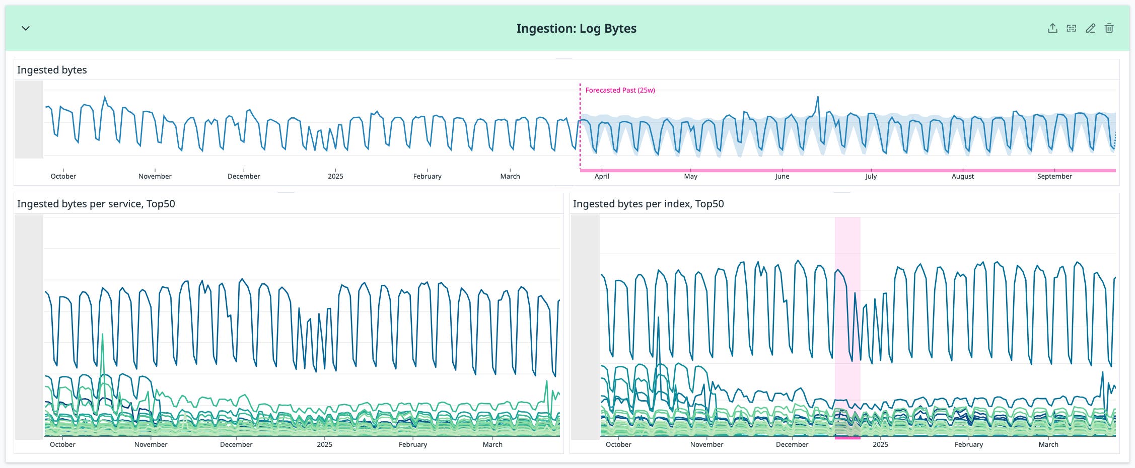
Metric: datadog.estimated_usage.logs.ingested_bytes
What it measures: The total number of log bytes ingested into Datadog, broken down by service and index.
Why it matters for cost: High ingestion volume from logs directly increases our Datadog bill. Reducing unnecessary or low-value log data can significantly cut costs without impacting visibility.
What we did: We prioritized the removal of high-volume, low-value logs. By comparing services within each index, we identified the largest contributors and applied targeted exclusions. We followed Amdahl’s Law, starting with the most impactful sources and optimizing based on service throughput, size, and criticality.
What the chart shows: A visible drop in ingestion volume for targeted services, confirming that these exclusions reduced one of the primary drivers of log-related costs.
Lowering event volume
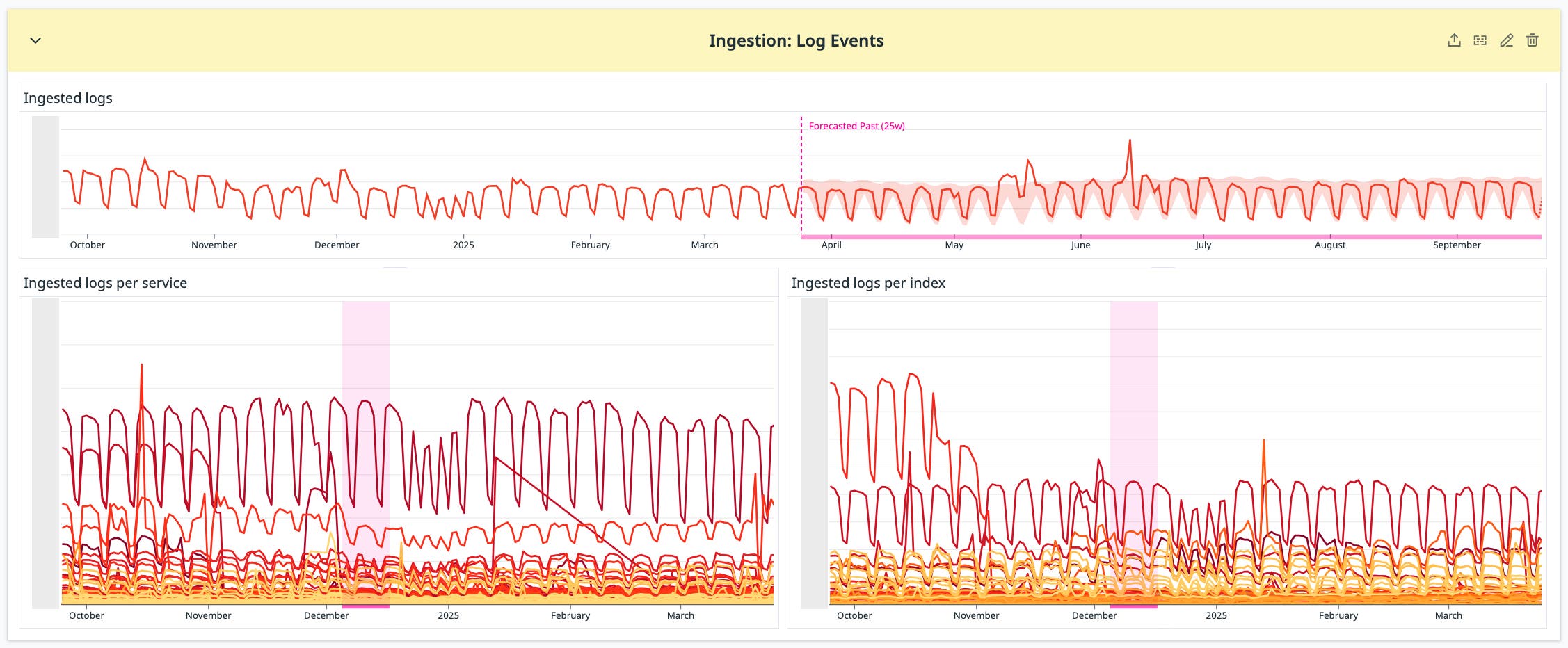
Metric: datadog.estimated_usage.logs.ingested_events
What it measures: The number of individual log events ingested into Datadog, broken down by service and index.
Why it matters for cost: Each event counts toward log ingestion limits, so reducing event counts without losing valuable content directly reduces costs.
What we did: We batched related single-line log entries into multi-line entries. This maintained the same payload content but significantly reduced event counts. The Log Patterns tool helped us find batching opportunities and cut our exclusion filter count by about one third.
What the chart shows: A steady reduction in log event counts across targeted services, reflecting lower ingestion costs and improved log usability.
Monitoring indexing trends
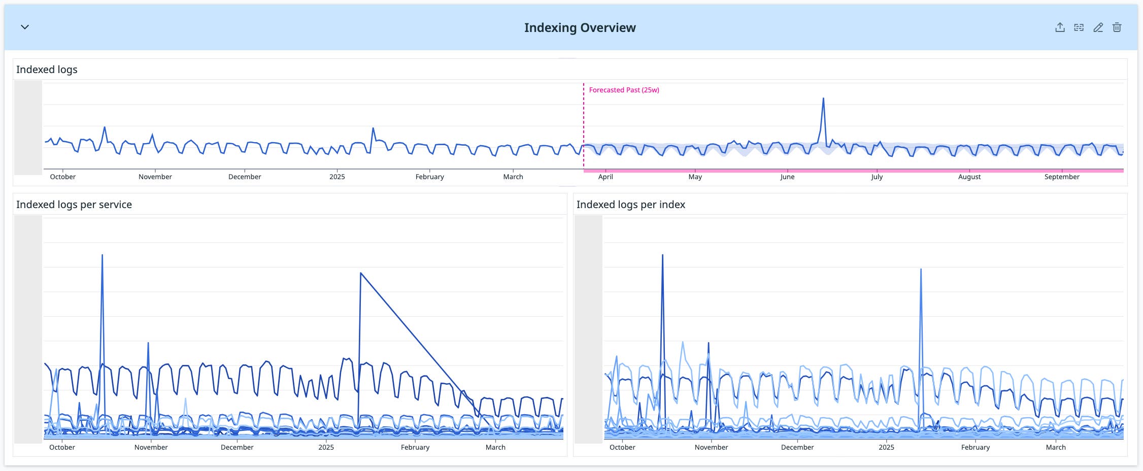
Metric: datadog.estimated_usage.logs.ingested_events (with datadog_is_excluded:false)
What it measures: The number of log events that were indexed (and not excluded), broken down by service and index.
Why it matters for cost: Indexed logs are more expensive to store and search. Monitoring and controlling this metric helps prevent sudden cost spikes.
What we did: We tracked this metric to identify services prone to indexing spikes, such as certain proxy logs triggered by external events. Because these situations required high-cardinality log data, we used indexing controls to keep volume in check without losing essential troubleshooting detail.
What the chart shows: Stable or reduced indexing volume in targeted services, confirming that controls kept indexing costs under control while retaining important log data.
Visualizing cost attribution for shared environments
After working through each metric individually, our final step was to bring them together into a unified view that connected usage patterns to actual cost impact. We created a set of cost attribution pie charts that broke down total log ingestion and indexing costs by service and by index. These visualizations were built directly from the same metrics tracked throughout the project, translating the trends and improvements shown earlier into a clear picture of cost distribution. By showing the largest cost contributors, they gave both engineering and finance teams a shared reference point for deciding where the next round of optimizations could deliver the greatest return.
The first image below contains four pie charts. Two show the breakdown of log ingestion costs, one by service and one by index. The other two show the breakdown of log indexing costs, also by service and by index. Together, they provide a high-level view of cost distribution, helping teams identify the services and indexes that represent the biggest financial opportunities for optimization.

To generate these charts, we used a simple formula for relative cost: take the annual log ingestion or indexing cost for a given service, divide it by the total, and multiply by 12.
The next image shows the actual Datadog queries used to produce the data for these calculations. On the left, the queries reference datadog.estimated_usage.logs.ingested_bytes for ingestion cost. On the right, they reference datadog.estimated_usage.logs.ingested_events with datadog_is_excluded:false for indexing cost.

Template variables allowed us to filter the charts by service or index, which made exploring cost differences simple. This capability created a common language for discussing cost impact across teams — particularly valuable in shared environments where ownership and usage are spread across multiple groups.
What we learned from a year of optimization
Our year-long effort demonstrated that observability costs can be reduced while preserving the level of signal engineers need for effective troubleshooting. We combined audit-driven prioritization with targeted dashboards and usage-specific techniques, such as single_span ingestion, to focus changes where they would have the most lasting impact.
We approached trace volume, log ingestion, and log indexing as separate levers for cost control. In each area, we identified the highest-cost contributors, applied changes to remove low-value or redundant data, and improved transparency through service- and index-level dashboards. This combination of targeted action and clear visibility allowed engineering teams to work with better context and gave stakeholders a direct view of how observability usage relates to financial impact. The result was a sustained flattening of cost trends supported by consistent access to critical operational data.
To read more about cost optimization with Datadog, see these blog posts. And if you’re not yet a Datadog customer, sign up for a 14-day free trial.


