Stephen Kappel
At Datadog, we believe in collecting data—and lots of it. But sometimes, when it comes time to look at your metrics, less is more. For those times when you care more about how the metric is trending over time and less about its exact value every minute of the day, regression functions can help. Adding to our long list of query functions, Datadog now offers three regression functions to enhance your dashboards.
Linear trends
In linear regression, an algorithm tries to find the line that best represents a set of points. Datadog has two different linear regression functions: trend_line() and robust_trend().
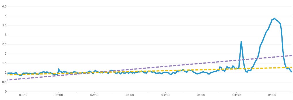
trend_line() uses the most common type of linear regression—ordinary least squares. For most cases, this algorithm works great, but it can be easily influenced by outliers. Just a small number of outlier points can hugely impact the regression. That’s where robust_trend() comes in. Our robust regression implementation uses Huber loss to pay less attention to metric values that are very different from the rest of the series. The picture below shows how the two algorithms produce different results for a series with a handful of extreme values.
Uses for linear trends
Highlight the trend
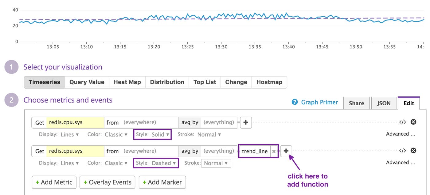
Trend lines may be added to graphs alongside the original metric to help highlight/clarify the trend. Simply click the + button next to an expression in the query editor to access the function menu, and navigate to the Regression section, where you’ll find all three functions discussed in the post. At Datadog, we like adding the trend line as a dashed line like this:
Remove visual clutter
Charts with “group by” queries can sometimes turn into a mess of spaghetti, especially when the series are noisy. The heatmap visualization type can help visualize the distribution of the series, and top lists can help identify specific tags that are at the top or bottom of the pack. Using trend lines gives you another option for cleaning up a chart by flattening out fluctuations in individual timeseries. For example, the pair of charts below show a set of noisy series with and without trend_line() applied.

Piecewise regression
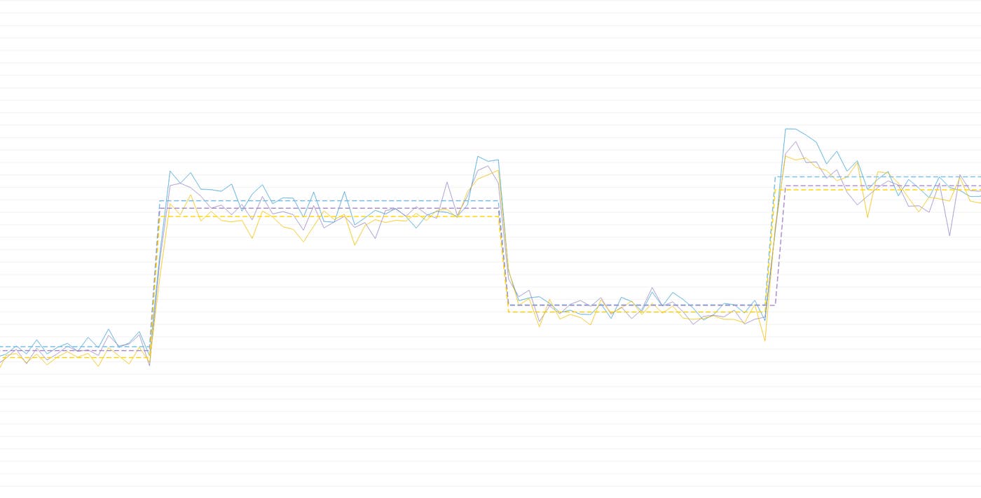
Sometimes a series can’t be well represented by a single regression line. Often this is the case when a code or config change results in a sudden change in a metric. For example, in the graph below, the trend line incorrectly hints that the series is trending upward at a constant rate, but piecewise_constant() fits a step function which correctly shows that the metric had a sudden change in value around 14:00, with a steady state before and after.

The number and duration of the segments (i.e. “steps”) returned by piecewise_constant() are determined automatically, based on the characteristics of the metric passed to the function. The value of each segment will always be the average of all the original metric values that fall within the segment’s time range.
As with linear trends, the piecewise constant regression can also be overlaid on top of a metric. At Datadog, we’ve found this function to be a quick and easy way to visualize the overall change in a metric before and after a deploy.
Line it up
Functions for trend lines, robust trends, and piecewise regression are now available through the graph editor for all Datadog users. If you’re new to Datadog and would like to apply our new regression functions to your own metric graphs, you can sign up for a trial account here.
