Thomas Sobolik

Miranda Kapin
Funnels are now part of Datadog Product Analytics! Note that some visuals in this post may not reflect the updated UI.
Monitoring user journeys is essential to ensuring that your application is functioning optimally. Datadog Product Analytics enables you to view your user journey data from multiple perspectives and correlate it with key performance metrics, conversion rates, and errors. With funnel analysis, available for Product Analytics customers, you can leverage the user session data captured by Datadog to understand if users are successfully completing key workflows for your business’s health—like e-commerce checkouts, account creation, or email signups. By tracking how your users are navigating your UI, you can identify sources of friction in your app’s key user flows and determine where you need to optimize.
In this post, we’ll show you how to use funnel analysis to visualize customer conversion rates across user journeys and easily pivot to other features such as Session Replay to drill deeper into customer sessions and investigate the root causes of user friction.
Visualize the funnel across key workflows
Funnel analysis enables you to visualize aggregated traffic across each step in key user journeys. Once you select the sequence of views and actions you want to analyze, the resulting funnel graph shows what percentage of users move from each step to the next one. By observing how many users make the jump between steps—and how many don’t—you can monitor the rate of success for the workflow and see where there might be sources of friction causing users to churn away.
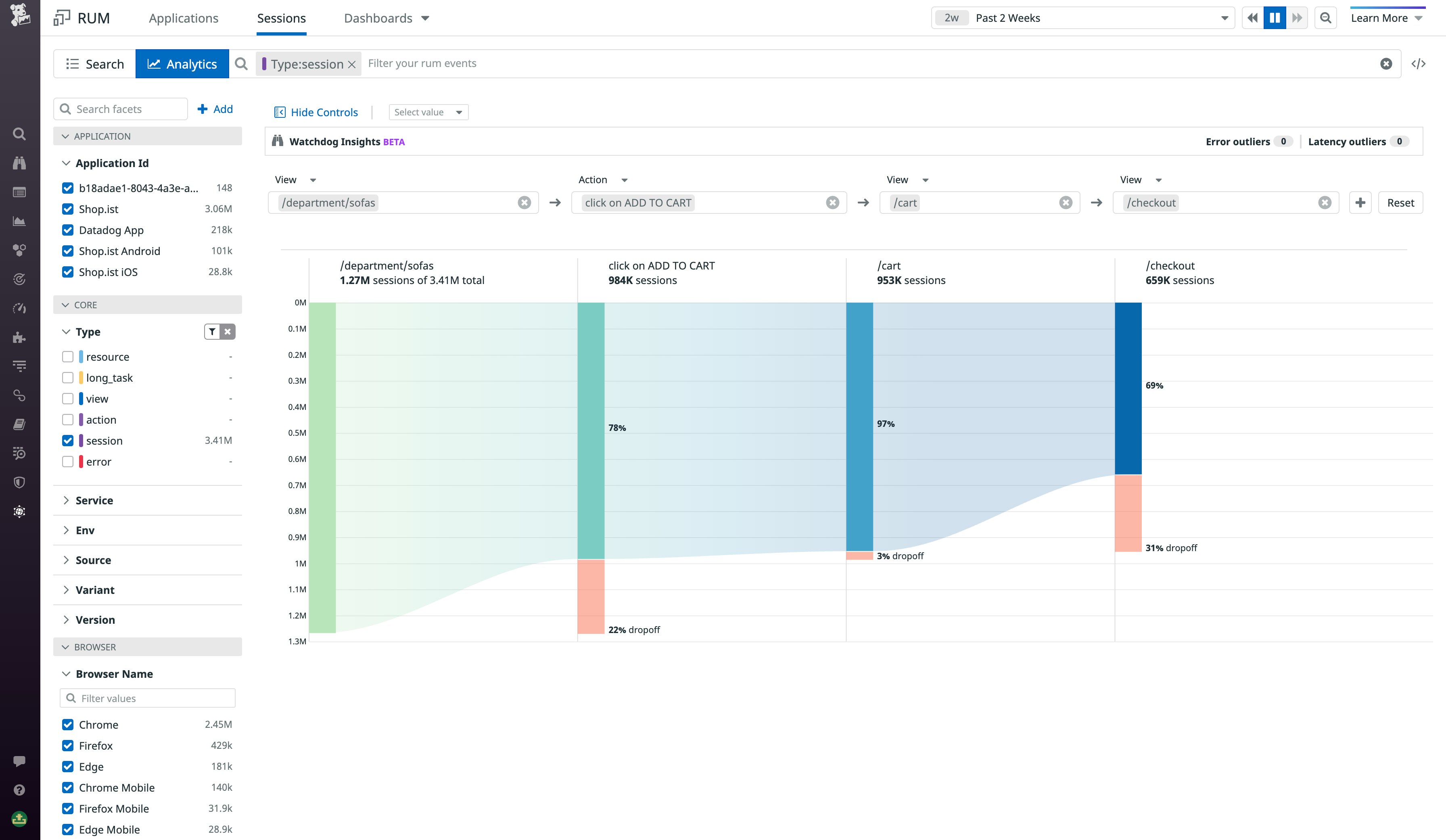
Let’s say you manage the web store of an e-commerce company. The checkout workflow is probably the most important user journey for you to consider for your business health. Using funnel analysis, you can easily see the conversion rate across all of the required steps in this user journey (i.e., adding a product to the cart, clicking through to the checkout page, entering payment info, and confirming the purchase). From a glance, you can see if a plurality of customers are churning away before completing any of your funnel’s required steps.
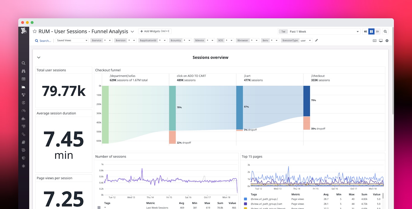
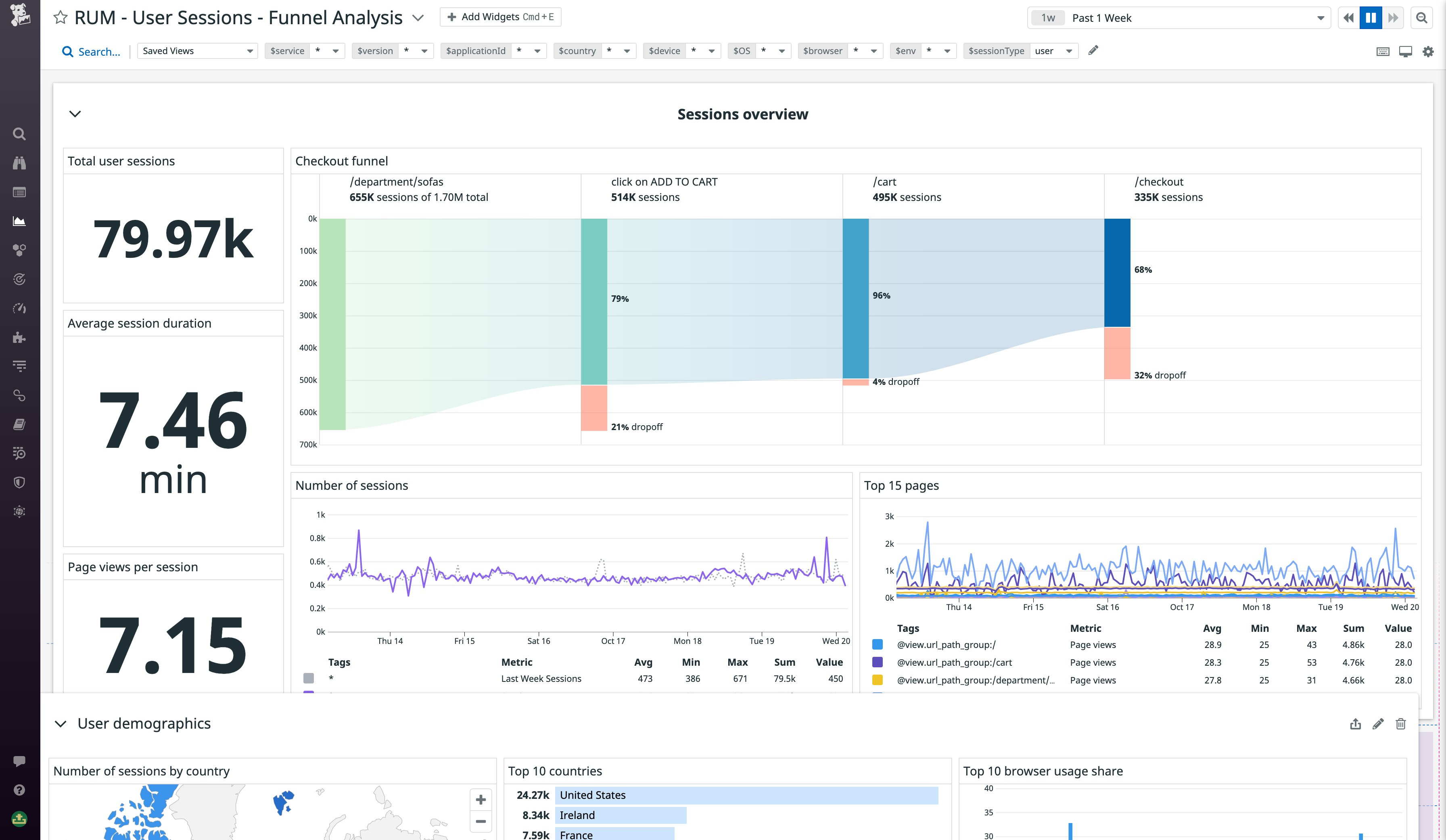
You can also add funnels to your dashboards alongside other key performance indicators for your application’s health, making it easy to share product data across engineering, marketing, finance, and management teams at your organization.
Understand causes of user friction
Once you’ve identified a potential source of friction with funnel analysis, the next step is to investigate its root cause. You can easily dive into a specific workflow step to view additional metrics and relevant usage data to identify where you need to make improvements.
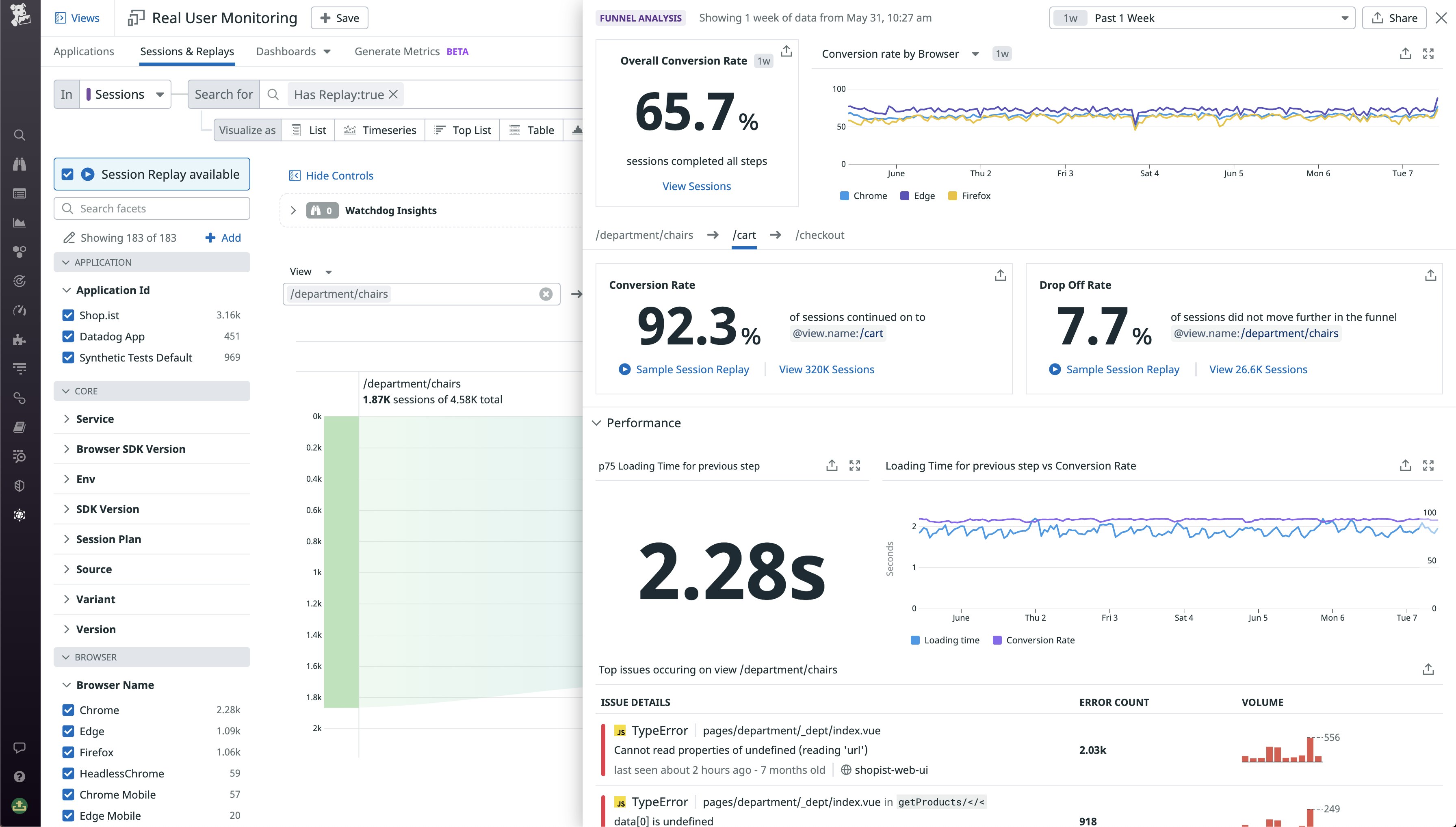
Clicking on a step in the funnel lets you drill in for more details, including metrics for conversions (sessions where the user continued to the next step) and dropoffs (sessions where the user churned away) that you can use to understand the churn rate between steps. You can compare the conversion rate of the selected step to that of the entire funnel to understand that step’s contribution to the funnel’s overall performance. You can also break down the conversion rate by facets such as browser, country, and device type to gain further insights about the root cause of friction. Viewing the conversion rate by country, for example, can help you understand whether the funnel performance is degraded in a particular region—maybe due to a regional cloud outage causing backend errors.
Often, you’ll want a deeper understanding of users’ behavior within a specific workflow. You can pivot directly from the Funnel Analysis side panel to a list of relevant Session Replays, which are video-like reproductions of user journeys that include all of the steps in your funnel. This helps you understand, for example, which actions a user took before abandoning a key step. The side panel also displays the selected step’s average page load time, which can help you spot when users are churning away from the funnel due to poor loading performance. And finally, the side panel also includes error clicks and frustration signals so you can quickly see if ongoing conversion issues are potentially due to problems within your application code, such as broken functionality in important UI components.
Get started with funnel analysis
With funnel analysis in Datadog Product Analytics, you can visualize traffic patterns across key user journeys to quickly identify friction points and then drill in deeper to investigate the root cause. Funnel analysis is currently available out-of-the-box for all Product Analytics customers—you can learn more about Product Analytics with our documentation. To get started with Datadog, sign up for a 14-day free trial.
