Aman Kapur

Mallory Mooney
When you’re alerted to a problem in your infrastructure, the last thing you want to do is waste time wondering what to do next. That’s why we have enhanced our monitor status page so you can quickly get the lay of the land and take action. We’ve redesigned the monitor status page to be faster, and each page brings together a wealth of useful data about any automated monitor and the alerts it generates:
- Timeseries graph of the monitored metric or state
- Detailed history across monitored infrastructure
- Graph of how the data was evaluated to determine the monitor’s state over a selected timeframe
- Stream of alert notifications and other events generated by the monitor
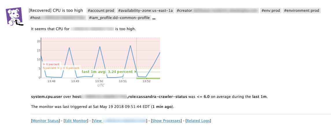
When you receive a Datadog alert, you can quickly access the monitor status page and use it to jump-start an investigation. Each page includes a high-level view of your monitor’s status, associated tags, and other metadata.

You can also access the status page when your systems are healthy to explore how often each monitor alerts, in which groups, and see the detailed history of each monitor from the past days, weeks, or months.
See the history of all your monitors
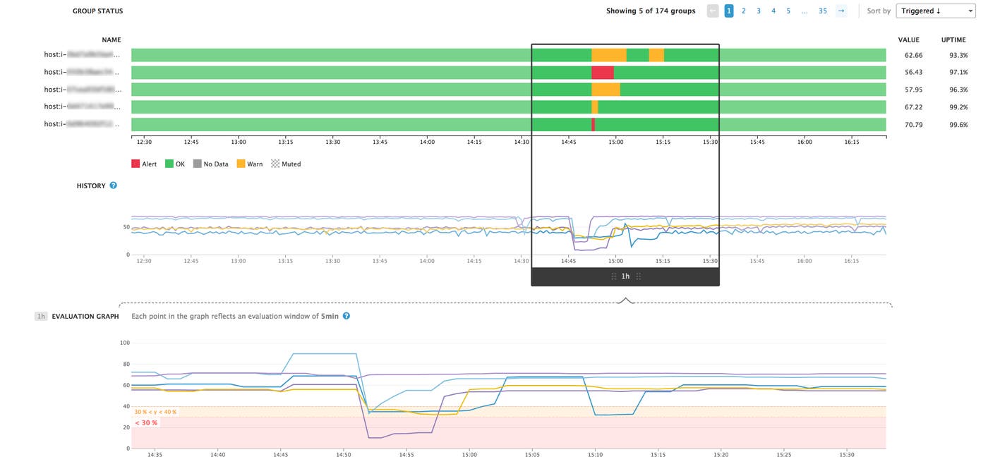
The monitor status page displays the history of your monitor and its associated metrics across any timeframe you choose.
What happened when?
The history pane allows you to explore monitor trends, see instantly whether a particular issue is acute or chronic, or compare monitored groups with one another. Just like any timeseries graph in Datadog, you can select an area of interest to zoom in, or pan across time to identify when symptoms first appeared. With the timeframe bracket, you can drill down to a smaller range of time to pinpoint where issues are occurring. The evaluation graph shows how that data was evaluated against the alert thresholds you set for the monitor, giving you greater context for that selected timeframe.
Is a single noisy host causing problems?
In a distributed environment, your monitors usually keep watch over many components of your infrastructure at once. Now you can easily isolate metrics and alert history from the hosts or groups that are triggering alerts. You can also look at alerting hosts alongside their healthy peers to see, for instance, if one particular host has recently been triggering alerts more frequently. With the evaluation graph, you can see exactly when a metric crossed one of the alert thresholds you specified.
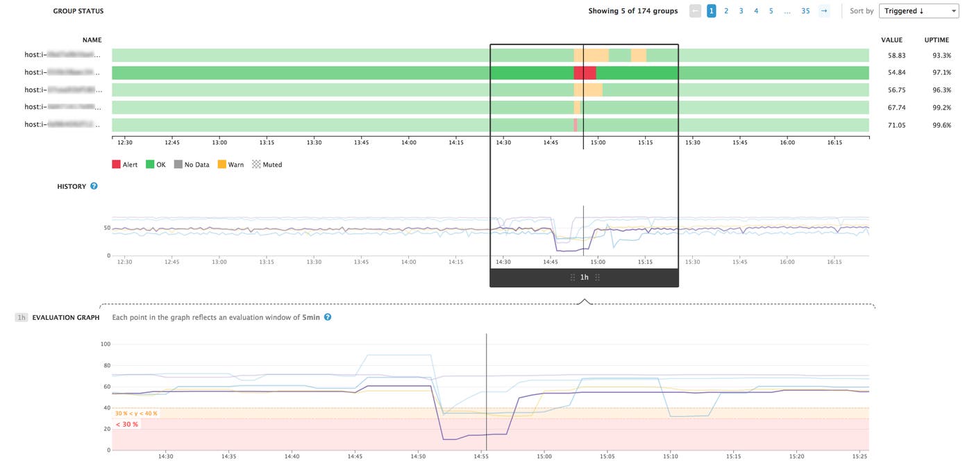
Uptime statistics show the percentage of time a host was not in an alerting state, based on your alert thresholds. Uptime is calculated over the timeframe you specified at the top of the “Status and History” section of the monitor status page.

Each status page also includes a stream of events generated by your monitor, such as alert and recovery notifications, each of which enable you to view more detail about the host, processes, and logs related to the alerting event.
A new home for your monitor data
By displaying all the data about a monitor in one place, we are confident that the status page will help you better understand your monitors and the data they’re tracking. The monitor status page is available for you to explore in Datadog today. Current users can access the status page by clicking on the name of any monitor or from any monitor event notification. Not a Datadog customer yet? Sign up for a free trial.

