Thomas Sobolik

Sacha Guyon
Datadog Events provides customers with a data feed about their infrastructure and applications, delivering an up-to-the-minute history of activity such as code deployments, configuration changes, and triggered alerts. Events collects data from Datadog products and over 100 third-party integrations—including Docker, Jenkins, Kubernetes, Sentry, AWS CloudWatch, and Azure Service Health. By consolidating this information into a single, filterable view, Events enables you to keep tabs on changes that occur across your stack and investigate issues more efficiently.
We’re pleased to announce that we have updated Events with a slate of new features to help you browse, filter, alert on, and analyze your events. These new features make it easier than ever to track new changes in your infrastructure and gain helpful insights into incidents. In this post, we’ll walk through this new functionality and discuss:
- Navigating and analyzing your events with the new Events Explorer
- Tracking events data with dashboards and event monitors
- Generating custom metrics to access predictive monitoring features
- Enriching your events data by using processing pipelines
Identify and troubleshoot issues faster with the new Events Explorer
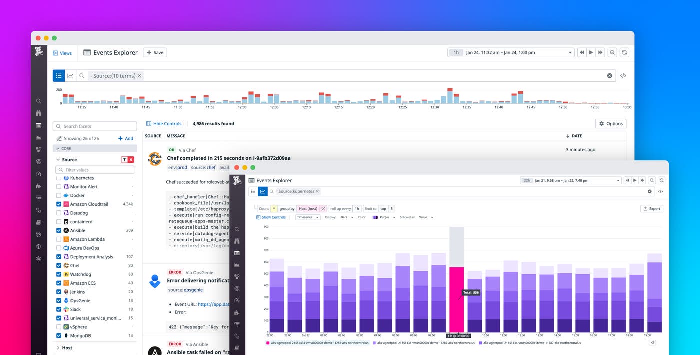
With the new Events update, we’ve replaced the long-running event stream with the new Events Explorer. The Explorer offers more advanced querying and analytics capabilities, which we will introduce in this section.
Advanced querying to help you hone in on the events you care about
Queries inside the new Events Explorer now use the standard query syntax you can use to query data in APM, RUM, and other Datadog products. Accordingly, you can now make more robust event queries by combining wildcards and AND/OR operators. For example, if you’re an AWS customer, you might be receiving events from a number of different AWS products, such as RDS, ECS, EC2, Lambda, etc. By using a wildcard (*), you can now easily query for all sources that contain the prefix amazon*.
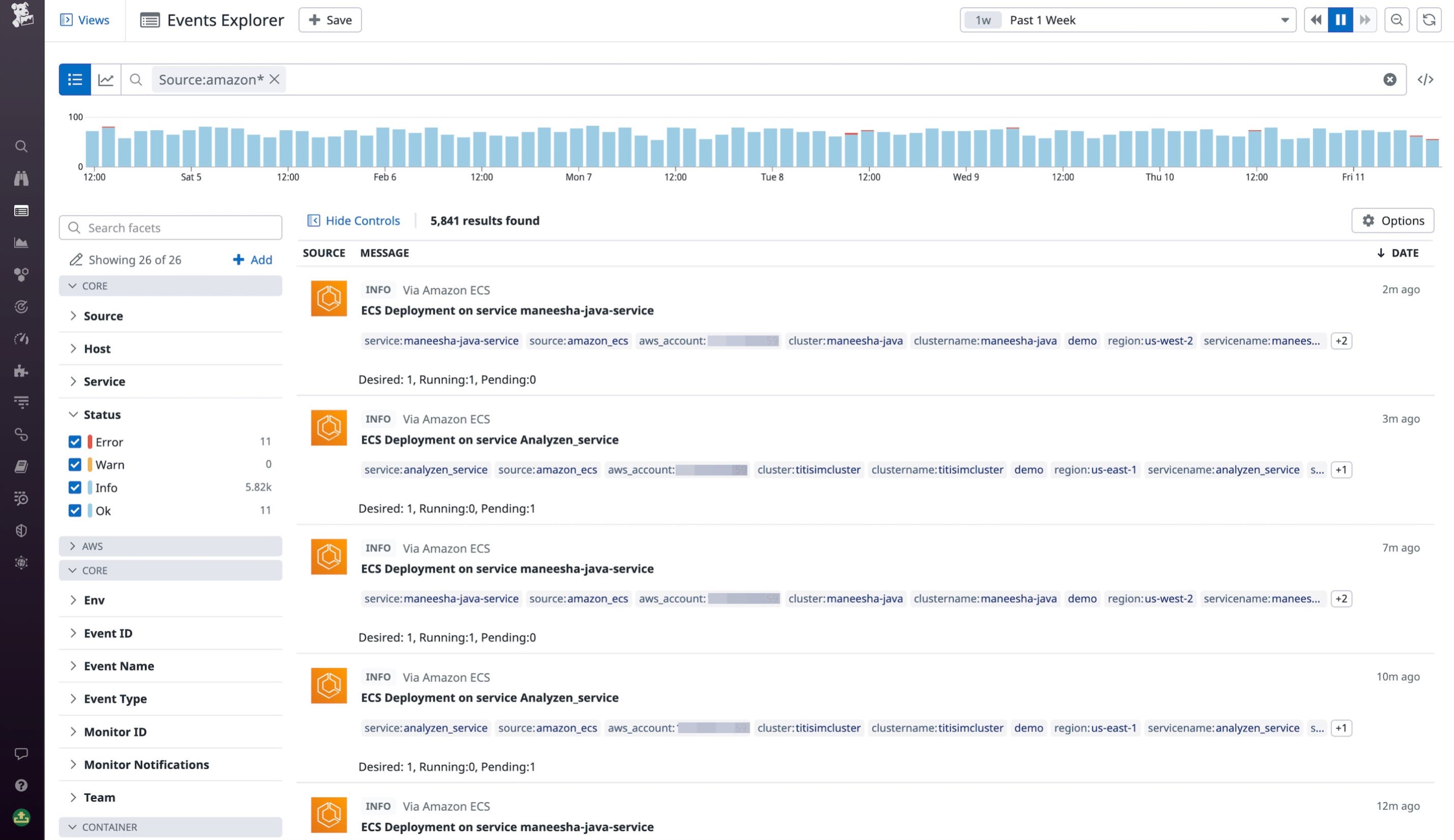
To narrow down the results of your query, you can also use the sidebar to filter events by attributes—such as service, source, and status (e.g., Error or Warn)—to focus your investigation further. You can even customize this sidebar to add any other tags or attributes as facets, and organize them in groups to simplify navigation. Additionally, Saved Views allows you to favorite common queries for quick access.
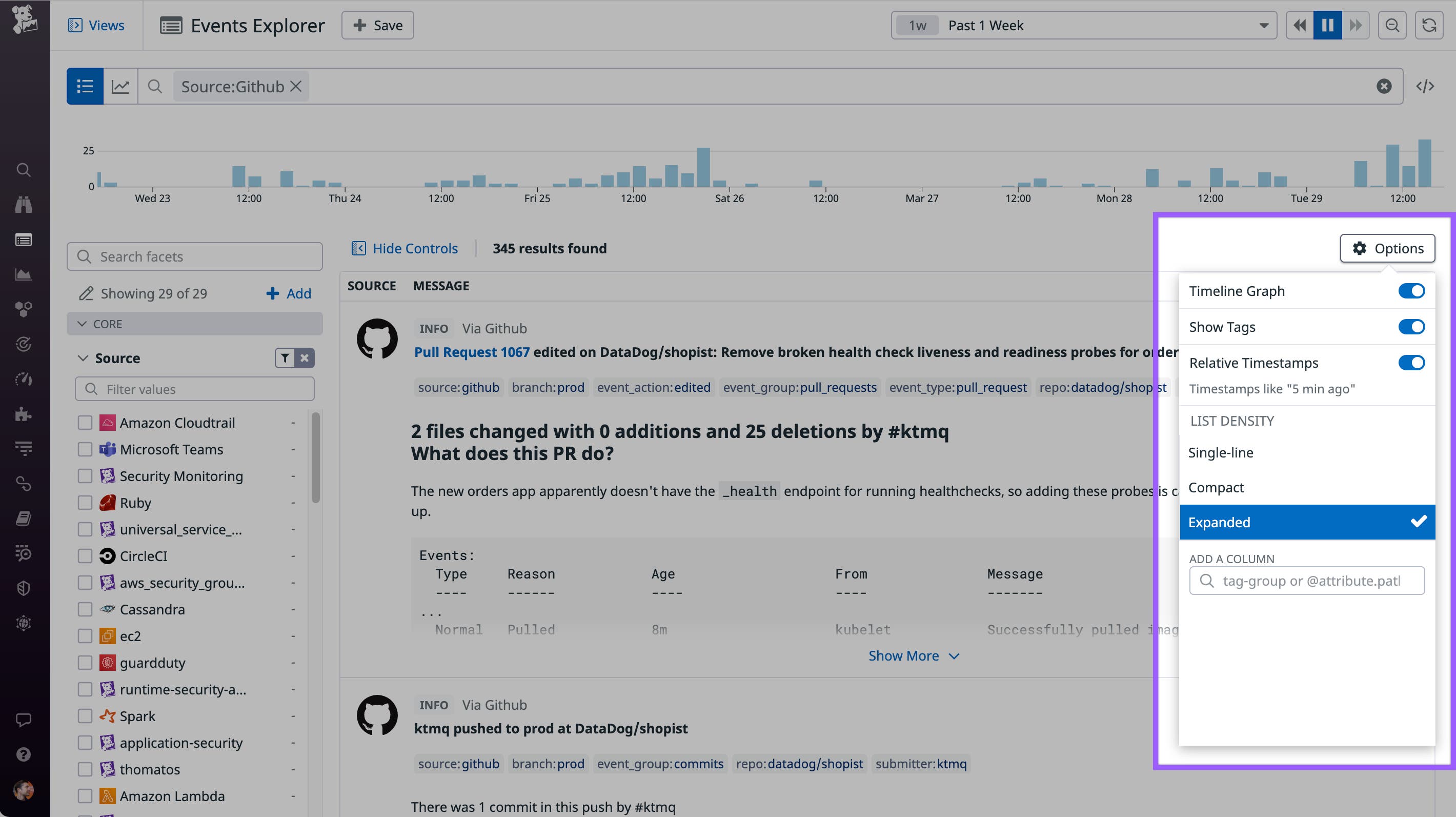
To give you control over the size of event previews as they appear in your query results list, we’ve added three list density options. Choose the “Single-line” option if you want to browse through numerous results as quickly as possible. Alternatively, choose the “Compact” or “Expanded” option to preview event messages with a medium or high level of detail, respectively. Click on an event to open the side panel and view the full message alongside tags and attributes.
Create graphs and perform analytics on events
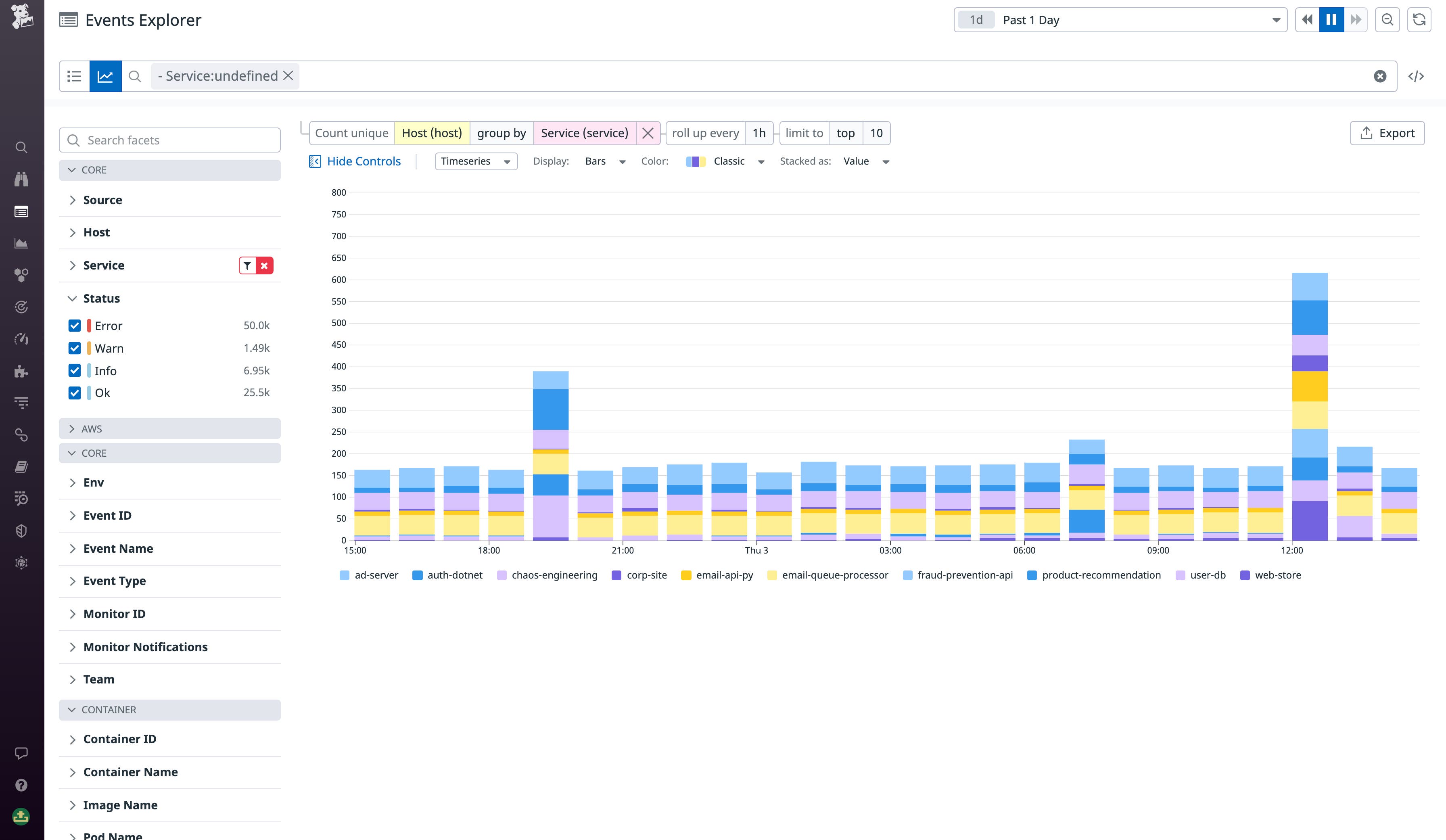
To help you gain better insights from your event data, we’ve added the ability to create analytics graphs from your events by using tags or attributes. To take advantage of this feature, simply select a tag you wish to graph, a second tag to group the filtered results by, and the time interval for each data point. In the example below, we’ve graphed the host count, grouped by service, and chosen one-hour intervals to better understand which services are provisioning the most hosts over time.
Visualize your events analytics better within dashboards
The Events update brings a number of feature improvements to Datadog dashboards. To begin with, we’ve updated event widgets in dashboards—including the event stream widget, event timeline, and event overlays—to work with the same robust query syntax used in the Events Explorer. The new syntax makes it easier to query for the particular events that are relevant to the focus of your dashboard.
Additionally, you can now use events as a data source in Datadog’s standard timeseries, table, and top list widgets. For example, you can create a top list widget that lists the top users ranked by GitHub commits, or a table showing all services that were recently deployed with Jenkins or Chef. Or, you can create a timeseries widget that counts the number of events tagged with the Error status for a particular source or group of sources.
To illustrate some of these new capabilities, we’ve added a new out-of-the-box Monitor Notifications Overview dashboard. This new dashboard analyzes trends from events generated by triggered alerts to help you improve your configuration and reduce alert noise. The dashboard includes some examples of the new event widgets, including an event stream widget, a top list of the top notification messages, and a timeline of alert and warn notifications.
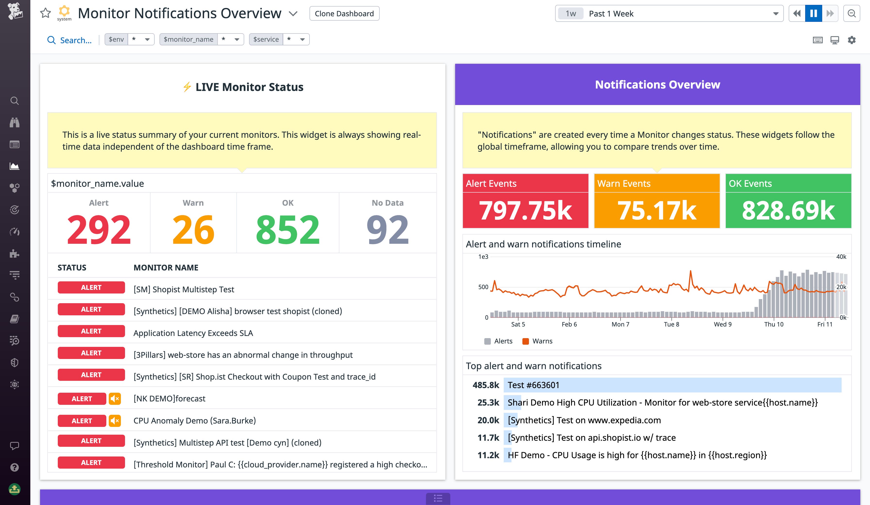
The new dashboard is designed to help you easily gather key insights, such as which monitors send the most notifications, or which hosts or services are triggering the most alerts. By using the time filter, you can broaden the scope of data to compare with previous periods, helping you understand how trends in your alerting develop over time. You can easily clone this dashboard to create a new version and adapt it to your own needs, or incorporate a few widgets in your team’s existing on-call dashboard.
Keep your team notified with more powerful alerts
The Events update also introduces improvements to event monitors, a feature that enables you to create alerts on event-based metrics. As with events widgets in dashboards, event monitors have been updated to use the new query syntax, so you can leverage AND/OR operators and wildcards to make more robust queries. For example, you might want to create a single alert on the rate of events for a group of hosts that share a hostname prefix. You can now easily accomplish this goal by using a wildcard after the prefix in your query. If, say, your hosts don’t share a common prefix, you can use OR operators to join them in a set, or a NOT operator to exclude your testing environment from production alerts. We’ve also added autocomplete to the query bar, so you won’t have to painstakingly type out long strings of characters to specify each hostname.
If you use an infrastructure automation tool such as Terraform to manage your applications, you might prefer to create event monitors programmatically. To facilitate this option, Datadog provides an event monitors API. With the new Events update, we’ve updated the event monitors API syntax to require fewer attributes and provide the same new features found in the Events Explorer’s query syntax. For more information about the differences between the new and old Events API syntaxes, see the migration docs.
Generate custom metrics to leverage predictive monitoring
Datadog’s forecasting and anomaly detection enable you to create dashboard graph widgets and alerts with dynamic warning thresholds based on trends in the data. With the new Events update, you can now use events data to create monitors and dashboard widgets that also use predictive monitoring, by generating custom metrics from your events data. You can create and store custom events metrics in Datadog by using the new configuration view.
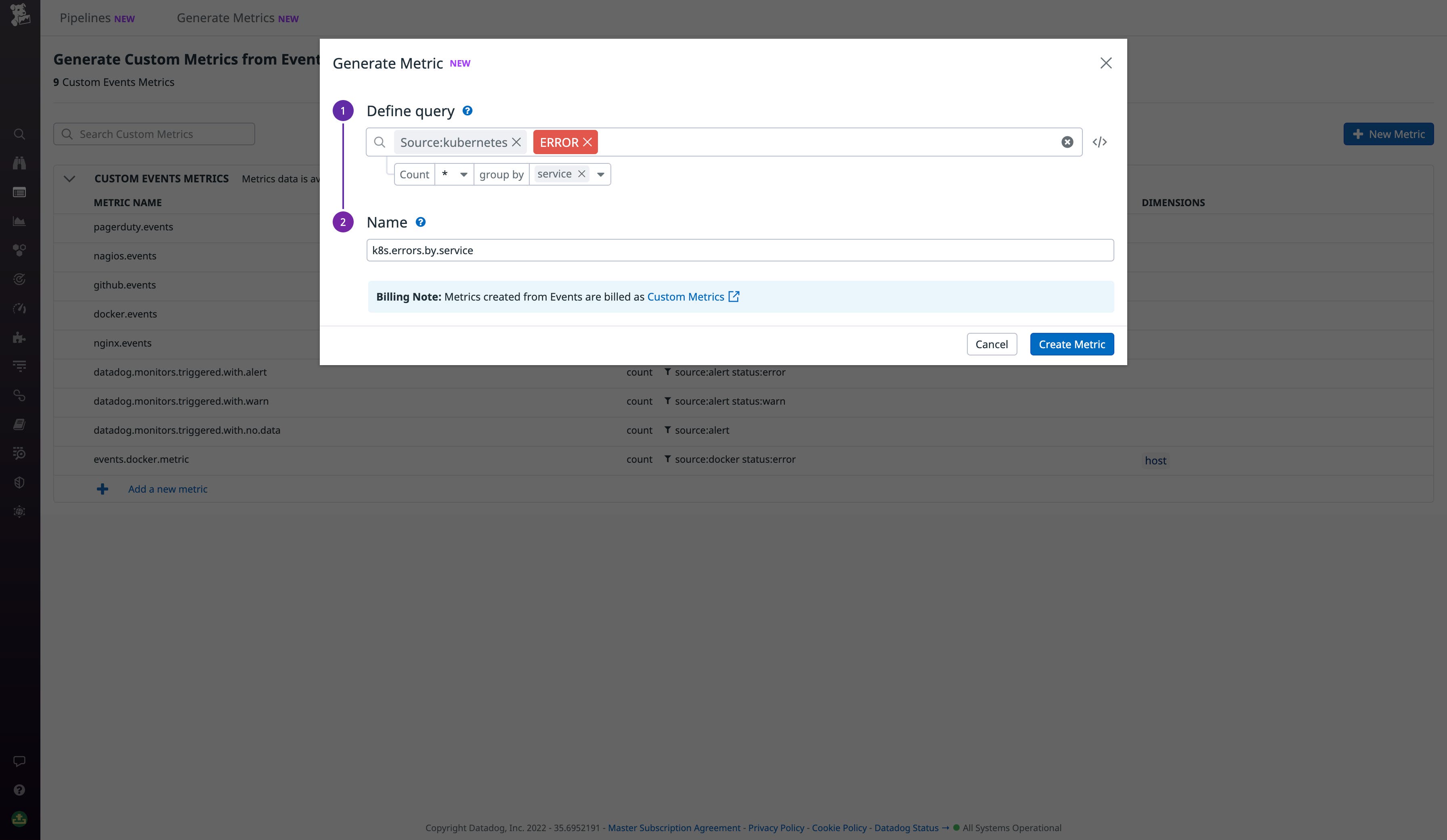
Once you’ve configured a metric, you can easily select it as a source for forecasting and anomaly detection, both in dashboard widgets and event monitors. By using forecasting, you can monitor the expected behavior of your custom event metrics based on their historical values. This way, your team can be notified before a metric reaches a problematic threshold. Or, you can use anomaly detection graphs and alerts to observe when a metric deviates from its usual trend. For example, let’s say you’ve created a custom metric that counts errors from Kubernetes events. You can use an anomaly monitor to track when the error rate spikes abnormally and thereby suggests a potential issue.
As an added benefit, you can now also specify units and add a description to your custom metrics in the Metrics Explorer, Datadog’s main view for all of your metrics. This information will be included in dashboard graphs you generate from these metrics, enabling you to supplement your graph widgets with additional context.
Normalize and enrich events with processing pipelines
When you’re receiving events from dozens of different internal and external sources, it can be difficult to standardize all their tags and metadata to facilitate accurate querying. To help you keep your events data well-structured and properly contextualized, we’ve now made it possible for you to add processing pipelines to Events. By using processors, you can enrich your events by adding attributes containing important data—such as team ownership information, links to dashboards, or links to documentation. You can also set up processors to remap tags from across your event sources so that your tagging convention is maintained.
Keep up with current events in your infrastructure and applications
The new update brings Datadog Events up to speed with the rest of the Datadog platform through improved querying, data analytics, alerting, and other enhancements. With this update, we’ve made it easier than ever to track changes in your infrastructure and applications over time and discover trends in event data. We will gradually roll out the new Events update to all customers over the month of April. All new Datadog customers will automatically start with the latest Events version, which is now generally available. As for existing customers, we’ll be helping them migrate their data over the next quarter, in time for the event stream’s scheduled sunset date on May 5—see the migration guide for more details, or contact Support. If you’re brand new to Datadog, you can get started with a 14-day free trial.
