Ilan Rabinovitch
It's been an eventful few weeks. We hope that you and your families are safe and keeping healthy, both physically and mentally.
We're all trying to do our part to contribute, so here at Datadog, our company and our employees are donating time and monitoring to organizations like CovidNearYou and Folding@home, and we're sponsoring and participating in hackathons dedicated to tracking the spread of the virus, and researching new treatments. Datadog has also empowered and sponsored individual employees to do what they can in their own communities. Many of us have a lot of questions about what's going on with COVID-19—there's a lot of data out there, and it can be overwhelming. A few Datadog employees have built public Datadog dashboards to organize and parse official sources of COVID-19 data.
Do you know of an organization fighting COVID-19 that could use our support? Let us know at covid19-help@datadoghq.com.
Folding@home
Are you willing to donate computing time from the downtime of your personal computer? Folding@home is a distributed computing project for simulating protein dynamics, including the process of protein folding and the movements of proteins implicated in a variety of diseases. Citizen volunteers can offer computing power from their home computer downtime toward running the protean dynamic simulations. Insights from this data are helping scientists develop new treatments, including research into COVID-19. For more information, check out their official website.

CovidNearYou
If you or anyone in your family is showing symptoms of COVID-19, go on the CovidNearYou site to report your case. CovidNearYou is a program sponsored by Boston Children's Hospital and Harvard Medical School to informally track cases of the disease. With testing so limited, this platform provides a much more realistic picture of the spread of the virus.

CovidCommitment.org
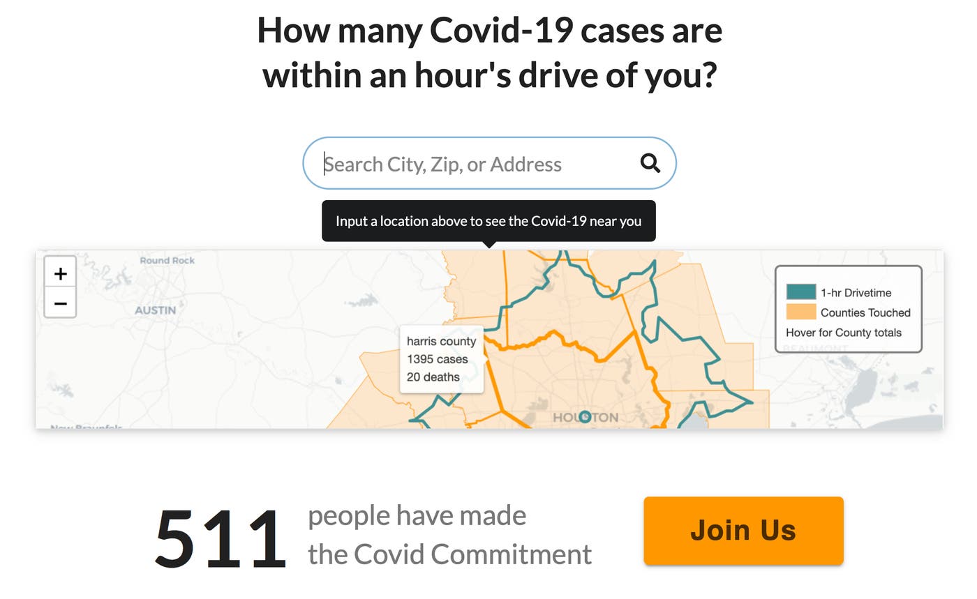
Do you want to see the COVID-19 stats for your area? Are you ready to commit to helping stop the spread of the virus? Cameron Yick, a software engineer on our Data Visualization team, is a codeveloper of CovidCommitment.org, a web application designed to flatten the curve of Covid-19 infections by engaging individuals: by showing them the virus cases and deaths within an hour's drive of them, and then, by asking them to commit to taking five easy steps to stop the spread—and to share that commitment on social media. The site was endorsed by world renowned behavioral economist Dan Ariely, who recently asked them to help expand the site's functionality internationally.

COVID-19 Hackathon
AWS, Fairwinds, Gitlab, and Datadog have teamed up to sponsor a hackathon with the goal of providing an end-to-end infrastructure solution to enable an application that addresses the pandemic. We believe with this combination of partners, we can give full infrastructure support to get an idea off the ground, scaling, and moving. Our goal is to address the situation practically and give our engineering teams and the community a way to be involved. To submit an idea for the competition, pitch your idea as an issue to the covidhack repo by April 10th and tag your issue with submission.

WHO and ECDC Data
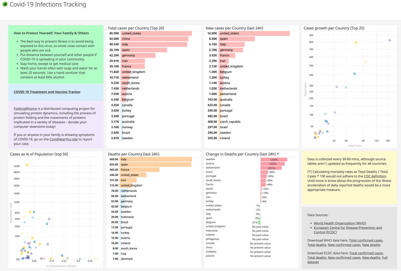
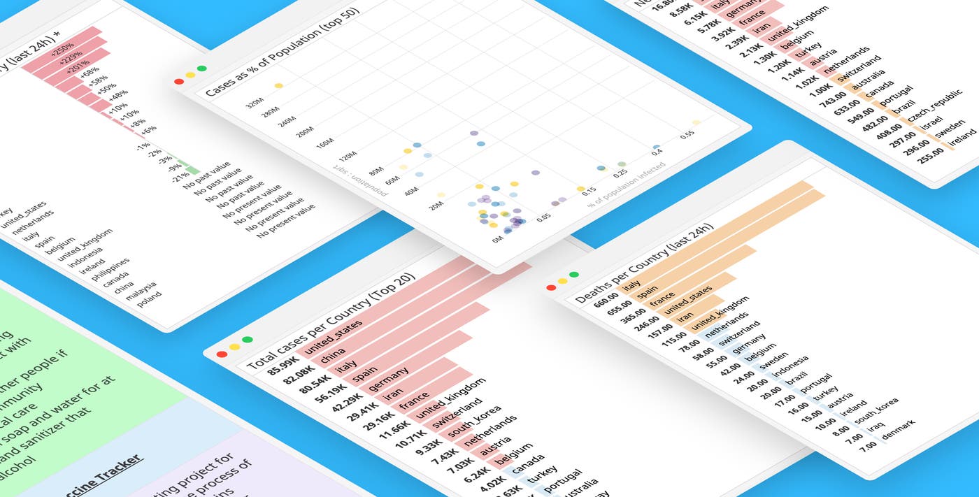
Boyan Syarov, an Enterprise Solutions Engineer out of Los Angeles, has built a Covid-19 Infections Tracking dashboard using the official World Health Organization (WHO) and European Centre for Disease Prevention and Control (ECDC) data.
Boyan put together this dashboard because he had specific questions about the data between countries, and he wanted to see day-to-day trends, and he couldn’t find that information anywhere else.
He intends to continue to expand his dashboard by plugging in machine learning algorithms as the data becomes more and more accurate. As testing and reporting of cases to WHO continues to improve, it’ll become possible to identify outlier countries in terms of infection growth or mortality rates. Time-shifting of data between countries for comparisons will also be a useful visualization—health experts expect the virus will slowly migrate to countries in the Southern hemisphere. When that begins to happen, we can then compare them with what we’d previously seen in the Northern hemisphere. Looking at outlier countries and the time-shift of how the virus spreads could help slow the spread now, and it could help improve how we respond to a pandemic in the future.

JHU CSSE Data
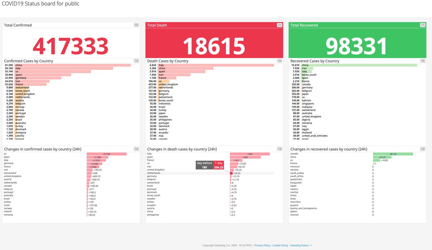
Jacky Jung, an Enterprise Solutions Engineer out of Seoul has built a COVID-19 Status board using the data from https://wuhan-coronavirus-api.laeyoung.endpoint.ainize.ai/, which is an API that pulls CSV data from the Center for Systems Science and Engineering at Johns Hopkins.
Jacky built this dashboard to help people to understand COVID-19 better by region so that they can be cautious about the situation. He believes that the more stable information people have, the more hopeful about the situation they become.
Jacky intends to continue to expand his dashboard once more data starts coming in by creating more widgets with specific data points. Further breaking down the data could give more insight into possible outliers. Identifying repeatable outliers could help slow the spread of the virus.

