Kai Xin Tai

Anshum Garg
Whether you're investigating an issue or simply exploring your data, the ability to perform advanced log analytics is key to uncovering patterns and insights. Datadog Log Management makes it easy to centralize your log data, which you can then manipulate and analyze to answer complex questions. For example, you can use formulas, as well as Datadog's library of functions, to calculate ratios between log queries, compare application activity across multiple time periods, exclude a range of values from your result set for greater specificity, and more. If you see an interesting trend, you can add the graph to a dashboard and correlate it with other types of monitoring data for a comprehensive view of your system and business.
In this post, we’ll show you how applying formulas and functions to your logs can help answer common questions like:
What is the usage and performance breakdown of my application?
Are there any seasonal patterns in how my application is used?
Is my system behaving abnormally?
If you notice a troubling change in your system, it's important to consider its baseline performance, as well as the circumstances under which the change occurred. Ratios place problematic events in context, so you can easily assess their breadth and pervasiveness. In this section, we'll show you how to calculate whether the percentage of errors, login failures, and firewall denials in your environment fall within an acceptable range, so you can quickly determine whether you need to take action.
1. What percentage of requests to my service result in errors?
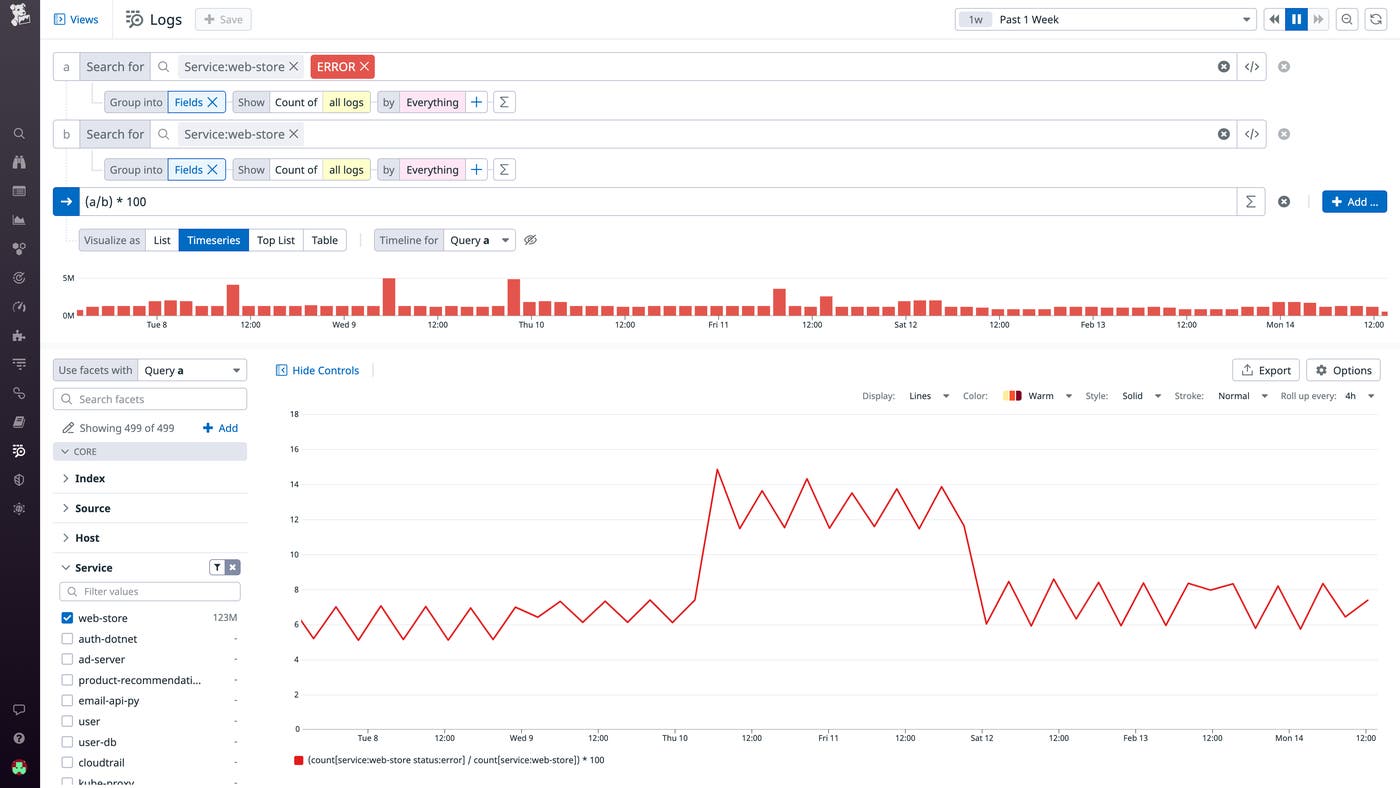
An increase in the raw number of error logs might be alarming at first glance, but comparing it to the overall set of logs can help you determine whether the spike was anomalous or the result of an increase in throughput. In the example below, you can see that the system typically has a baseline error rate of approximately 7 percent, and the increase in error logs between Thursday and Saturday was not proportional to the total volume of logs that day. This points to a legitimate issue that should be investigated.
2. What percentage of user login attempts fail?
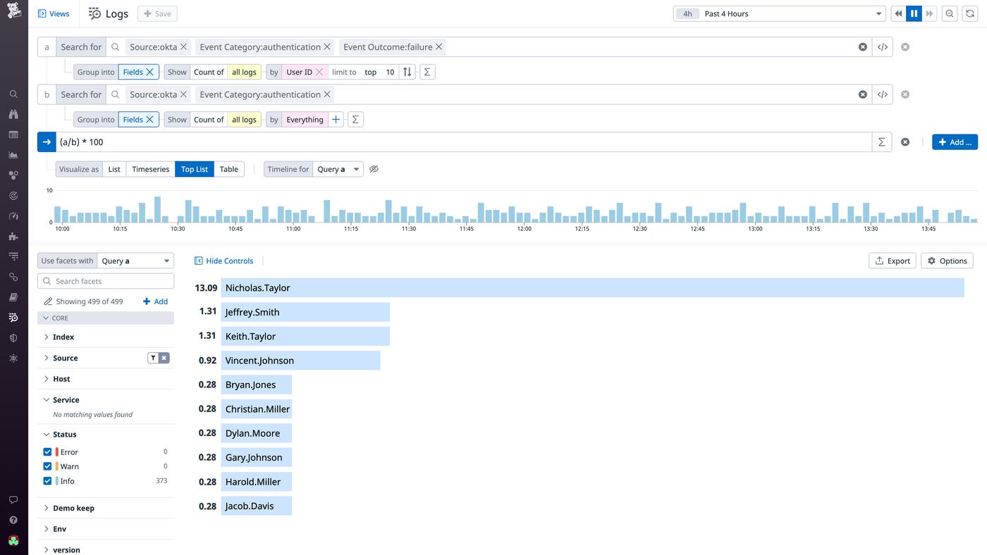
Audit logs generated by services like Okta, AWS CloudTrail, and Microsoft Entra ID display information about user login activity. Just like in the case of firewall denials, an abnormally high login failure rate raises a red flag about a potential security threat. As shown in the example below, you can query for failed login attempts, and group it by username, to see if a disproportionate number of failures come from a single user. This can alert your security teams to a malicious actor attempting a brute force attack (i.e., using trial-and-error to guess credentials).
3. What percentage of logged firewall events are denials?
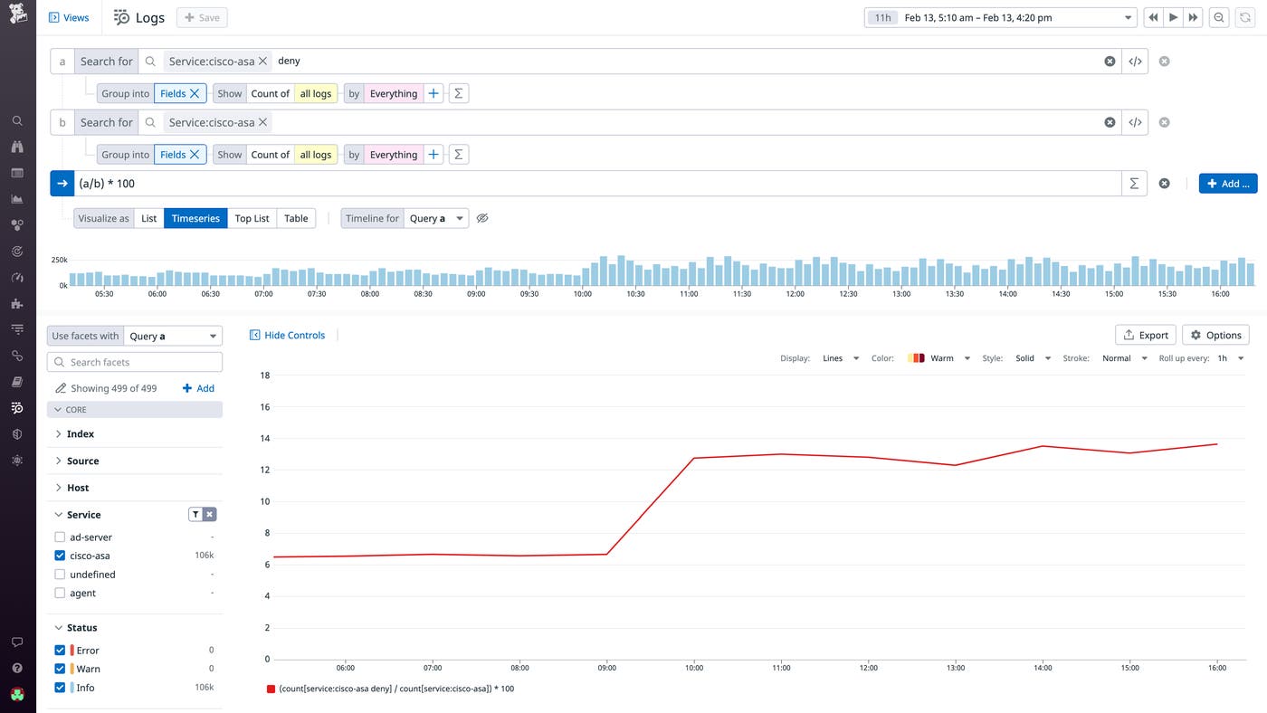
Similarly, if you've defined rules for your firewall (e.g., Palo Alto Networks Firewall, Cisco Adaptive Security Appliance) as part of your security strategy, you should compare the number of denials to the total number of logged events across your environment. The example below shows that the denial rate of Cisco ASA persisted above its baseline for a significant period of time, which may indicate of a misconfiguration that is inadvertently blocking network traffic. It could also signal malicious activity, such as a denial of service attack.
How does the behavior of my system change over time?
While ratios can provide quick insights into concerning trends, you can also use functions to perform long-term analysis, such as measuring the impact of code changes and tracking business results.
4. How did my recent code deployment impact API request latency?
As you adopt CI/CD practices to speed up software delivery, it is crucial that you also monitor your code deployments to verify that they perform as intended. In Datadog, you can use the timeshift function to display data from different time periods on the same graph. For instance, if you just pushed a code change to address a latency issue in your order fulfillment service, you can compare the current and previous API request latency to monitor its success. If you find that the deployment was faulty—and that latency has, in fact, increased—you can quickly roll back to a previous version to minimize impact on the end-user experience.
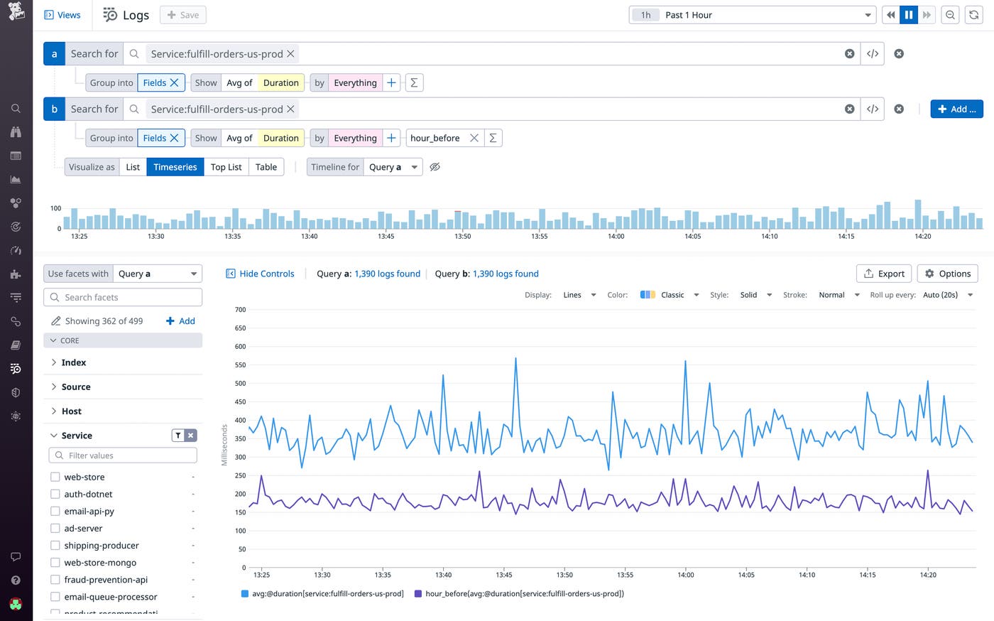
5. How much revenue did my business generate this week compared to last week?
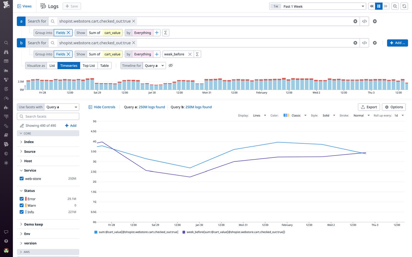
In addition to providing infrastructure and application insights, log analysis can also reveal business performance trends. For example, if you run an e-commerce site and you're logging your customers' shopping cart size, you can again use the timeshift function to compare the difference in revenue between weeks. You can further correlate revenue with the sales volume of a newly released product or any backend improvements that you've made to see how these results measure up against your internal goals.
What is the usage and performance breakdown of my application?
So far, we've shown how you can use formulas and functions on your logs to get high-level insight into your application's performance. In this section, we'll focus on formulating more granular queries to explore trends across the different segments of your user base and application. Having more fine-grained insights can help you answer questions like "Which countries are my users from and how should I focus my engineering efforts to best serve them?" and "Which of my services are performing poorly and need to be optimized?"
6. What is the geographical breakdown of my user base?
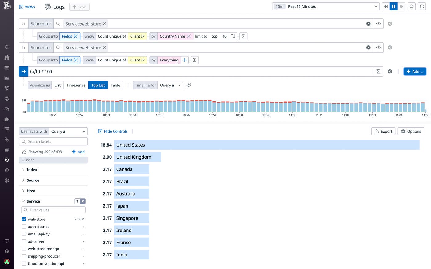
You can use your logs to derive a geographical breakdown of your user base that can inform business decisions, marketing initiatives, and feature prioritization. To generate this breakdown, calculate the ratio of unique IP addresses grouped by country to all unique IP addresses, as shown in the screenshot below. In this case, you might want to double down on successful ad campaigns in the United States, where the vast majority of users are from, while also localizing some of those assets to better target international users.
7. Which of my services have above average request latency?
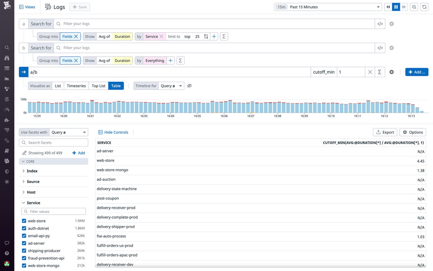
When you're running a large application with hundreds of services, it isn't always easy to determine which ones should be prioritized for optimization. In Datadog, you can measure the ratio of average request latency of each service to the average across all services—and then set a minimum cutoff to isolate the services with above average latency. Adding a minimum cutoff removes all values below a defined threshold—learn more in our documentation.
8. Is my application gaining more users from certain countries over time?
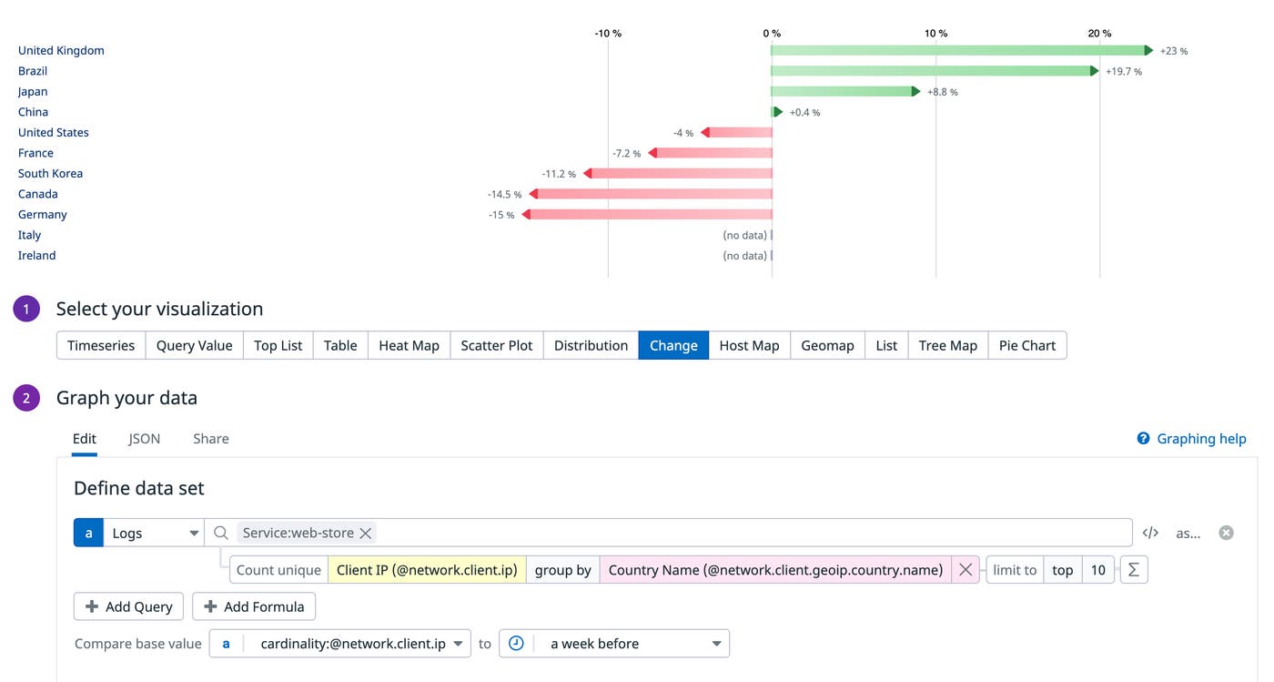
As you build out your application, you might want to track regional fluctuations in user traffic so that you can properly allocate cloud resources and optimize your end-user experience. You can add a change widget to any of your dashboards to visualize changes to the result of a log query over a set period of time. For instance, you can track the percentage change in the number of site visitors (as measured by unique IP addresses) from different countries since the previous week. In this example, because there has been a consistent week-over-week growth in users from Brazil, infrastructure teams can begin to scale up cloud resources to match the rising demand.
Are there any seasonal patterns in how my application is used?
Seasonality refers to a pattern that repeats at regular intervals, such as weekly, monthly, or quarterly. It is often useful to see if there is an underlying seasonal pattern in the way your application is used, so that you can scale it accordingly.
9. Is there a seasonal pattern to my application's load and resource consumption?
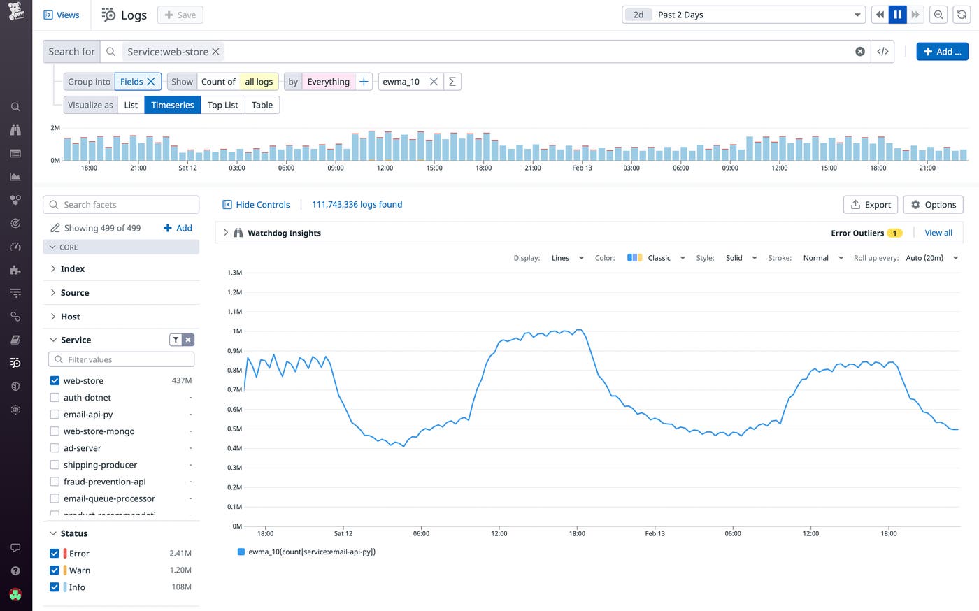
As part of your capacity planning strategy, you might want to look for seasonality in the volume of request logs generated by your internal services. This way, you can provision the right amount of resources to ensure that your system is able to process requests efficiently, especially during peak traffic. By applying an exponentially weighted moving average, you can smooth over your data (i.e., remove noise) to reveal patterns more clearly. The below example leverages the ewma_10() function, which uses the last 10 datapoints to calculate the exponentially weighted moving average. Selecting the last 10 datapoints to smooth over allows you to see medium-range patterns (versus 20 datapoints, for instance, which reveals longer-range patterns).
10. How does seasonality affect my sales?
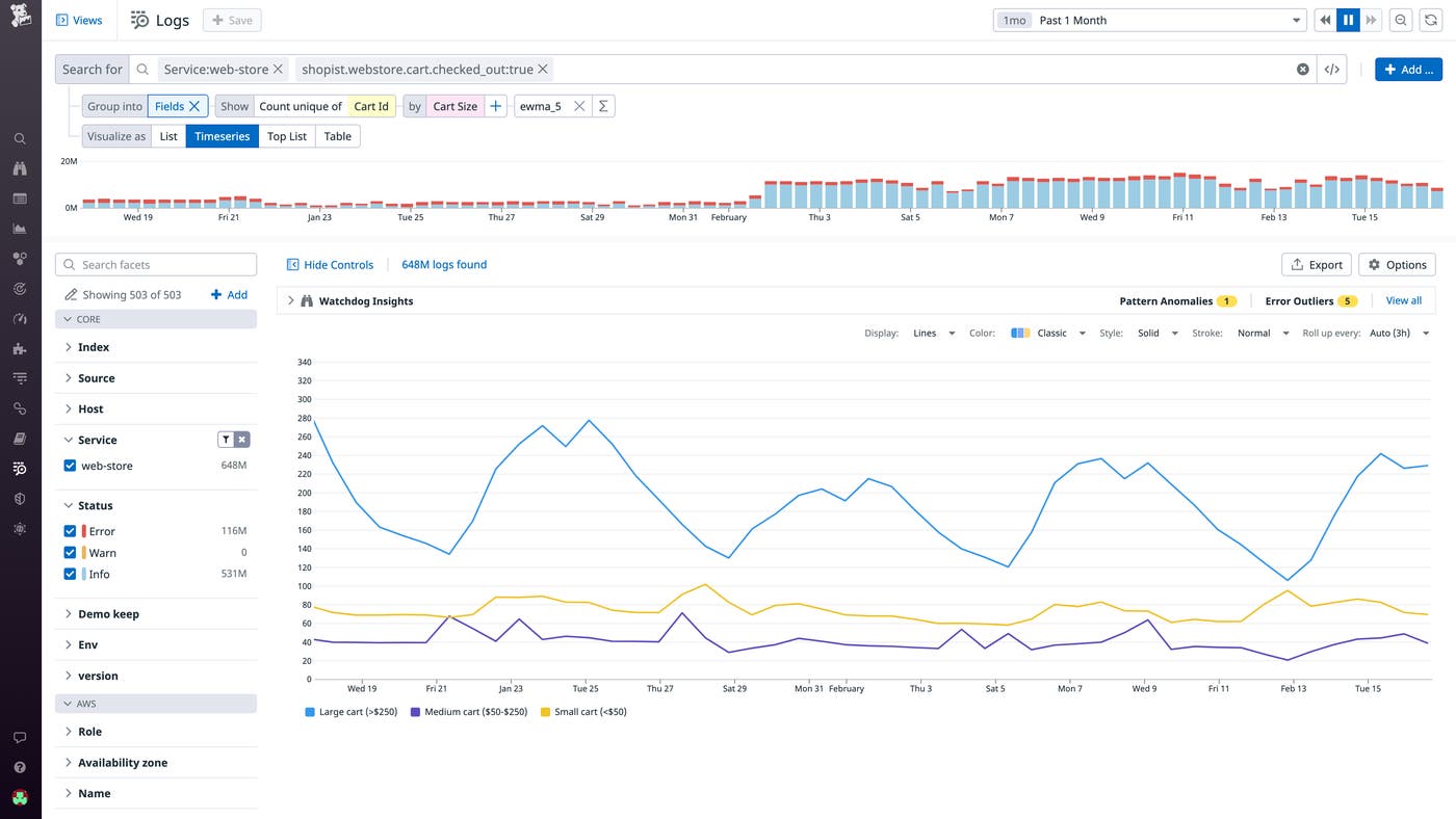
Some businesses receive more commercial interest in certain parts of the month or year. Analyzing logs that contain checkout information can help you better understand the spending habits of your customers. As shown in the example below, you can build a query to visualize the number of checkouts by cart size. The graph here shows that customers tend to make large purchases during the weekend. This information can help product teams decide when to schedule major product launches and promotional events to maximize success.
Start analyzing your logs with Datadog Log Management
Applying functions and formulas to your semi-structured and structured logs lets you answer complex questions and uncover rich infrastructure, application, and business insights. What's more, by using Flex Logs—Datadog's long-term storage solution for high-volume logs—you can keep your log data queryable for up to 15 months, enabling long-range analytics.
For the full list of available functions, you can refer to our documentation. If you're an existing Datadog customer, you can get started right away in the Log Explorer. Or, if you're new to Datadog, sign up for a 14-day free trial today.
