Jace Harker

Colten Woo
As your cloud environment grows more complex and dynamic, it becomes more difficult to maintain up-to-date reference diagrams, visualizing its components, that are available to all teams. As a result, teams often end up lacking the visibility they need to understand, manage, and troubleshoot their cloud infrastructure and applications. Many factors—including the dynamic and inherited nature of infrastructure, along with the common tendency for components to be deployed by different teams—make it difficult for teams to fully grasp their own infrastructure and related application dependencies.
To help solve this problem, Datadog is announcing a new platform feature, Cloudcraft, that provides a live visualization of your AWS cloud infrastructure. The Cloudcraft diagram serves as a single source of truth that gives your teams a common understanding of your cloud architecture. And by tightly integrating with the rest of the Datadog platform, the Cloudcraft diagram helps you navigate key observability, cost, and security information to effectively manage your infrastructure.
The Cloudcraft diagram is a new way to navigate, understand, and interact with your cloud environment in Datadog. In this blog post, we’ll show how you can use Cloudcraft to:
- Automatically generate cloud architecture diagrams
- Find Agent-less hosts and fix observability blindspots
- Spot security misconfigurations
- Identify cost optimization opportunities
Automatically generate cloud architecture diagrams
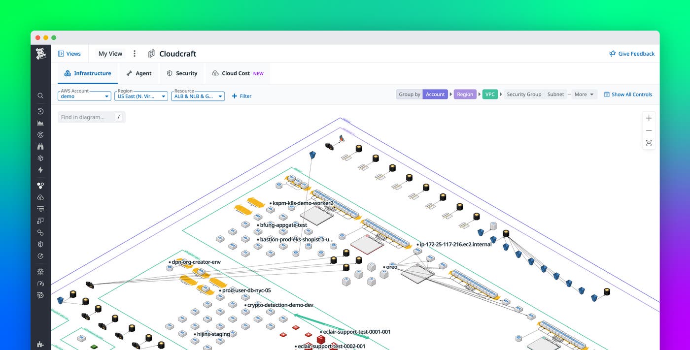
Once you’ve enabled resource collection, Cloudcraft in Datadog automatically generates diagrams of your AWS infrastructure. These diagrams visualize the resources in your environment and how they’re connected. Clicking on a resource opens a side panel providing details about that resource.
To customize your view, you can adjust which resources appear in your diagram and how they’re organized. To begin with, you can refine your view based on what’s relevant to you. For example, you can filter resources by tags like team, service, and cost center, or by AWS, Kubernetes, and Terraform tags. Additionally, for a more organized and structured diagram, you can group resources by account, region, VPC, security group, subnet, or network access control list (NACL). Once you’ve applied these customizations, you can save the view, set it as your default, and share it with teammates.
Another way to zero in on relevant resources is through a search-and-highlight feature, which enables you to locate resources by name, ID, or tag. Instead of generating a new diagram, this feature grays out elements that don’t match the search criteria. This can be useful in helping you find resources that may not be tagged correctly. It can also help you see shared components among resources and spot upstream and downstream dependencies for better troubleshooting.
Find Agent-less hosts and fix observability blindspots
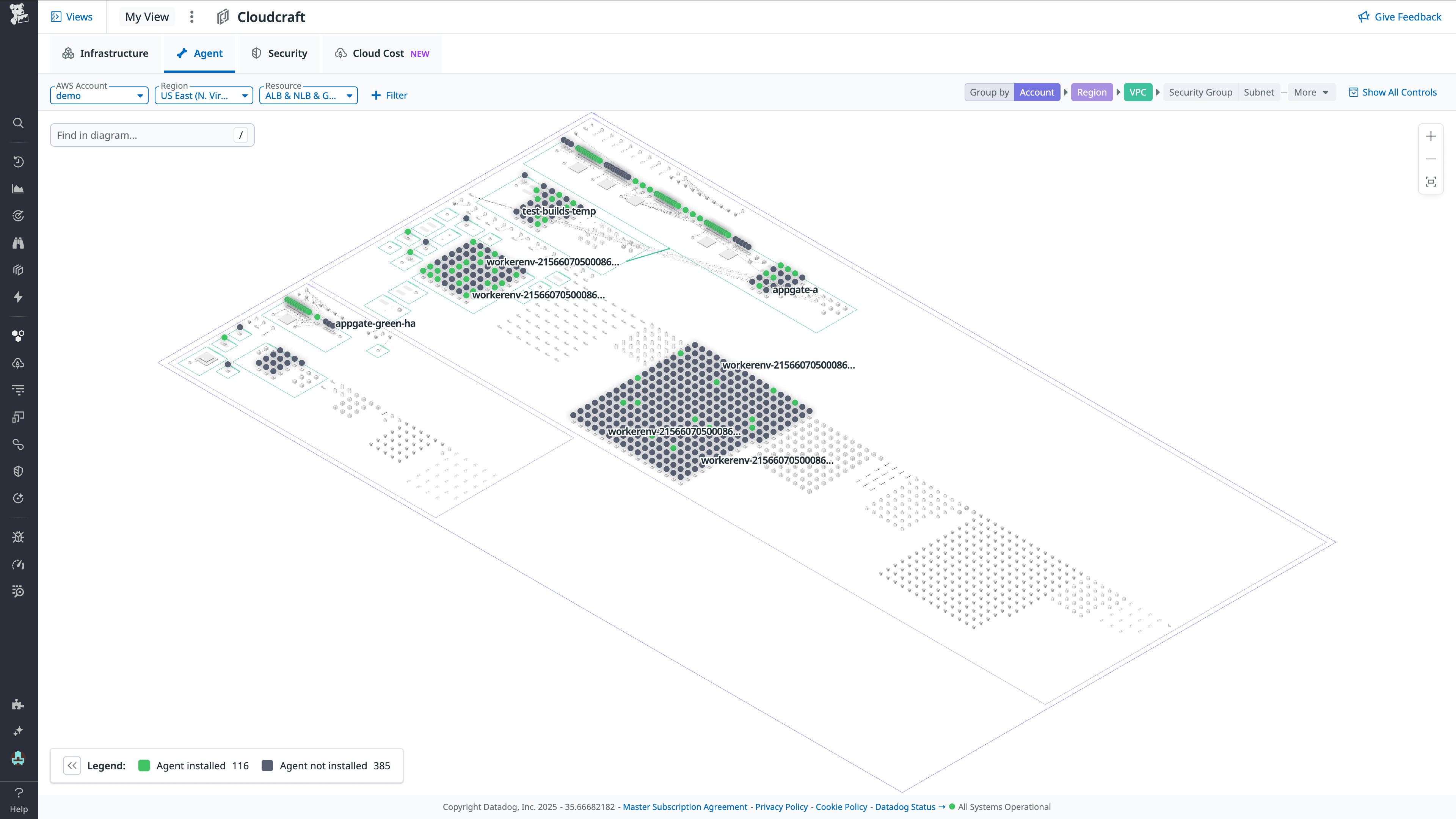
The diagram also comes with a number of overlays that surface important details. For example, the Agent overlay uses color coding to show which hosts have the Datadog Agent installed, and which don’t. When you click into a host with the Agent installed, you can verify that the host is running the latest Agent version and which Datadog products are enabled on that host. If the host doesn’t have the Agent installed, you can navigate to Fleet Automation to install the Agent and ensure you have full visibility into the performance of the host, its integrations, and the applications it supports.

Spot security misconfigurations
The security overlay shows infrastructure misconfigurations in context to help you assess your security posture at a glance. This feature detects misconfigurations by evaluating resources against out-of-the-box rules from compliance frameworks like NIST, SOC 2, HIPAA, and more.
These findings are overlaid on the Cloudcraft diagram to help you understand how the misconfigured resource impacts your broader environment. For example, the security overlay helps you analyze how an attacker might reach sensitive data or discover the downstream impact of a security issue. To help with prioritization, misconfigurations are color coded according to their severity score, which is computed based on the likelihood of abuse and impact.
Once you’ve spotted a misconfiguration that you want to remediate, you can continue your investigation by clicking into a resource. This opens a side panel summarizing the problem and how to fix it—based on industry compliance standards—enabling you to immediately take action. Through this feature, engineers of all types, whether security specialists or not, can proactively address security misconfigurations that leave your infrastructure vulnerable to attacks.
Identify cost optimization opportunities
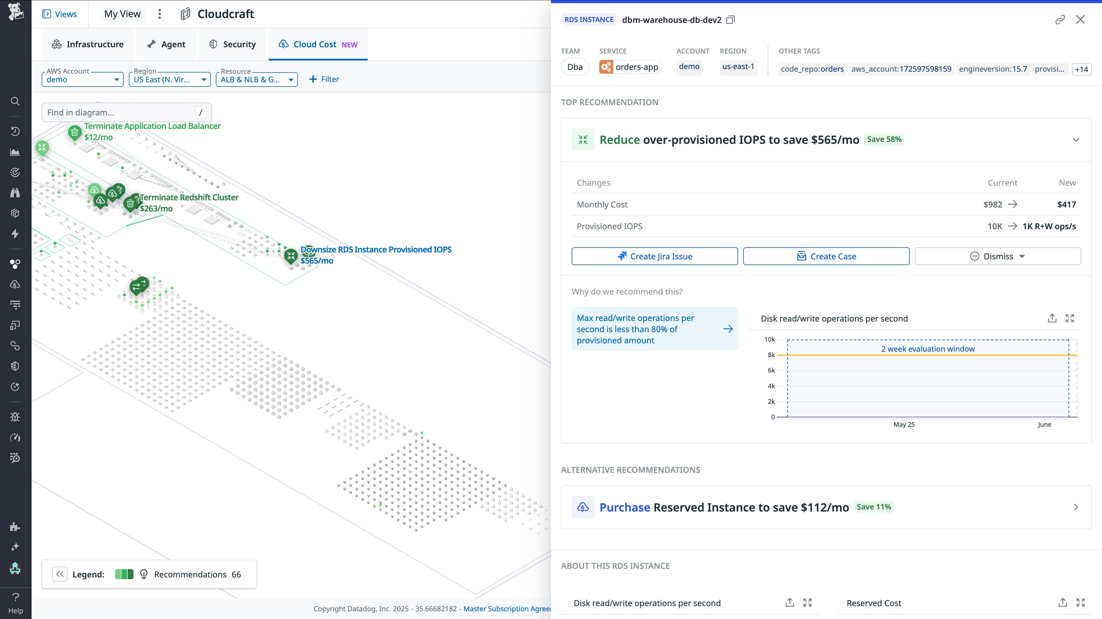
Besides surfacing security insights, Cloudcraft diagrams also work with Datadog Cloud Cost Management to provide recommendations for reducing cloud spend. Cloud Cost Management generates recommendations by combining observability data with billing data to identify orphaned, legacy, or overprovisioned resources. By connecting these insights about costs to infrastructure diagrams, you can better understand recommendations before acting on them.

The side panel also supplies details—including a resource’s current and recommended future states—about the metrics used to arrive at cost optimization guidance. For example, an EC2 instance that has stayed below 5 percent CPU usage and 10 percent memory usage for the past week might be recommended for downsizing. You can then act on these recommendations to optimize costs by creating an issue in Jira, creating a case in Datadog Case Management, or triggering a workflow without ever leaving the diagram.
Visualize your AWS environment with Cloudcraft
Cloudcraft in Datadog is your first step toward understanding your cloud environment and the components within it that need your attention. With automated diagrams of your AWS infrastructure enriched with observability, security, and cost insights, you can explore and take action on your infrastructure in context. For more information about how to get started, see the Cloudcraft in Datadog documentation. If you’re new to Datadog, sign up for a 14-day free trial.


