
Evan Mouzakitis
Host Maps let you see all of your hosts together in one place, giving you a bird's-eye view of your entire infrastructure. From that perch you can drill down into any segment of your infrastructure, with arbitrary aggregation and filtering. The best part about Host Maps is they help you understand your infrastructure at any scale, whether you have 10 hosts or 10,000.
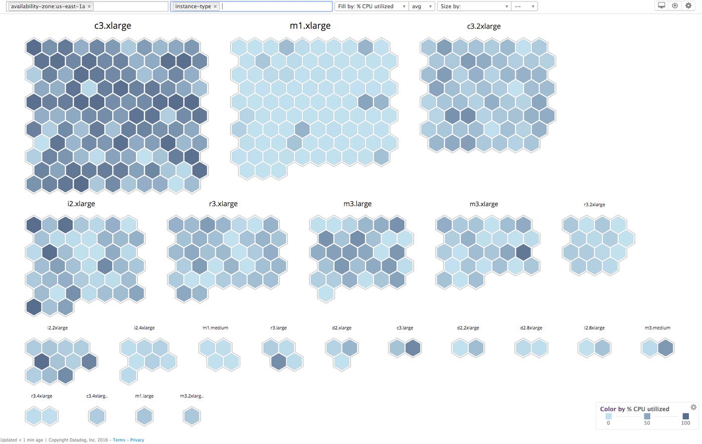
Since we released Host Maps last year, our engineering teams have added numerous enhancements to make Host Maps even more powerful and versatile. Here we'll highlight four new features: a dashboard widget, three new color schemes, custom fill and size by metrics, and saved Host Maps.
Dashboard widget
To find the root cause of a performance issue, you’ll often need to look at the problem from multiple angles.
Now with the new dashboard widget, you can place Host Maps alongside the rest of your metrics, on any timeboard or screenboard.
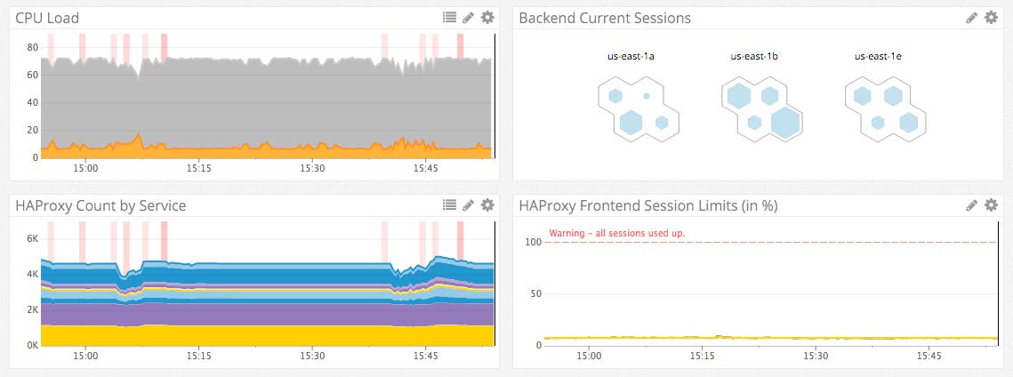
You can even combine custom fill metrics and filters to produce an embeddable Host Map of any slice of your infrastructure. In the screenshot above, the Backend Current Sessions Host Map widget displays: all HAProxy backends, aggregated by availability zone, colored by CPU load, and sized by current number of sessions.
Custom color schemes
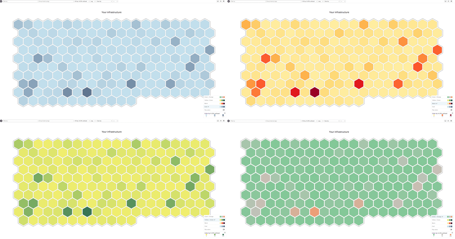
Colors have their own implied meanings when they are used to represent data. For example, green conveys good and red conveys bad much more than light blue and dark blue do, respectively. We've expanded our palette of color choices so you can choose the representation that makes the most sense for your data.
The new patterns are also color-blind friendly, specifically the Yellow/Green, Warm, and Cool patterns.
Fill and size by any metric
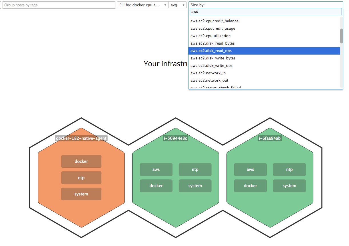
By default, the color of each host is set to represent the percentage of CPU usage on that host. Now you can configure your Host Maps to color by any metric you collect, whether it's an out-of-the box metric from one of our integrations or a custom metric reported by one of your applications.
Want to see your busiest HAProxy backends? Just select haproxy.backend.session.current in the "Fill by" or "Size by" menu. You can even mix and match, using one metric for the fill and another for the size, like in the screenshot below.
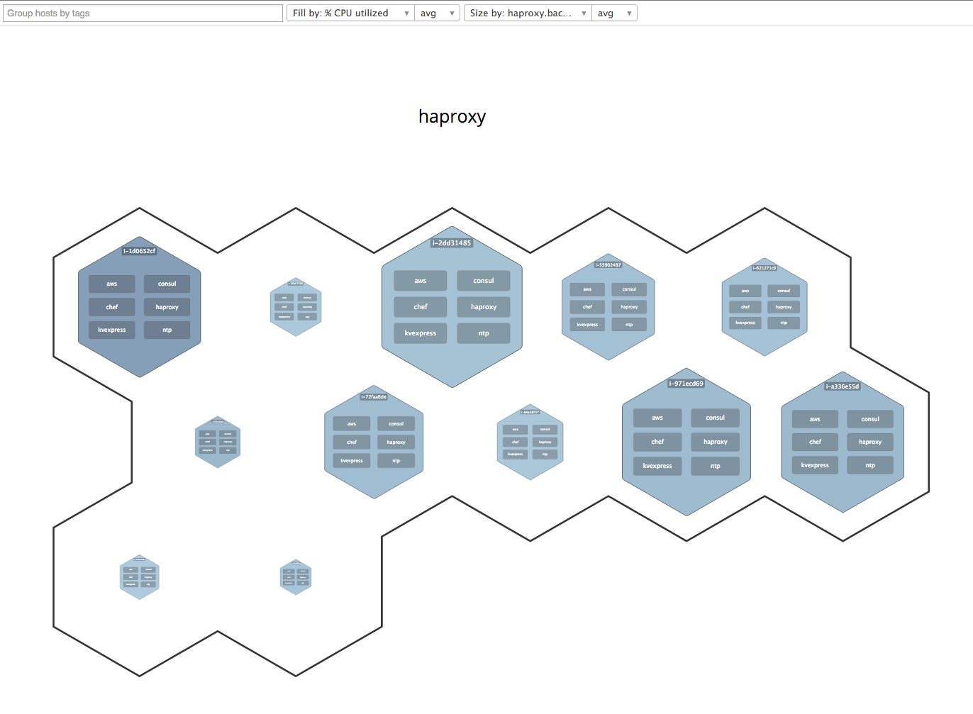
In the above screenshot, each hexagon represents an HAProxy backend. For each host, a darker color represents higher CPU usage, and a larger hexagon indicates more sessions.
Saved Host Maps
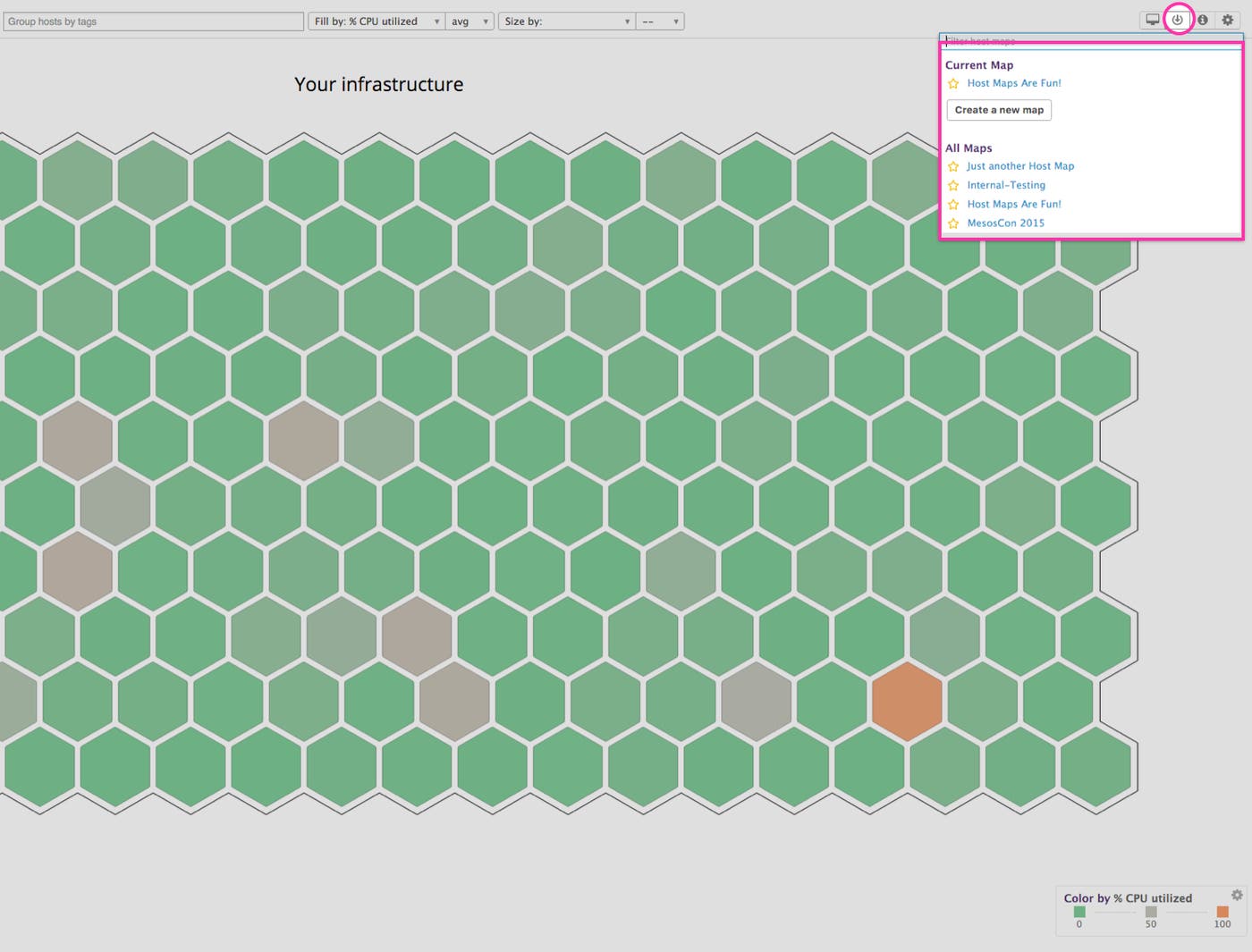
Similar to Datadog screenboards, we've made it easy to save customized Host Maps so you can share specific views with the rest of your organization. It's never been easier to get your team on the same page.
For example, you may want to share a view of CPU load across all production Redis servers. Instead of manually filtering each and every time, now you can save your filtered Host Maps for later.
Slice and dice any way you like
As always, with Datadog Host Maps you can use tags and filters to slice and dice your data into any representation you like. Want to see all Redis slaves in the US-East-1 availability zone, so you can see at a glance which hosts have high latency? No problem! Our flexible interface supports advanced aggregation.
Try it today
New to Host Maps? Check out our guide on how to get the most out of this powerful tool.
Datadog customers can access all the new features by navigating to the Host Map under the Infrastructure tab. If you don't have a Datadog account, try Host Maps out today by signing up for a free 14-day trial of Datadog.

