
Yassir Ramdani

Austin Lai
At Datadog, we’ve been using SwiftUI since day one. We went from initially using it for prototyping and building internal tools, to adopting it in small features, then to building full products!
In 2022, we introduced APM Services with its rich data visualization experience to the Datadog mobile application. And for that, we started implementing DogGraphs, an internal graphing library, to bring Datadog's data visualization to iOS using native technologies like Swift and SwiftUI, as no public library met our needs (Swift Charts was not announced yet). This was an opportunity to develop a deep understanding of how SwiftUI works and optimize our rendering pipeline.
This article explains how we identified some performance bottlenecks in the early phases of DogGraphs development, fixed them, and measured the results.
The Challenge
Originally, the library was introduced to support data visualization for the Datadog Service Catalog, but was designed to support additional products across the Datadog mobile application.
Our challenge was that we had to rely on SwiftUI (since we needed to support native widgets in the future), and we were limited by compatibility requirements with the minimal OS version of the app: iOS 14 (i.e. we could not leverage newer SwiftUI APIs such as Canvas { }). Most importantly, our goals with building this library were ease of use through a flexible API and a default “Datadog style and behavior”, all while maintaining fast rendering to ensure a top-tier user experience.
The Result
Today, DogGraphs is used in several products across the Datadog mobile application and mobile widgets.
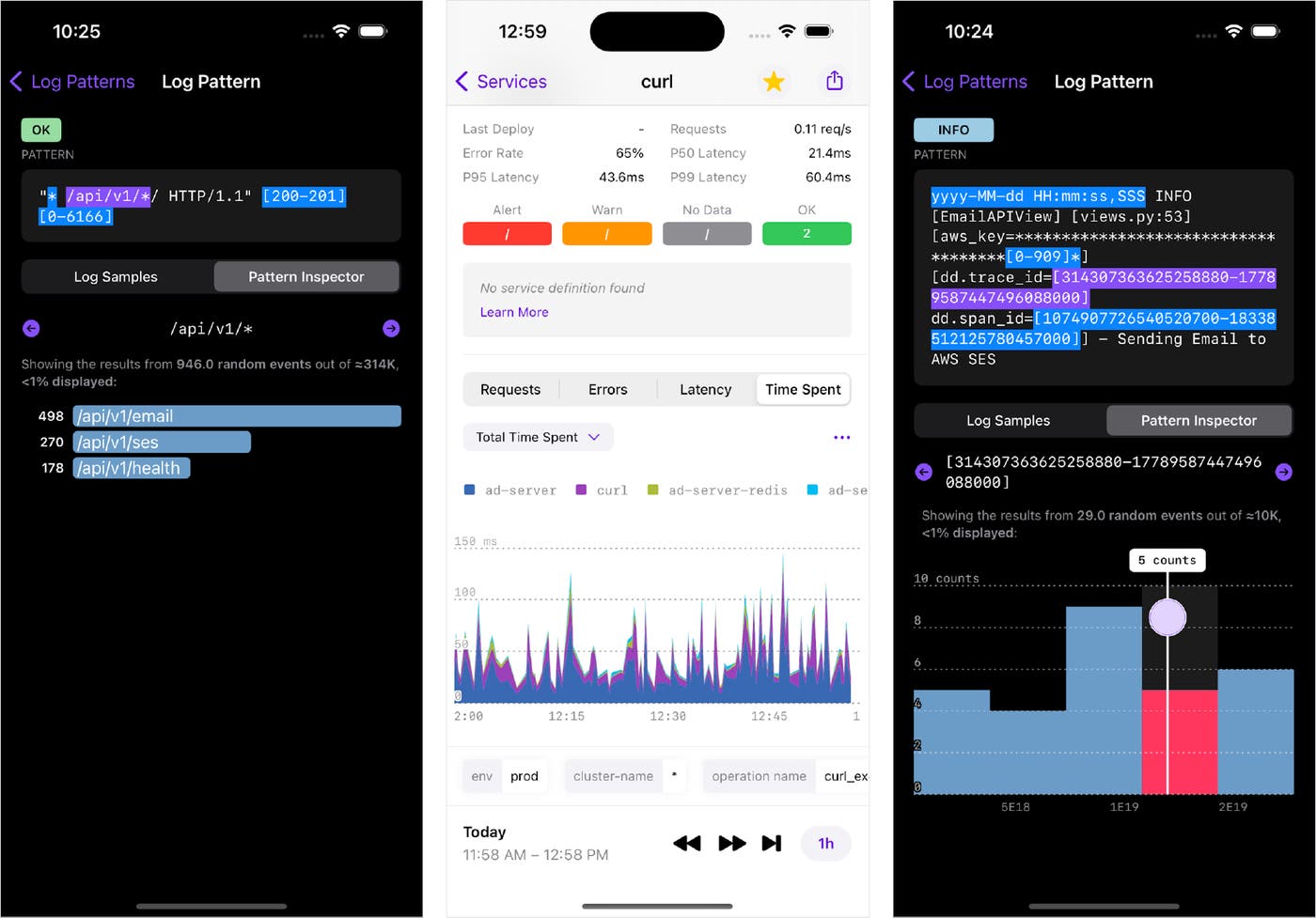
Here are some examples of DogGraphs in action:
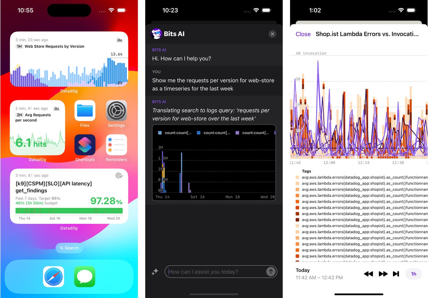
As more products start integrating with the mobile application, more visualization types are needed, and they are readily supported by the framework we developed.
For example, you can see DogGraphs in logs, services, dashboard widgets, and Bits AI:
The DogGraphs API
Beyond the visualizations and user experience, DogGraphs leverages the power of Swift features like result builders to offer an expressive API that allows us to describe complex graph constructions in a natural, declarative approach similar to SwiftUI.
These features enable the rendering of different graph configurations defined by users (e.g, a dashboard widget configuration) dynamically from a server response. Furthermore, graph constructions are type-checked by the compiler to ensure their validity (e.g, stacking a Bar and a Line graph would throw a compile time error, preventing any wrong definitions at run time).
DogGraphs implements principles like the progressive disclosure paradigm to ensure the defaults adhere to Datadog's style and behavior for data visualization, while allowing customization where needed.
The following video showcases examples of the library's API usage:
A Deep Dive on Profiling & Performance
Compared to the graphing needs of other mobile applications such as health trackers, stock prices, budgeting, and weather, Datadog's graphs can be extremely complex, and they support several widget types.
Depending on your analysis, you may query metrics, logs, traces, and other data sources; configure your aggregation across method, time, and space; apply various arithmetic operations; and tweak the display of axes, labels, scales, etc., to fit your needs. For more information about querying, see the Dashboards documentation.
These raw query responses are pre-processed by an internal service shared with the web platform to ensure uniform configuration (including formatting, scale, color palettes, etc.) across devices.
In order to guarantee fast and responsive rendering, we directed our efforts towards optimizing the library's performance to handle the resulting graphing data. To identify what is impacting our SwiftUI runtime performance, we needed to measure it with the following tools at our disposal:
Print changes
The _printChanges() method can be called in the body of a View to identify what changes caused the View to update. This can be handy to spot unneeded or unwanted View updates.
Note that this is a private API and shouldn’t be used in production as it may have an impact on the View's performance and its behavior may change in the future.
var body: some View { let _ = Self._printChanges() // ...}While _printChanges() is very helpful in debugging and observing what is causing a View to reload, it can quickly become overwhelming to track changes with logs in the console.
Xcode Instruments
For advanced profiling and in-depth analysis, Xcode's Instruments tool is more suitable.
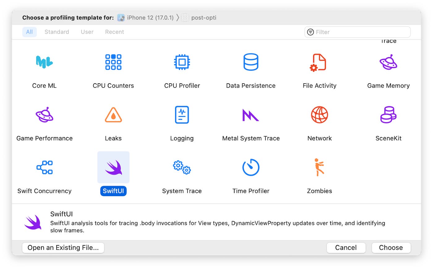
In the context of our graphing library, two high-level key metrics were essential in unraveling our performance challenges:
SwiftUI View body evaluations: This represents how many times View bodies are evaluated. Unnecessary evaluation can cause performance degradation, especially on a large number of Views. The average duration for a View's body evaluation is important, too. Any expensive logic should be kept outside of the View's body.
Time profiler: To identify and optimize slow function calls.
During the profiling process, it's important to consider key events where performance issues are more likely to manifest when capturing recordings to analyze.
Events like these include the following:
The first appearance on the screen, which in this case, is the initial rendering of a graph.
After an update trigger such as a visible window change, the selection of a value with the tooltip, or a user toggling the visibility of layers in a graph.
After a device environment change like device rotation or toggling dark/light mode.
When interacting with unrelated Views on the screen like ScrollView, toggles, and buttons.
Understanding SwiftUI concepts
The Demystify SwiftUI video session (WWDC2021) serves as an invaluable resource to get a deeper understanding of SwiftUI's inner workings. This session elucidates the core principles underlying SwiftUI's internal mechanisms.
Identity: How SwiftUI recognizes elements as the same or distinct across updates.
Lifetime: How SwiftUI tracks the existence of a View and its allocated data over time.
Dependencies: How SwiftUI knows when to update the interface and why.
Understanding these concepts, coupled with an insight into how the diffing mechanism functions, provides us with a clear, comprehensive mental model for when and how SwiftUI views are updated, and helps us shine a light on performance issues.
Diffing mechanism
The diffing mechanism used by SwiftUI remains undocumented, but various experiments and the following tweet from an Apple software engineer suggest the following:
When it does the per-field comparison the same rules are applied recursively to each field (to choose direct comparison or == if defined). (POD = plain data, see Swift's _isPOD() function.). December 16, 2019
Memcmp
Memcmp can compare two objects byte-by-byte directly in memory, and is the fastest comparison mechanism possible. However, it is only used when the View's dependencies are simple "Plain Ol' Data" (POD).
You can usually split a View so that the POD dependencies are in a child View. Note that _isPOD(MyView.self) can be used to determine if MyView is POD. For more information, see the _isPOD definition.
Equatable
Like other types in Swift, Views can be Equatable, too. By conforming a View to the Equatable protocol, we can provide a custom definition of equality for the View. When available, this is used by SwiftUI as a comparison mechanism if the View is not POD. You can always force SwiftUI to use the Equatable equality for a specific View by wrapping it in EquatableView or by using the equatable() modifier).
Reflection
If none of the above is possible, SwiftUI falls back to comparing each field recursively using reflection. This can be relatively slower than the options mentioned above.
Note that this is not official documentation, and the behavior may change in future versions (but it can be verified empirically).
Improving Performance in DogGraphs
Structural changes to the shared coordinate system
You may have noticed from the API video demo above that the library uses the power of @resultBuilder to offer an API that can build graphs in a declarative approach similar to SwiftUI and other Apple frameworks APIs like RegexBuilder.
The following example usage of our API defines a graph. This graph renders data from multiple queries in both Bars and Lines, depending on the query, and adds annotations as well as a time axis.
Graph(window: visibleWindow) { ForEach(request.queries) { query in switch query.type { case .bars: Bars(id: query.id, points: query.points, widths: query.barWidths) case .lines: Line(id: query.id, points: query.points) } } AnnotationMarks(request.marks) TimeAxis()}Internally, the library positions the different layers using a shared coordinate system that is computed based on the provided data points, the visible window, the canvas size, the stacking logic, and more.
Each time one of these elements changes (e.g., a visible window change after a user gestures, toggling the visibility of a layer, or rotating the device), the coordinate system updates, and, potentially, a redraw of the graph occurs. On the other hand, selecting a data point on the graph displays a tooltip with more information and doesn’t always require a redraw.
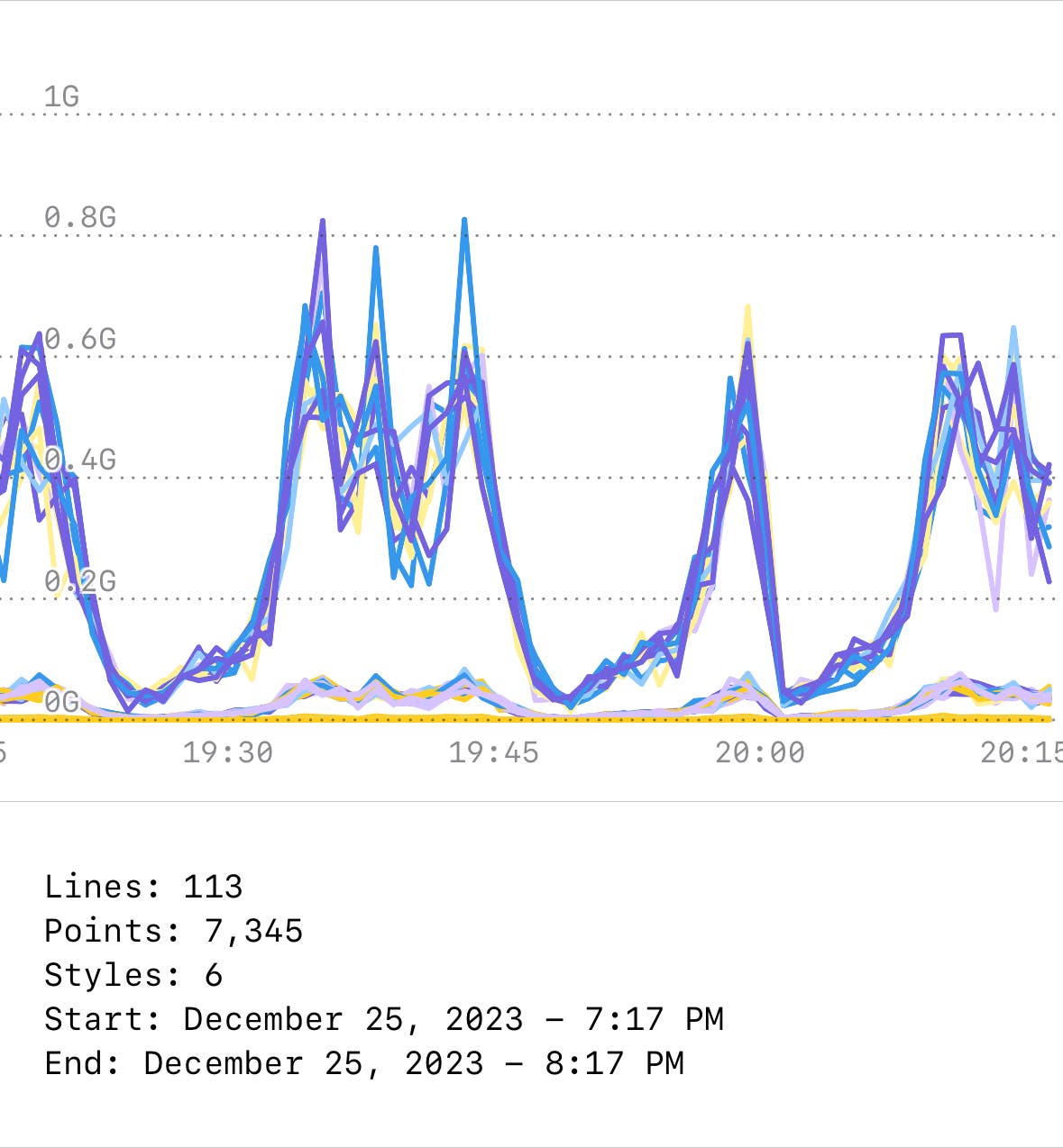
Our initial approach relied on a shared EnvironmentObject property that was consumed by the graph layers. Since each layer participates in defining the shared coordinate system (by yielding its own magnitude, unit, etc.), too many body evaluations, condition checks, and updates were being made. Some of these were due to reentrancy).
It's important to compare the profiling recording to the expected behavior. In this example, the Line's View body is evaluated 339 times, which is twice more than anticipated (113 lines). A “micro hang” is also noticeable, especially when interacting with the graph.
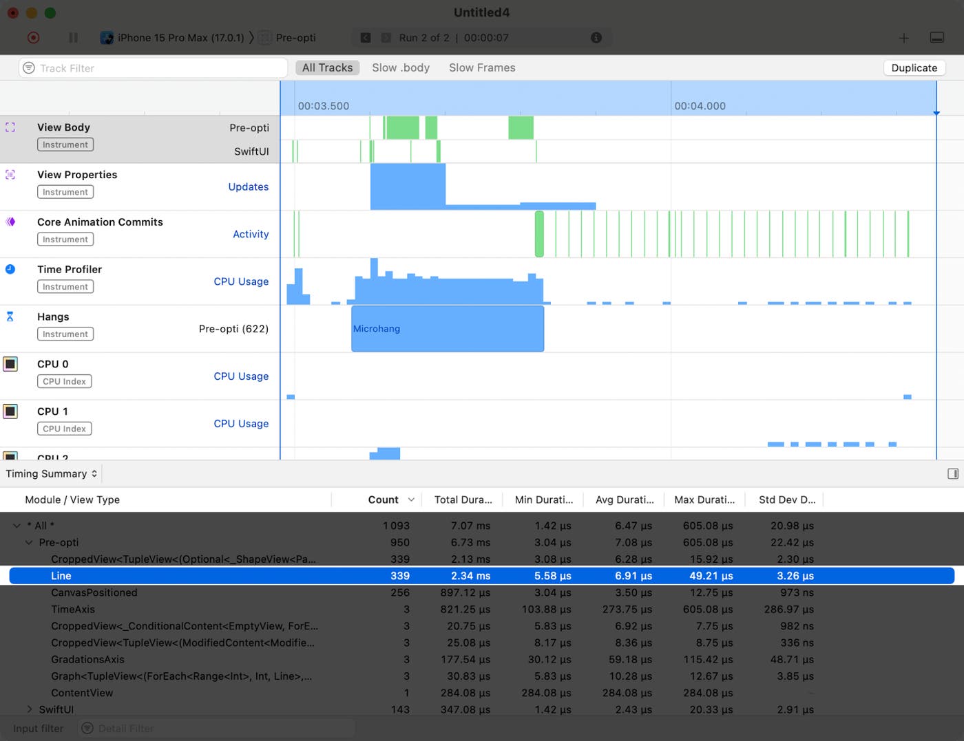
In order to keep this declarative API where the user only describes the different layers composing a graph, and to remove unnecessary body evaluations, we made a structural change so the layers no longer observe and update changes on the shared coordinate space.
The DogGraphsBuilder, the library's @resultBuilder that constructs layers from different DogGraphsContent layers, now takes this responsibility and reduces the combination of data yielded by the different DogGraphsContent layers into a global value.
static func buildPartialBlock<Content: GraphContent>(content: Content) -> Content { content}
static func buildPartialBlock<AccumulatedContent: GraphContent, NextContent: GraphContent>( accumulated: AccumulatedContent, next: NextContent) -> TupleGraphContent<AccumulatedContent, NextContent> { TupleGraphContent(first: accumulated, second: next)}In the snippet above, reducing two graph contents into one TupleGraphContent combines their values into a value for the newly-generated layer. The same goes for other quantifiers (e.g., ForEach, switch/if-else, limited availability, or Stack). After the @resultBuilder phase, we end up with one DogGraphsContent whose value is the result of the combination of the different layers composing it.
This guarantees that whenever an external change occurs in the graph, each layer yields its value only once, avoiding extra or mutual triggers internally. Once completed, a single View construction is performed if needed.
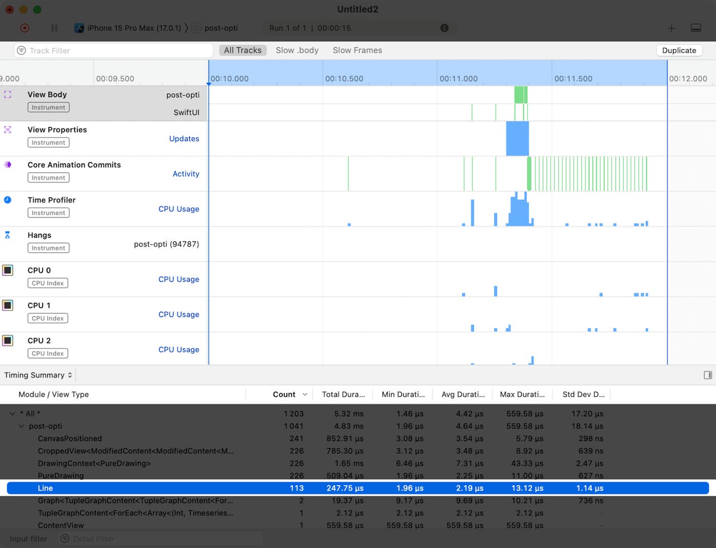
From the profile after this change, you can see that each graph layer (Line) is evaluated only once after an update.
Batching
Another area for enhancement that we identified originated from the need to simultaneously render a large number of small and simple shapes on the screen at the same time. The following example demonstrates service requests by version during a timeframe of 30 days.
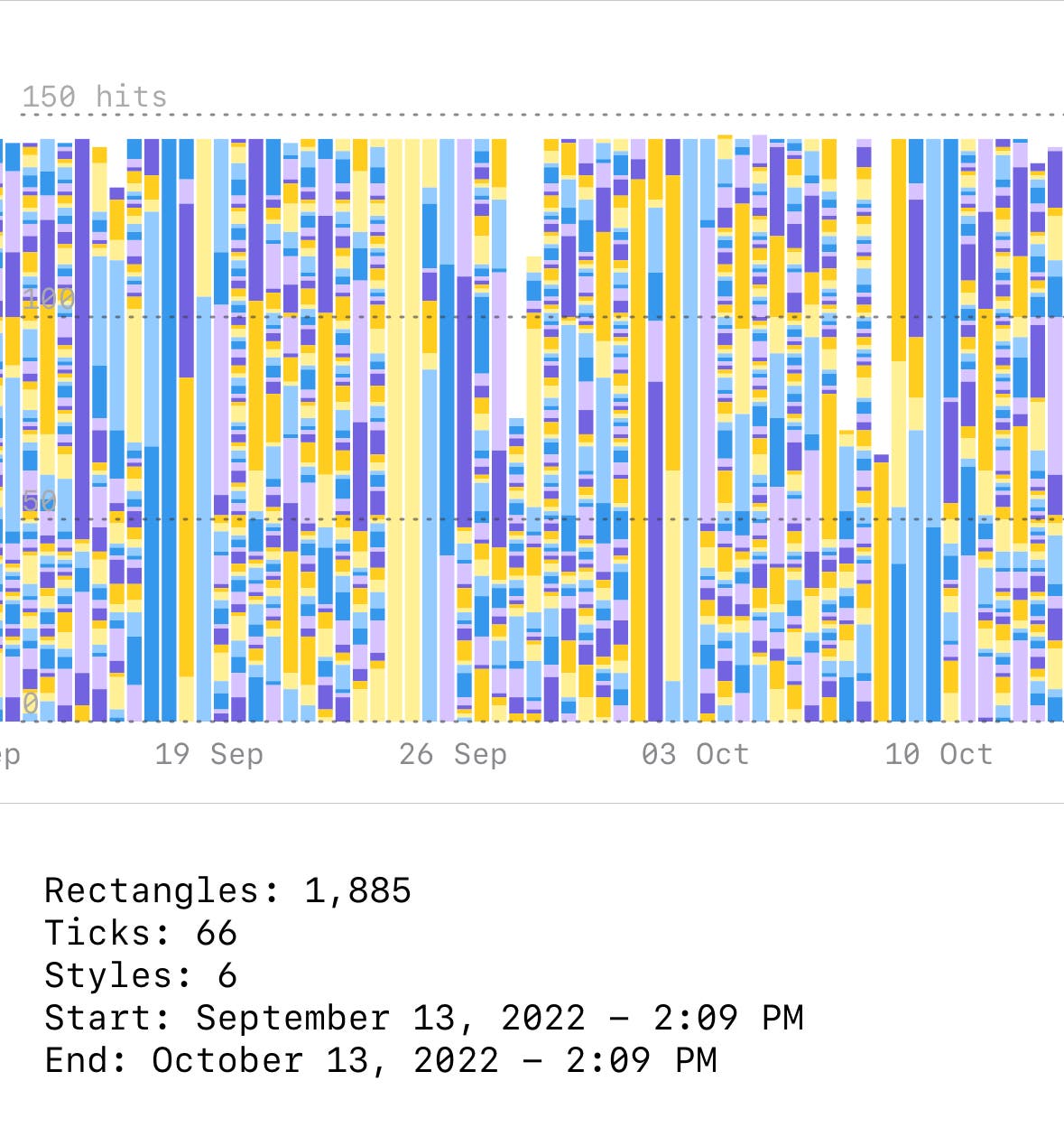
Thousands of rectangles are displayed on the screen after each interaction with the graph. Bars and other layers can have different stroke and fill styles.
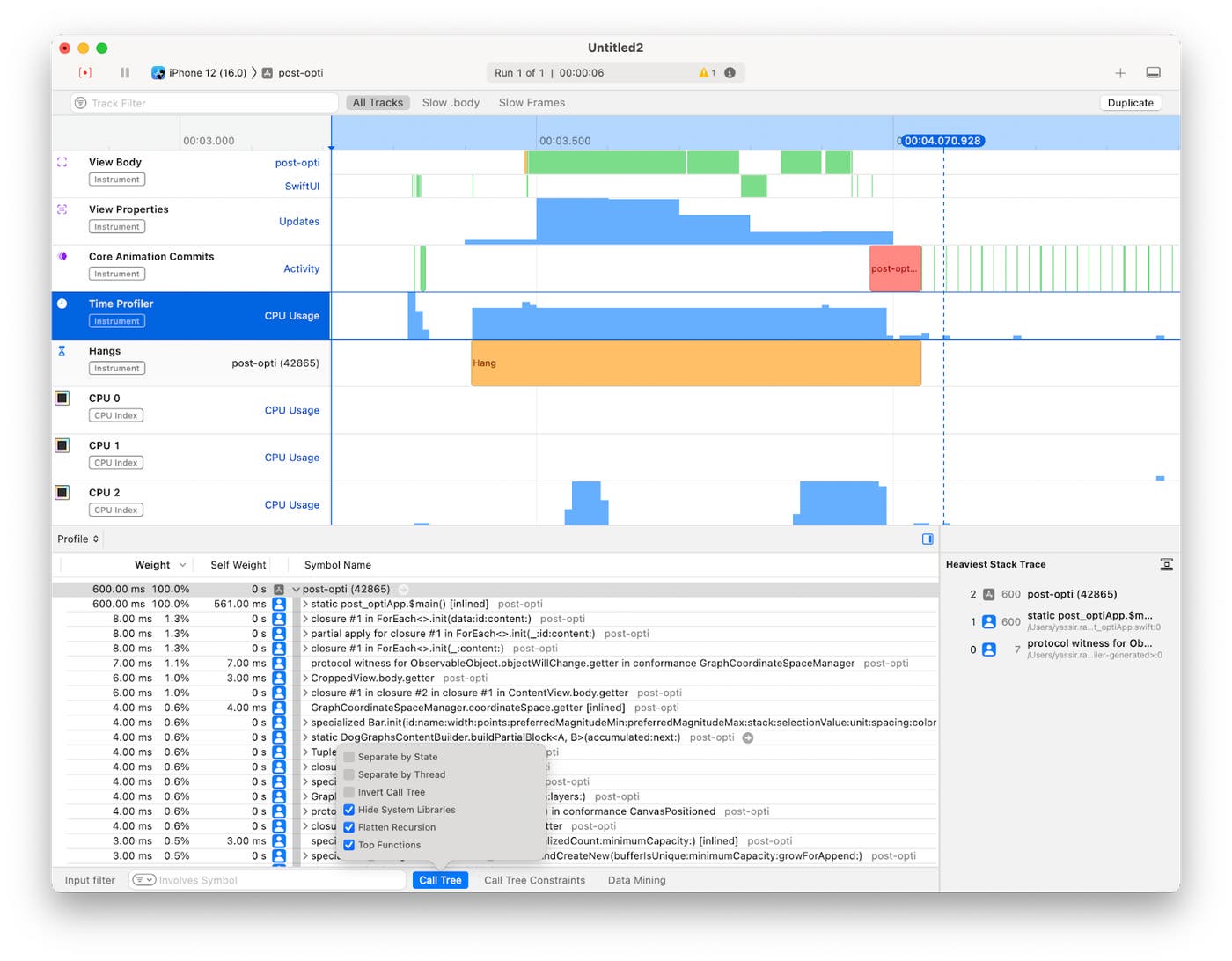
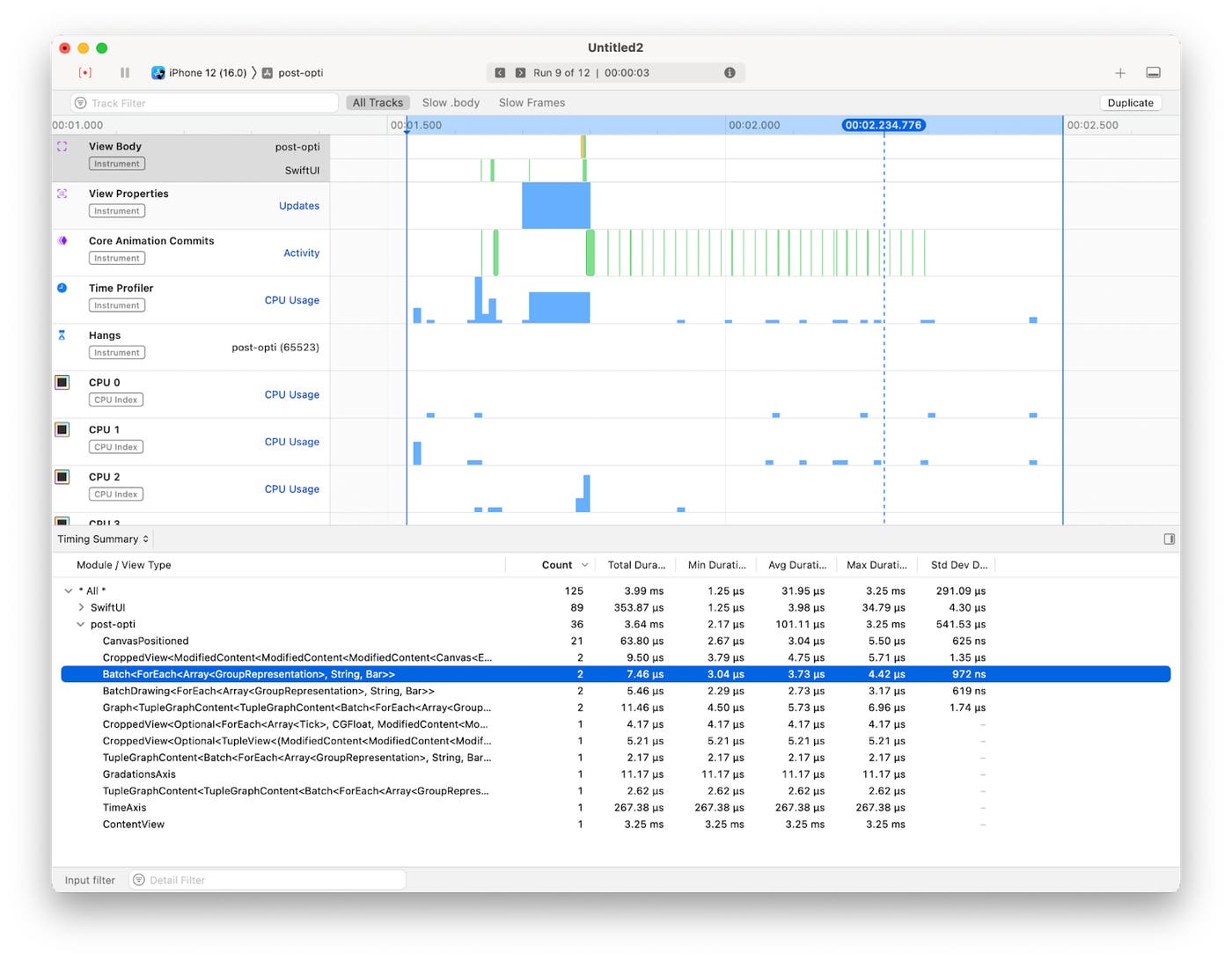
By looking at the SwiftUI View Body evaluation profile, the average duration of each View is below 15 µs and the longest total duration is around 12 ms, which is fine for a 60 fps rendering. However, this does not describe reality perfectly. A small but noticeable hang happens at each rendering.
Continuing the investigation in the Time Profiler reveals that this is not related to a specific slow process (or slow body) when hiding the system libraries. Heavy stack traces get most of their weight from SwiftUI internals. Instantiating a large number of Views at the same time can also be expensive.
In this situation, SwiftUI Canvas can help improve the runtime performance of the rendering since the drawing operations results in a single layer that is displayed, not multiple SwiftUI Shapes being created. Since a shape cannot have multiple styles, and with our limitation of supporting iOS 14, another idea we proposed was rendering the shapes in batches that share the same fill and stroke styles.
The solution requires us to better understand the scope of our problem. Knowing all the possible combinations of styles, we can create a single Shape by defining a Path containing all the rectangles for Bars that share the same style, and render it at once.
In practice, we introduced a new GraphContent type: a Batch, which allows passing large amounts of layers (that support batching requirements), and renders them with the least amount of rendering passes by grouping them by style and rendering each group as a single shape.
Graph(visibleWindow) { Batch { Stack(queries) { query, stack in Bar(...) } } DualYAxesLabels(ticks: ticks) TimeAxis()}It's also possible to combine batched and non-batched layers in a graph construction because non-batched ones are more flexible, and therefore, have fewer constraints.
Note that this is not a ScrollView, so every frame is rendered during the gesture interaction. Data is cached for the demo. No network calls are made during this recording.
This technique enables us to reduce the shapes from thousands in some cases, to just the number of distinct styles present in the graph.
Optimizing SwiftUI
Split into smaller Views
Computed variables and functions invoked within the View body are re-evaluated on each dependency change. For instance, consider a Toggle in our View; every toggle triggers the re-evaluation of all computed variables and functions in the body.
struct APMGraphSection: View { var body: some View { Toggle(...) title(...) timeseries makeLegend(...) }
@ViewBuilder var timeseries: some View { Timeseries(window) { ForEach(...) {...} } }
@ViewBuilder func makeLegend(...) -> some View { // legend View implementation }}
extension Graph { func title(...) -> some View { // title View implementation }}Introducing a distinct View structure for these Views allows SwiftUI to perform data comparison and update only if a change is detected.
struct GraphSection: View { // ... var body: some View { VStack { Title(...) GraphView(...) Legend(...) // ... } } struct GraphView: View {} struct Legend: View {} struct Title: View {}}Splitting Views in SwiftUI doesn’t necessarily mean that they are made to be reusable or part of the application's design system components—sometimes, it can be a mechanism to delimit the View dependencies for faster diffing, and avoid body evaluations that are not relevant to a part of the UI.
Remove time consuming process from the View body
Expensive processes in a View body will hinder or slow down the rendering pipeline—a View body should consume preprocessed data ready to be displayed, and any time-consuming operation should be kept outside of it.
Many options are possible, for instance, by firing the process on some event (.onAppear, asynchronously .task, .onChange, and more) and updating its State once completed, or by applying the transformation needed before committing it to the consumed dependency.
struct Legend: View { let series: [SingleSeries]
var body: some View { // Sorting should be avoided in the body. ForEach(series.sorted()) { singleSeries in LegendItem(title: singleSeries.title, color: singleSeries.color) } }}In DogGraphs, for example, user interaction for selection is asynchronously fired from the gesture. Once the value is determined, the selected data point is highlighted and a tooltip with details is displayed. If the user selection changes while still computing, the task is canceled and a new one starts. The View acts like a passive listener to the selection end result.
Eliminate dependencies not needed by the View
Whenever a dependency of a View changes (States, Bindings, StateObjects, ObservableObjects, Environments, or stored properties provided by parent Views), a new View value is produced. SwiftUI re-evaluates the View body to populate the change recursively to child Views composing it in the dependency graph.
By reducing dependencies to the data the View needs to render, we avoid unnecessary evaluations. For instance, a TimeAxis should only know about the visible window and the canvas width. Passing a widely scoped dependency with user selection or the graph's magnitude, for example, would lead to unnecessary TimeAxis body re-evaluation each time the user selects a value in the graph or toggles the visibility of graph entry.
Fewer calls to @Published properties
@Published properties have a performance overhead compared to stored properties. In our case, the impact is significant enough to make a noticeable difference with thousands of calls made to coordinateSpace, the central piece of rendering computations.
Polished code versus speed
It's often very tempting to make some parts of code as generic as possible and support different behaviors and options in an “elegant Swifty way”. In some cases, better performance can be achieved with specialization: simple methods that only perform specific tasks, rather than handling many cases, using more expressive data structures but increasing dynamic dispatch. For more information, see the Increasing Performance by Reducing Dynamic Dispatch blog post.
What's Next
This article describes the early phases of DogGraph's development, and illustrates some of the techniques we employed to enhance our rendering pipeline. It does not necessarily reflect the state of DogGraphs today.
We've integrated DogGraphs into several products across Datadog's mobile application to provide a native, interactive data visualization experience in the Service Catalog, BitsAI, Log Management, and full-screen and home screen dashboard widgets. We've also added support for additional visualizations and incorporated concepts from the latest Swift and SwiftUI APIs, while keeping pace with the minimal operating system version supported by the Datadog mobile application.
We are exploring additional topics to increase reliability and performance, such as screenshot testing and the potential for an application companion lab that we can use to explore different cases for visualizations.
You can give it a try by downloading the app on the Apple App Store. And if you’re not already using Datadog, get started with a 14-day free trial.

