MacKenna Kelleher

Khang Truong

Evan Marcantonio

Demi Iglesias
In most organizations, leaders are surrounded by data: revenue reports, customer analytics, uptime metrics, support tickets, and more. But when this information lives in separate tools and disconnected views, it’s hard to answer basic questions like “Are we growing in the right markets?” or “Did last week’s incident cost us real revenue?” Executives can end up scrolling through dense charts or waiting on ad hoc reports instead of seeing a unified, clear picture of business health.
To address this challenge, you can create executive dashboards in Datadog that gather relevant telemetry data—such as product usage, reliability, and customer experience data—to tell a cohesive story that helps leaders gain actionable insights and make informed decisions in minutes instead of days. Building this kind of story-driven dashboard requires deliberate design, clear priorities, and careful execution.
In this post, we’ll cover how to:
- Understand who your executive dashboard is for
- Prepare your data before you design
- Apply simplicity-first design principles
- Use key questions to shape your dashboards
- Make executive dashboards easy to navigate
We’ll also go through an example of an ecommerce executive dashboard to help guide you when you build your own dashboards.
Understand who your executive dashboard is for
Effective dashboards start with a clear audience. An executive who owns company-wide revenue needs a very different view from a product director responsible for a single line of business. Before you open the dashboard editor, decide whether you are building a high-altitude view for C-level stakeholders or a lower-altitude view for managers and team leads.
High-altitude dashboards are for executives, VPs, and other senior leaders who need a concise overview of business performance. These dashboards emphasize outcomes rather than implementation details. At this level, focus on metrics such as revenue, user adoption, market expansion, overall system health, and any leading indicators of growth or risk. Each widget should help leaders answer “Are we on track?” without requiring them to interpret low-level telemetry data.
Lower-altitude dashboards are designed for business managers and operational leaders who bridge technical performance with business results. They still focus on outcomes, but with more detail about how services and infrastructure influence those outcomes. For example, you might include throughput and error rates for critical APIs alongside conversion rate and cart abandonment, or show how latency on the checkout service relates to revenue per minute.
Treat these altitude levels as complementary. High-altitude views help executives set direction and spot trends, while lower-altitude views help teams investigate why a metric moved and what they should do next. In Datadog, you can link between these dashboards so stakeholders can move from the big picture to detailed diagnostics in a single click.
Prepare your data before you design
An executive dashboard is only as good as the data behind it. Before you invest time in layout and styling, make sure that the telemetry data flowing into Datadog follows tagging and naming conventions that support the views you want to build.
Start with tagging
Apply consistent tags for dimensions such as environment, region, team, service, and product line. This allows you to slice metrics by attributes that match how your business operates—for example, comparing US and EMEA revenue, or separating production performance from staging. If tags are missing or inconsistent, you may need to iteratively refine your instrumentation as you discover gaps while prototyping dashboards.
Focus on data quality and naming hygiene
Metrics and events should have descriptive names that clearly reflect what they measure, such as checkout.revenue_per_minute or mobile.login.errors. Avoid duplicating metrics with slightly different names, and standardize units so that charts are easy to interpret at a glance. This work ensures that your dashboards remain maintainable as more teams contribute data.
Use custom metrics strategically to capture the business signals that matter most
Datadog ships with hundreds of integrations, but some executive KPIs—such as revenue per session or the value of items in a cart—are unique to your application. Many teams create custom revenue metrics from Real User Monitoring (RUM) events, logs, or some other custom metric submission method, then use those metrics in dashboards and monitors. This lets you correlate user behavior directly with bottom-line impact.
Apply simplicity-first design principles
Once your data is trustworthy, you can design dashboards that surface the right insight without overwhelming the viewer. A good executive dashboard follows a simplicity-first philosophy: Every element should be easy to understand, grounded in a question, and clearly connected to a business outcome.
Simplicity starts with clear language and intuitive metrics. Avoid jargon-heavy widget titles or ambiguous abbreviations. Instead of “CX metrics,” label a widget “Checkout conversion rate.” Use units and visualizations that make sense to non-technical stakeholders—for example, revenue per day as a line chart, or uptime service level objectives (SLOs) as a simple gauge.
Each widget should exist to answer a specific question, such as “How many users completed a purchase today?” or “Which regions generated the most revenue this quarter?” When you build a chart, write down the question it addresses and include that in the title or description. This mindset keeps your dashboard focused on decisions rather than on raw data.
Finally, contextualize technical metrics with business impact. Rather than showing latency and error rate in isolation, pair them with conversion, churn, or revenue metrics. For example, plot checkout latency alongside cart abandonment and revenue per minute. When service performance changes, executives can immediately see whether it is affecting customers and the business.
Use key questions to shape your dashboards
A successful executive dashboard helps leaders answer the right questions quickly and confidently. When you design a layout, work backward from the questions that matter most at each altitude.
For high-altitude dashboards, consider questions such as:
- User engagement: How many active users do we have, and what are peak usage hours?
- Revenue and growth: How much revenue are we generating, and how does it correlate with system health and reliability?
- Business outcomes: How many customers complete a key workflow, such as checkout or signup?
- Regional and market trends: Which regions, markets, or business units are growing, and which are struggling?
- Performance over time: How are revenue, incident volume, and product adoption trending over weeks or quarters?
- Customer satisfaction: Are customers satisfied with application responsiveness—for example, based on Apdex scores or user feedback?
- System health: What is the overall health of our infrastructure and applications?
For lower-altitude dashboards, you can drill into more operational questions:
- Operational reliability and performance: How stable is our core infrastructure in terms of uptime, latency, and error rates? What are our mean time to detect (MTTD) and mean time to resolve (MTTR) for critical incidents, and how are those changing over time?
- User behavior and experience: How do application errors or slow response times affect session length, page views, or conversion? Which technical or UX issues correlate with churn or cart abandonment?
- Business–technical linkage: Are observability investments focused on the flows that matter most, such as account creation, search, and checkout?
- Team and process efficiency: Which services or teams generate the most incidents or alerts? Are we seeing patterns of alert fatigue that could hide important issues?
- Environment and regional insights: Are there differences in performance or adoption across environments (for example, production versus staging) or across regions such as EMEA, the US, and APAC?
When every chart and visualization ties back to a question like these, your dashboard becomes a narrative rather than a collage. Executives can move from “What is happening?” to “Why is it happening, and what should we do?” without switching tools.
Make executive dashboards easy to navigate
Even the most insightful metrics will be ignored if your dashboard is difficult to navigate. Executives skim, so the layout should guide them through the story with minimal friction.
Avoid cluttered designs with too many small widgets competing for attention. Instead, group related content into logical sections such as Overview, Traffic and Engagement, Financial Analysis, and Reliability. In Datadog, you can use Groups to visually separate these sections and enable users to collapse details they only sometimes need.
Template variables help dashboards stay flexible while remaining simple. For example, you can add a region variable so leaders can switch between global and regional views of the same charts without duplicating the dashboard. Similarly, environment or business_unit variables let stakeholders focus on the slices of the business they own.
Finally, add annotations, notes, and context links to help readers move from summary to detail. Notes can explain how a metric is calculated or what threshold represents “healthy.” Links can point to related dashboards, runbooks, or documentation, so an executive who spots an issue can send teammates directly to the right place for deeper analysis.
Example: Build an ecommerce executive dashboard
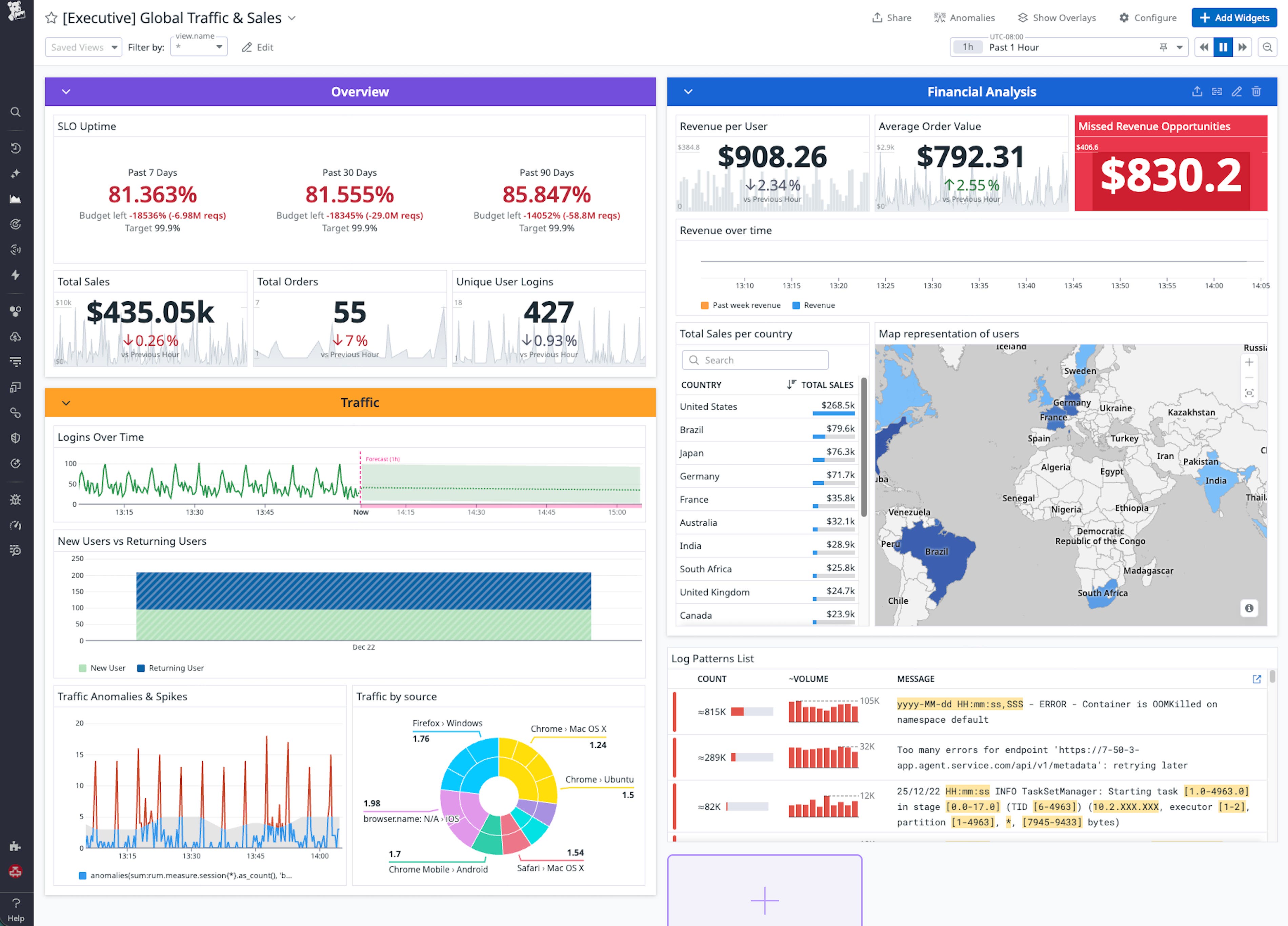
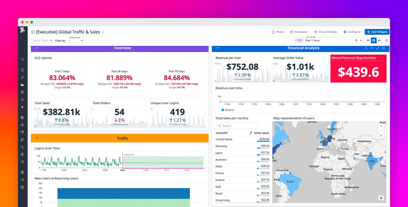
To see these ideas in practice, consider an ecommerce executive dashboard that connects customer behavior, revenue, and reliability into a single view. The following dashboard combines data from RUM, SLOs, and revenue metrics to show how user experience translates into sales:

At the top, an Overview section surfaces the metrics that executives care about most: total sales, order volume, unique logins, and key uptime SLOs. Together, these widgets provide a real-time snapshot of business health, answering questions like “How much are we selling right now?” and “Are our critical services within SLO?”
A Traffic section explains how users are engaging with the site. Timeseries and distribution widgets highlight trends in new versus returning users, forecast future traffic, and detect anomalies that may indicate emerging issues or opportunities. When traffic spikes but conversion does not, leaders know to investigate friction in the funnel. When growth comes mostly from returning customers, leaders might prioritize loyalty programs over acquisition campaigns.
The Financial Analysis section links behavioral insights directly to revenue. Widgets such as “Revenue per User” and “Average Order Value” quantify customer value over time, while a “Missed Revenue Opportunities” widget can estimate the monetary impact of cart and checkout errors. This helps business and engineering teams prioritize reliability work based on dollars at risk rather than abstract error counts.
Geographic visualizations complete the picture by showing which regions drive the most revenue and where optimization could have the biggest impact. A geomap paired with a country table lets executives quickly see growth markets and underperforming regions, then filter the rest of the dashboard accordingly.
Finally, reliability metrics such as SLO uptime, error budget burn, and latency for critical services tie operational health back to outcomes. When an SLO dips or error budgets burn faster than expected, executives can see the downstream effect on sales and conversions in the same view. This shared context encourages teams to treat reliability work as a direct contributor to growth rather than a separate technical concern.
Turn visibility into strategy with Datadog
When you design executive dashboards with intention, they become living narratives of how your business operates. By combining full-stack observability with business context, Datadog helps organizations see the complete picture from infrastructure reliability all the way to revenue impact in a single, unified view.
To get started, review your existing dashboards and ask whether each widget answers a specific question that matters to your leaders. Tighten tagging and data standards, introduce business-focused custom metrics where needed, and experiment with layouts that highlight the relationship between user behavior, revenue, and reliability.
For more information on building dashboards, see the Datadog Dashboards documentation and Custom Metrics documentation, and explore Real User Monitoring and SLOs to bring customer and reliability data into the same views. If you’re new to Datadog, sign up for a 14-day free trial.


