Won Choi
As product designers at Datadog, we need to understand our users, so that we can improve their experience of our platform. We need to understand how our products help them get work done. And we need data for that.
Some of this data can be gathered directly from interviews. Much of it is high-fidelity and qualitative data. How could we supplement it with quantitative data?
We needed a tool that gives us visibility into user experience. Since Datadog is a monitoring platform, this is an opportunity to do some “dogfooding”—that is, to use our own products on ourselves. In this case, we use Datadog’s Real User Monitoring (RUM), in conjunction with logs and notebooks. In addition to the quantitative data we need, using Datadog every day is a great way to experience Datadog as our users do.
We chose three examples to illustrate the effectiveness of quantitative user data in informing the design process.
Three stories
Picking a monospace font
Monospace fonts are used widely throughout Datadog to display many types of structured data—like logs, stack traces, source code blocks, and container IDs.
The benefit of using monospace fonts is that you can precisely calculate how much horizontal space each character takes up. In variable-width fonts (including Noto Sans, our default UI font) characters have different widths and spacing between each other, making it difficult to predict how much horizontal space each block of text or numbers takes up. This can be especially important when designing for information-dense views, like Watchdog Insights or Log Explorer.
Until recently, Datadog did not serve a specific monospace font to users; we used a generic font stack that consisted of various system fonts, like Consolas, Liberation Mono, Menlo, and Courier. Users ultimately viewed whichever monospace font they had installed on their computer.

The question, then, was which particular monospace font to serve.
Our primary concern was to minimize the potential visual impact of the update: we wanted to match the optical size of the new font as closely as possible to whichever font was already being seen by the highest number of users. If we didn’t minimize the difference between new and old fonts, the changed base font-size of the replacement font could cause issues for complex and tightly designed parts of the app—for instance, in embedded tables.
We needed to figure out which monospace font a plurality of our users were seeing. To achieve this, we needed to know exactly how many users were seeing which monospace fonts.
To track monospace font usage, we used RUM to gather user data. We extracted font load information by using Web API’s Document.font interface, which allowed us to access the CSS Font Loading API to gather detailed information on the actual fonts loaded by end users.
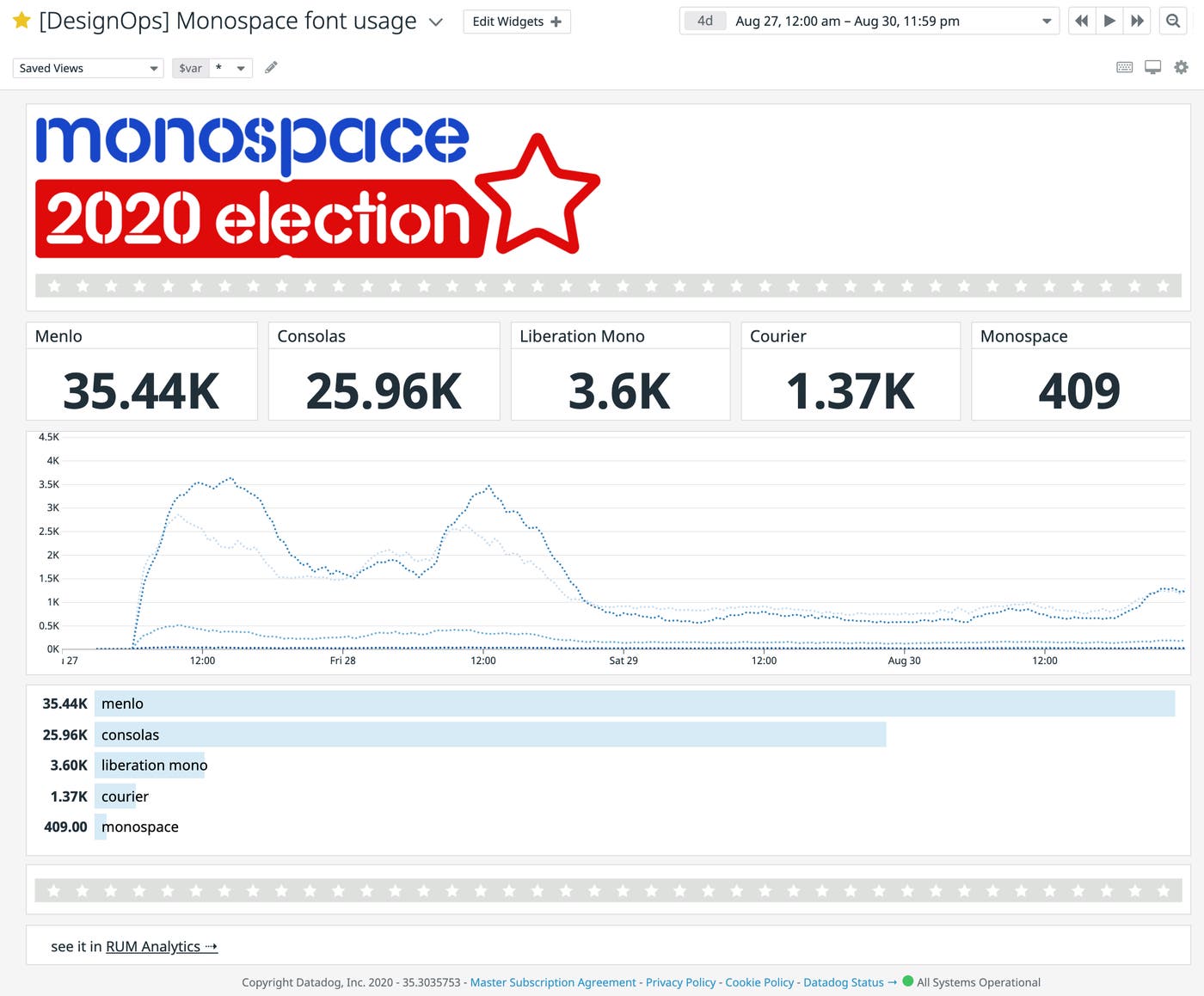
Pretty soon, we were able to see the full results from the RUM Analytics page. After we collected a large enough dataset to analyze, we built a dashboard to share the results across the product design team, as well as with the engineers that were involved in the project.
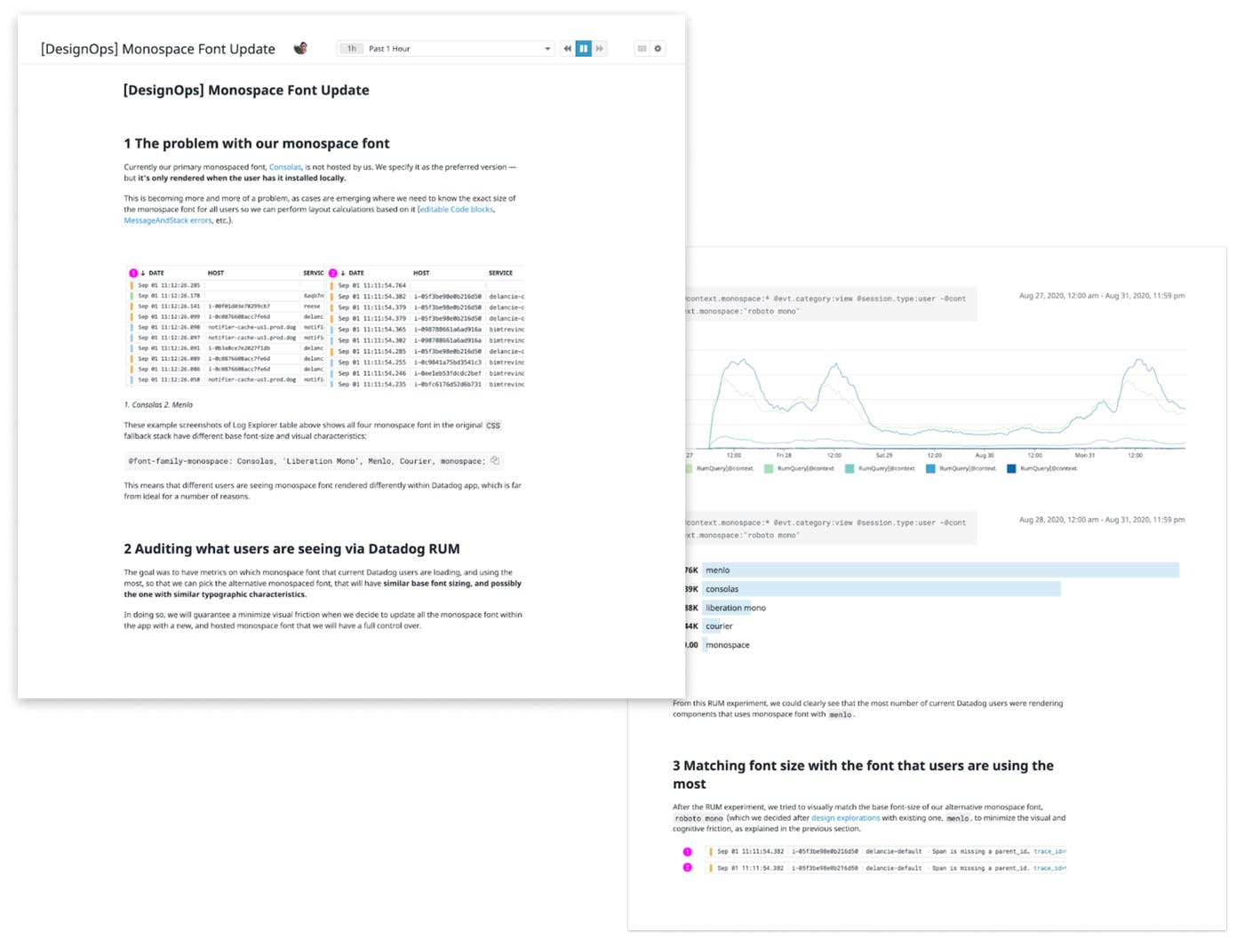
We ended up picking Roboto Mono as the monospace font for all code and tabular data in the app. After we rolled this out, we used RUM to verify that users were seeing the new font as we intended.
Updating the DraggablePane component based on user interaction data with Logs
We wanted to update the design and functional features of DraggablePane, a widely used component that lets users resize adjacent panels of content. In terms of technical construction, it’s a simple component—but it has a number of features that enable different user interactions to trigger specific functions. The draggable handle of DraggablePane is physically very small, so having numerous controls in a limited space could make the user interaction feel overwhelming, especially when surrounded with other complex UI elements. We wanted to see if we could simplify it.
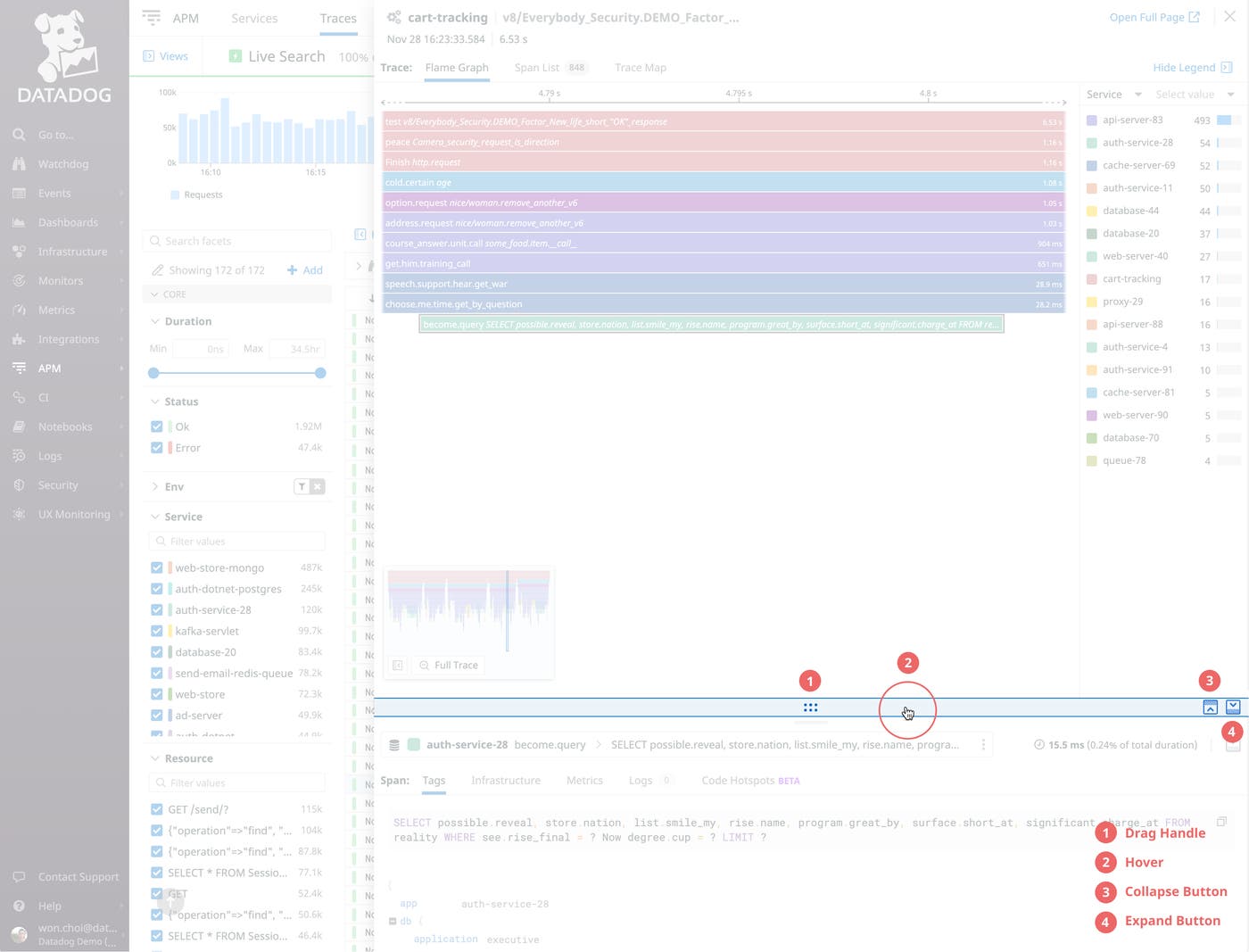
The main challenge was knowing which features were actually being used and how frequently each action occurred. We wanted to gather data on different user interactions so we could make data-backed design decisions on which features to remove—if any—as well as how to improve the features we wanted to keep.
Using Datadog Logs, we added custom loggers inside both the overall DraggablePane component and the draggable handle itself.
We learned that almost no users were using the minimize or maximize buttons, which took up a significant portion of real estate within the draggable handle and contributed to overall UI clutter. We decided to remove these buttons and instead implement a double-click event on the handle to replace the functionality.
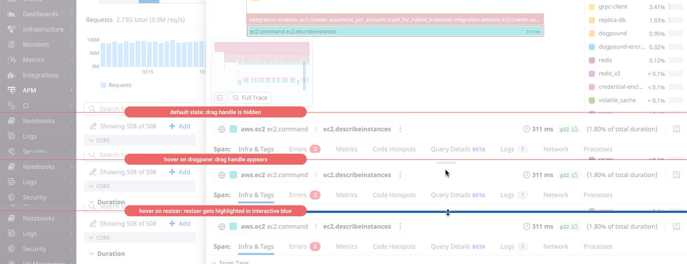
(Note that when we did this update, Datadog Logs was the only tool we had to collect data on individual user interactions. Now, Datadog customers can see these with custom actions in Real User Monitoring.)
Input syntax for custom time frames
Until recently, when Datadog users wanted to scope data in dashboards, the Log Explorer, or other similar workflows, they could only select from a preset list of time frames—such as 15 minutes, 1 hour, or 1 day. Nothing existed to let users enter custom time frames.
To make these workflows more powerful, we built the DateRangePicker component into our design system. It lets users enter text strings to represent custom time frames, in addition to choosing from common presets. The goal from a UX standpoint is to be as flexible and easy to use as possible.
But under the hood we needed to develop logic to accurately interpret many different types of custom text strings and display the correct result. When we first released the feature, we supported only a limited syntax, like {N} months and Jan 1 - Jan 31.
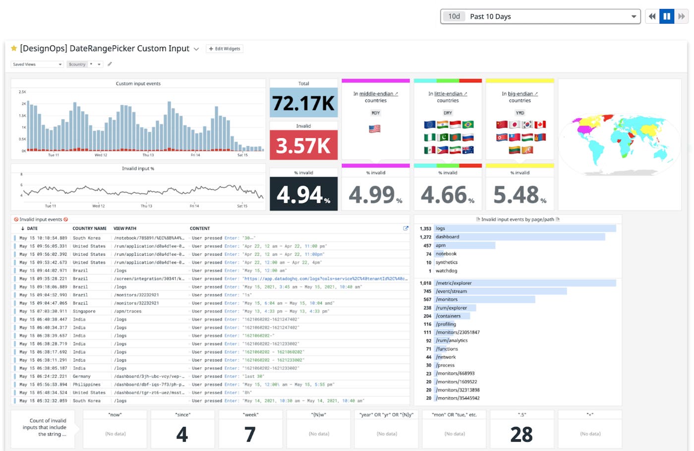
To expand our syntax, we used Datadog Logs to track the custom inputs that users were entering to better understand how they were interacting with the component and what additional syntax we should support for a better user experience.
We aggregated time inputs, defining an invalid input as when we were unable to interpret a time frame from a custom, user-entered text string. For all invalid inputs, we looked at what the user entered, the page on which they entered it, and the country from which the request was made. Then, from this data, we identified the syntax of the most common terms that users were typing into the field.
The most common type of invalid input was the keyword weeks. For example, users would enter last 1 week or last 2 weeks, which were not supported patterns at the time.
By capturing common patterns of invalid inputs, we were able to formulate data-backed hypotheses on what users wanted the component to be able to parse—and we were able to extend our parsing logic accordingly. The error rate, when we first began tracking, floated around 10 percent. After we updated the component logic to interpret common sets of previously unsupported user input (including the weeks keyword), it dropped immediately into the 5–6 percent range: a huge improvement!
Dogfooding and collaboration
Throughout these projects, we tracked user data to make informed design decisions, created curated dashboards with collected data, and documented and shared our gathered data, design documents, and additional assets. Sharing our project across different people and teams was highly effective for our processes—and it was exciting to use our own products to do all of this.
Since all of the user data was collected, analyzed, and presented in a single app, the design and review process was very smooth and time efficient. Additionally, in the future, anyone looking at this data can always go back and analyze individual data points further.
As Datadog expands its offerings and products, there are fast-growing opportunities for product designers to benefit from using our own products, as shown in the projects that we shared in this blog post.
At the conclusion of these projects, we created a presentation based on our experiences and discussed the practice of using Datadog for our daily tasks and projects in a number of events, including our product design team’s internal team update meeting, our company-wide Learning Week, and this year’s kickoff meeting for our technical enablement team. Our goal is to further promote the idea of dogfooding throughout the company, specifically for teams that aren’t regular users of the product.
If you’re interested in data-driven approaches towards design, join us: Datadog is hiring.
