
This is the second post in a series about visualizing monitoring data. This post focuses on summary graphs.
In the first part of this series, we discussed timeseries graphs—visualizations that show infrastructure metrics evolving through time. In this post we cover summary graphs, which are visualizations that flatten a particular span of time to provide a summary window into your infrastructure:
For each graph type, we’ll explain how it works and when to use it. But first, we’ll quickly discuss two concepts that are necessary to understand infrastructure summary graphs: aggregation across time (which you can think of as “time flattening” or “snapshotting”), and aggregation across space.
Aggregation across time
To provide a summary view of your metrics, a visualization must flatten a timeseries into a single value by compressing the time dimension out of view. This aggregation across time can mean simply displaying the latest value returned by a metric query, or a more complex aggregation to return a computed value over a moving time window.
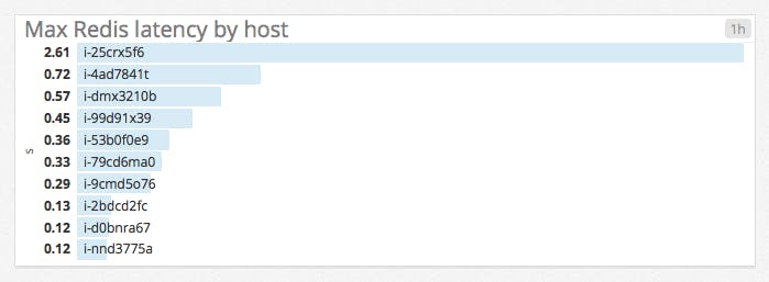
For example, instead of displaying only the latest reported value for a metric query, you may want to display the maximum value reported by each host over the past 60 minutes to surface problematic spikes:
Aggregation across space
Not all metric queries make sense broken out by host, container, or other unit of infrastructure. So you will often need some aggregation across space to create a metric visualization that sensibly reflects your infrastructure. This aggregation can take many forms: aggregating metrics by messaging queue, by database table, by application, or by some attribute of your hosts themselves (operating system, availability zone, hardware profile, etc.).
Aggregation across space allows you to slice and dice your infrastructure to isolate exactly the metrics that make your key systems observable.
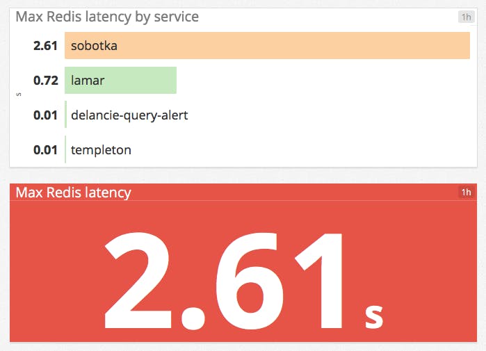
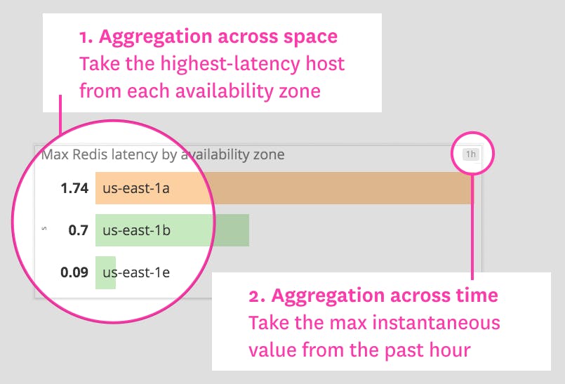
Instead of listing peak Redis latencies at the host level as in the example above, it may be more useful to see peak latencies for each internal service that is built on Redis. Or you can surface only the maximum value reported by any one host in your infrastructure:
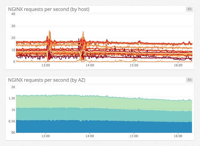
Aggregation across space is also useful in timeseries graphs. For instance, it is hard to make sense of a host-level graph of web requests, but the same data is easily interpreted when the metrics are aggregated by availability zone:
The primary reason to tag your metrics is to enable aggregation across space.
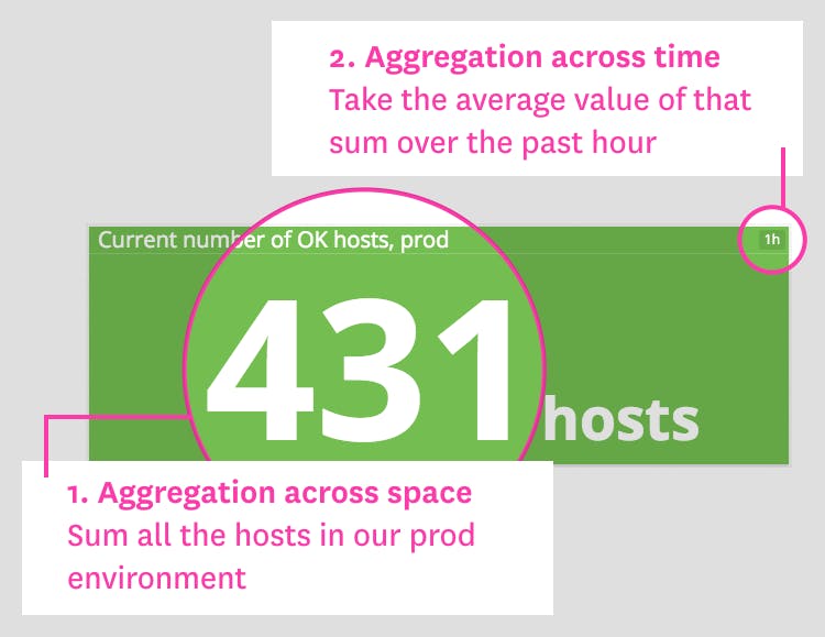
Single-value summaries
Single-value summaries display the current value of a given metric query, with conditional formatting (such as a green/yellow/red background) to convey whether or not the value is in the expected range. The value displayed by a single-value summary need not represent an instantaneous measurement. The widget can display the latest value reported, or an aggregate computed from all query values across the time window. These visualizations provide a narrow but unambiguous window into your infrastructure.
When to use single-value summaries
| What | Why | Example |
|---|---|---|
| Work metrics from a given system | To make key metrics immediately visible | Web server requests per second |
| Critical resource metrics | To provide an overview of resource status and health at a glance | Healthy hosts behind load balancer |
| Error metrics | To quickly draw attention to potential problems | Fatal database exceptions |
| Computed metric changes as compared to previous values | To communicate key trends clearly | Hosts in use versus one week ago |
Toplists
Toplists are ordered lists that allow you to rank hosts, clusters, or any other segment of your infrastructure by their metric values. Because they are so easy to interpret, toplists are especially useful in high-level status boards.
Compared to single-value summaries, toplists have an additional layer of aggregation across space, in that the value of the metric query is broken out by group. Each group can be a single host or an aggregation of related hosts.
When to use toplists
| What | Why | Example |
|---|---|---|
| Work or resource metrics taken from different hosts or groups | To spot outliers, underperformers, or resource overconsumers at a glance | Points processed per app server |
| Custom metrics returned as a list of values | To convey KPIs in an easy-to-read format (e.g., for status boards on wall-mounted displays) | Versions of the Datadog Agent in use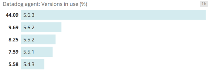 |
Change graphs
Whereas toplists give you a summary of recent metric values, change graphs compare a metric’s current value against its value at a point in the past.
The key difference between change graphs and other visualizations is that change graphs take two different timeframes as parameters: one for the size of the evaluation window and one to set the lookback window.

When to use change graphs
| What | Why | Example |
|---|---|---|
| Cyclic metrics that rise and fall daily, weekly, or monthly | To separate metric trends from periodic baselines | Database write throughput, compared to same time last week |
| High-level infrastructure metrics | To quickly identify large-scale trends | Total host count, compared to same time yesterday |
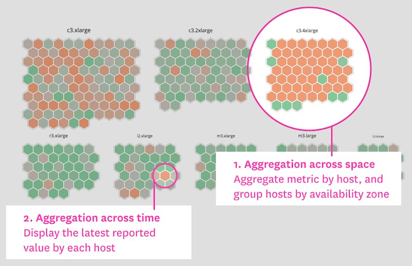
Host maps
Host maps are a unique way to observe your entire infrastructure, or any slice of it, at a glance. However you slice and dice your infrastructure (by data center, by service name, by instance type, etc.), you will see each host in the selected group as a hexagon, color-coded and sized by any metrics reported by those hosts.
This particular visualization type is unique to Datadog. As such, it is specifically designed for infrastructure monitoring, in contrast to the general-purpose visualizations described elsewhere in this article.
When to use host maps
| What | Why | Example |
|---|---|---|
| Resource utilization metrics | To spot overloaded components at a glance | Load per app host, grouped by cluster |
| To identify resource misallocation (e.g., whether any instances are over- or undersized) | CPU usage per EC2 instance type | |
| Error or other work metrics | To quickly identify degraded hosts | HAProxy 5xx errors per server |
| Related metrics | To see correlations in a single graph | App server throughput versus memory used |
Distributions
Distribution graphs show a histogram of a metric’s value across a segment of infrastructure. Each bar in the graph represents a range of binned values, and its height corresponds to the number of entities reporting values in that range.
Distribution graphs are closely related to heatmaps. The key difference between the two is that heatmaps show change over time, whereas distributions are a summary of a time window. Like heatmaps, distributions handily visualize large numbers of entities reporting a particular metric, so they are often used to graph metrics at the individual host or container level.

When to use distributions
| What | Why | Example |
|---|---|---|
| Single metric reported by a large number of entities | To convey general health or status at a glance | Web latency per host |
| To see variations across members of a group | Uptime per host | |
Wrap-up
Each of these specialized visualization types has unique benefits and use cases, as we’ve shown here. Understanding all the visualizations available to you, and when to use each type, will help you convey actionable information clearly in your dashboards.
In the next article in this series, we’ll explore common anti-patterns in metric visualization (and, of course, how to avoid them).
