


Jordan Obey

Cat Yao
Editor’s note: This post covers Cloud Network Monitoring, a Datadog feature that was originally called Network Performance Monitoring.
Datadog Network Performance Monitoring (NPM) gives you visibility into all the communication that takes place between the network components in your environment, including hosts, processes, containers, clusters, zones, regions, and VPCs. As organizations scale, and as their networks grow in complexity, the massive volume of network data to be monitored can become overwhelming. Knowing precisely what network data to surface to resolve issues within these larger environments can be a challenge. As a result, network traffic investigations can turn arduous and time-consuming, especially for those who are new to network observability.
To help solve this problem and further simplify network investigations, we have released a story-centric UX on the NPM Overview page. The new UX automatically organizes traffic data into distinct categories so that you can quickly grasp key network information within the context of various problem-solving use cases. We have also updated the UX of the NPM Analytics and DNS pages so that they include recommended queries to jumpstart your network investigations.
In this post, we’ll look at how our story-centric UX provides guidance in Datadog NPM to help you:
- Identify top traffic costs
- Quickly understand service dependencies
- Gain insight into DNS health
- Use recommended queries to jumpstart investigations
Identify top traffic costs
Cloud traffic costs are often difficult to track and predict because they can involve so many diverse components (e.g., virtual firewalls and load balancers) spread across different environments (e.g., different VPCs). External network traffic is particularly important to monitor because its associated costs tend to be higher, but it can be especially challenging to isolate and analyze.
The new External Network Traffic view on the NPM Overview page helps solve this problem by enabling you to immediately understand your most expensive traffic and identify cost-saving opportunities through three categories.
First, the most expensive traffic is often egress traffic, which flows from your organization to an external network. For this reason, the NPM Overview page now provides a “Change in Egress Traffic” visualization, which can help you quickly grasp costly trends related to the volume of traffic leaving your cloud environment.
Next, in AWS, VPC-hosted resources can connect to external internet endpoints either through an internet gateway (IGW) or a NAT gateway (NGW). Given their substantial fees, when traffic volume through these gateways is high, costs can escalate quickly. To help you avoid this problem, our updated UX includes a “Top AWS Gateway Users” visualization which highlights the services that send the most data through either an IGW or an NGW so that you can determine how you might revise traffic patterns to for cost efficiency. For example, you might spot opportunities where, instead of sending traffic through an NGW, you can reroute it to go through a VPC endpoint to save on costs.
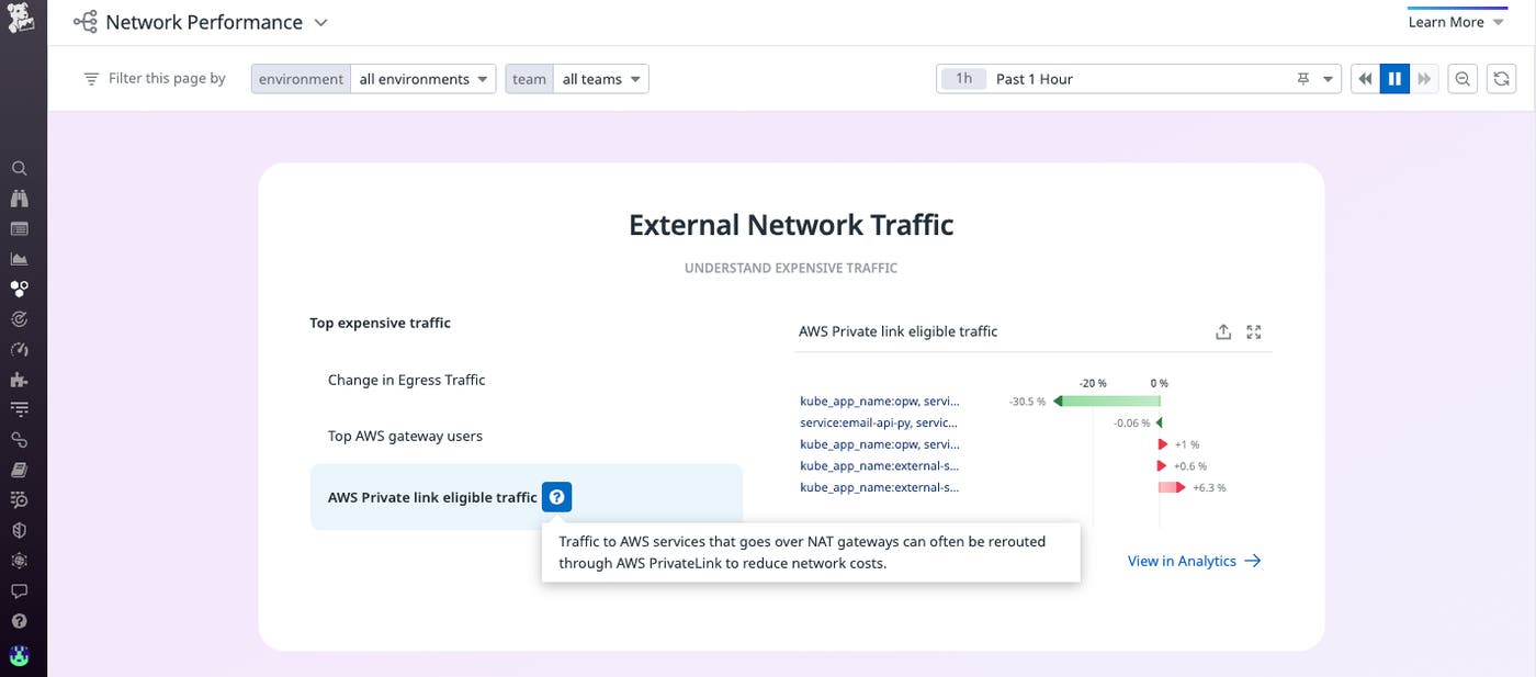
Additionally, the “AWS Private Link Eligible Traffic” visualization identifies where traffic between AWS services can be rerouted to help reduce expenses. For example, Datadog will surface which services are eligible to be connected via an AWS PrivateLink, which can cut down on external network costs.
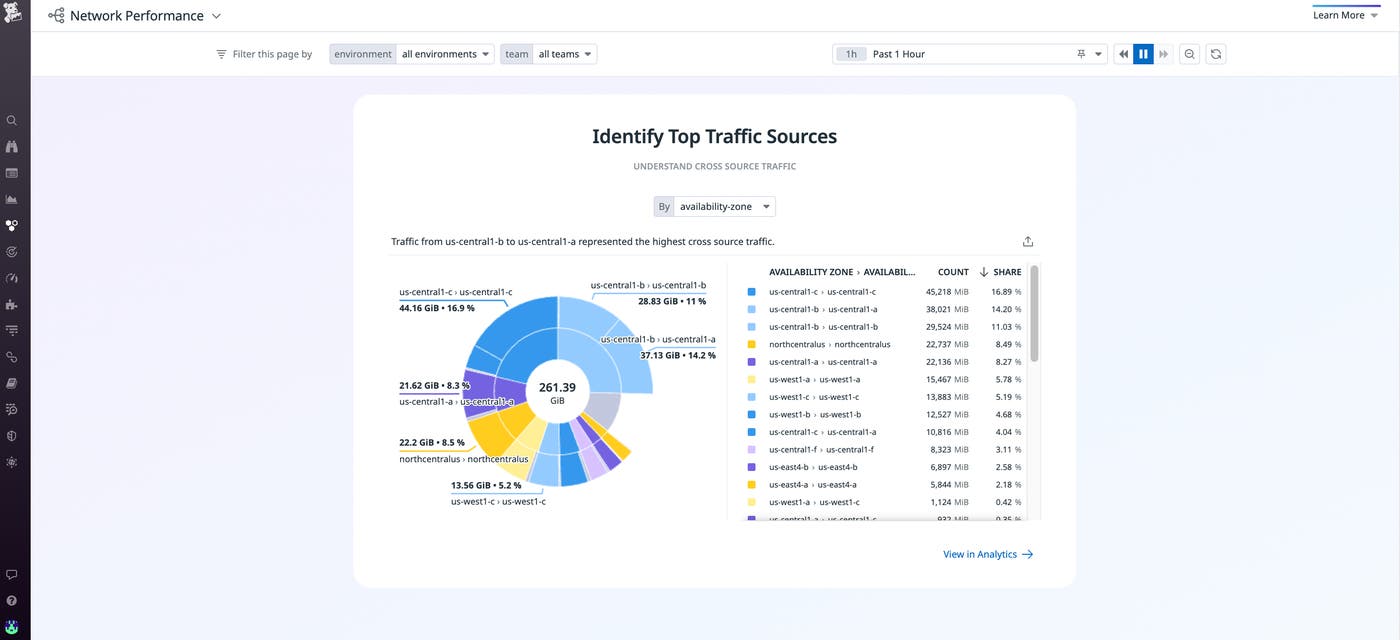
Another major contributor to an organization’s cloud spend is traffic that is sent across Availability Zones (AZs) or regions. The NPM overview page also includes an “Identify Top Traffic Sources” view so that you can quickly see where the highest volume of data is being sent across sources, enabling you to identify opportunities to re-architect your network to reduce cloud spend.
Quickly understand service dependencies
As you update, migrate, or deprecate services, it’s crucial to be able to quickly view and understand what dependencies exist and how changes in one service can impact another. Seeing this dependency information enables you to prevent issues from cascading across your network. For example, if you are migrating to the cloud from an on-prem infrastructure, it’s important to have a full birds-eye view of existing inter-service dependencies so that you can ensure they persist before and after your migration to prevent network-related service outages.
Despite its importance, however, information about service dependencies becomes increasingly difficult to monitor as applications scale and grow in complexity.
To address this issue, our updated NPM Overview page includes an “Application and Dependency Top Talkers” section, which enables you to easily identify service dependencies by visualizing service-to-service traffic by volume. This way, you can verify that dependencies remain intact as you update, migrate, or deprecate your services.
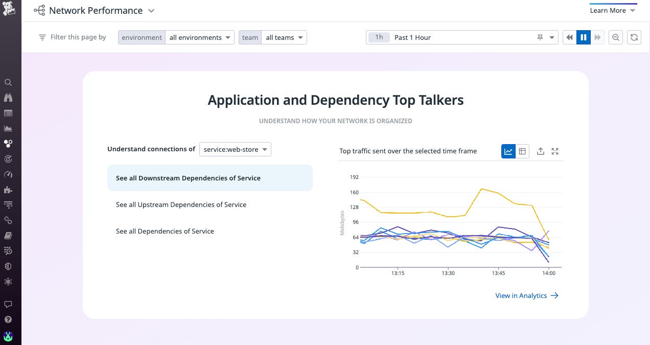
The “Application and Dependency Top Talkers” section can also help you strategize your migrations. For instance, you can identify which services have the most dependencies and are therefore more risky to migrate first.
Gain insight into DNS health
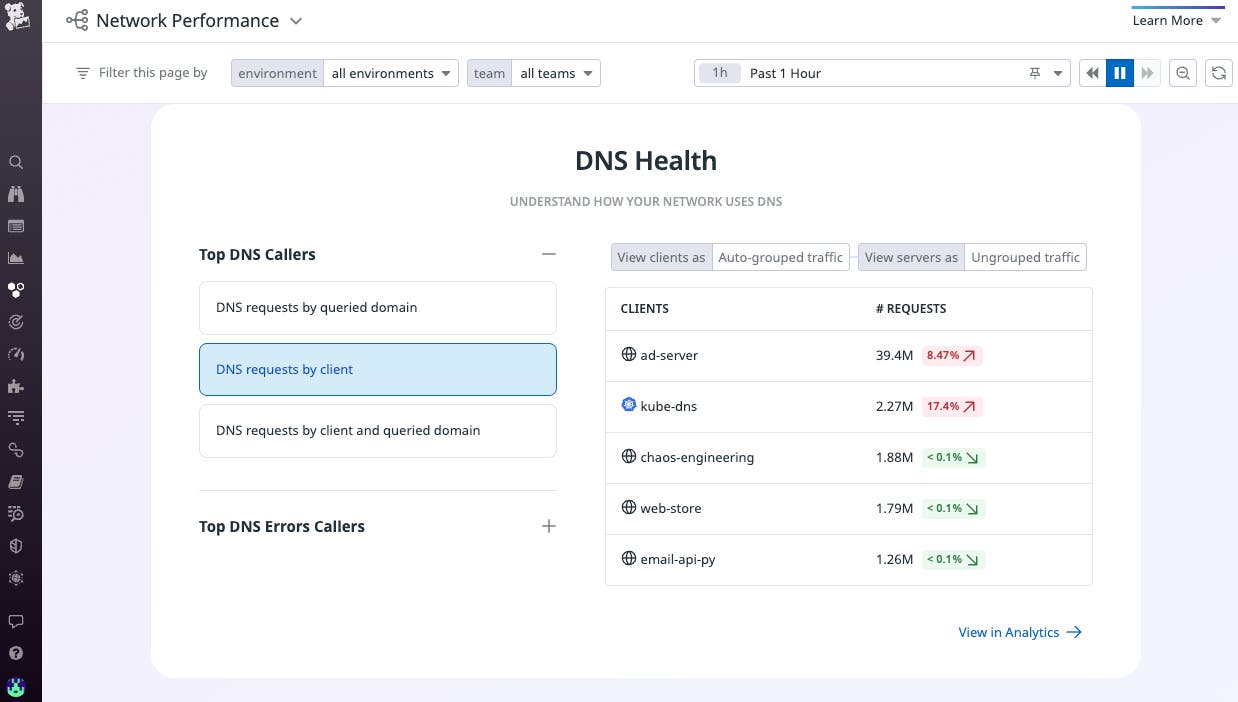
DNS is critical for services to be able to create connections to the endpoints they rely on. The “DNS Health” section of the NPM Overview page assists your investigations into DNS issues by visualizing the top sources of DNS requests and highlighting the largest changes in DNS-related errors in your network. This is particularly helpful for identifying suspicious activity, misconfigured DNS settings, and subtle application connection errors.
For example, let’s say you have implemented DNS caching via Nodelocal DNS Cache. As part of an investigation into slow response times, you click on “DNS requests by client” on the NPM Overview page and see that a node-local-dns client in your network has a sharp increase in requests. That change could indicate a DNS misconfiguration or, in rarer cases, a DNS amplification attack.
You can also view the largest changes in DNS-related errors, such as timeouts, SERVFAILS, and NXDOMAIN responses. If you click on any of the errors listed under the “Largest Changes in DNS Errors” section of the DNS health overview, you can see the percent increase or decrease for a specific error within a particular time period (e.g., the last hour). You can then click on “NXDOMAIN” to identify the DNS servers with significant changes in NXDOMAIN errors, which occur when there is no IP address that corresponds to a given DNS request. A spike in these errors could indicate that a domain has expired and/or that DNS records have not been properly updated.
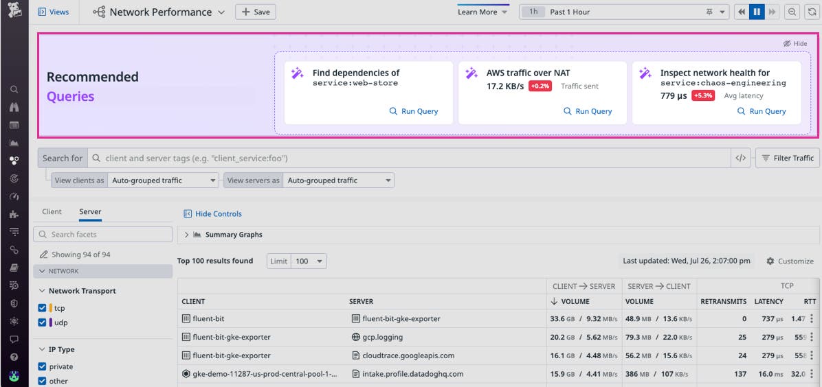
Use recommended queries to jumpstart investigations
In addition to updating the NPM Overview page, we have also developed recommended queries that are embedded within the NPM Analytics and DNS pages. These are preloaded queries that quickly surface key information—such as service dependencies, egress traffic, and DNS timeouts—that is critical for troubleshooting network performance issues. These preloaded queries enable you to easily launch an investigation even if you are new to NPM. For instance, some of the most common indicators of network health are metrics such as TCP retransmits, latency, and open connections. A spike in any of these metrics can indicate issues such as network congestion, which can lead to high latency and other performance issues.
Get started with the story-centric Datadog NPM Overview page
Whether you are new to NPM or need quick insight into your network’s performance, Datadog’s new UX and recommended queries for NPM will help jumpstart your network investigations. With this update, you can identify and cut down on costly traffic, better understand your service dependencies, and help maintain the DNS health of your network. Check out our documentation to learn more about Datadog NPM.
If you aren’t already using Datadog, sign up today for a 14-day free trial.


