Stephen Lechner
Achieving optimal performance can be challenging when you depend on separate platforms to monitor service health and to manage your logs. When data about your systems is spread across multiple platforms, investigating issues—and ultimately resolving them—takes longer and requires expertise with more tools. It takes more effort to identify real customer impact, as well as to verify that your responses to an incident are having the desired effect.
We added log management to Datadog precisely to solve these problems—to eliminate the friction from switching tools and contexts to access the data you need for monitoring, troubleshooting, and optimizing the performance of your applications.
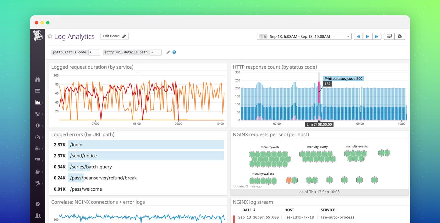
We are pleased to announce that you can now visualize log analytics data in Datadog dashboards to drive your investigations, just as you can with metrics and APM data. You can use all three of these important data types together in the same dashboards—even the same graphs—to get all the right data in one view, to make more seamless correlations, and to better inform your conclusions.
Eliminate the friction of disparate systems
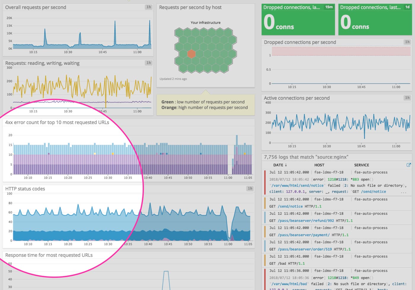
Metrics from your infrastructure and applications are extremely valuable for identifying issues quickly via dashboards or automated alerts. Log analytics are an important complement to this data, since they link you to the deeper context that you often need to diagnose those issues. By unifying all your data in one platform, you can get that context without having to sign into a separate logging tool, manually navigate to the logs you care about, and then filter to the timeframe of interest—all of which tacks on precious minutes to your incident response.
Datadog’s dashboards make it easy to aggregate, explore, and visualize your log analytics and metrics in beautiful graphs that immediately communicate insights to anyone on your team. There are two easy ways to add log analytics graphs to your dashboards:
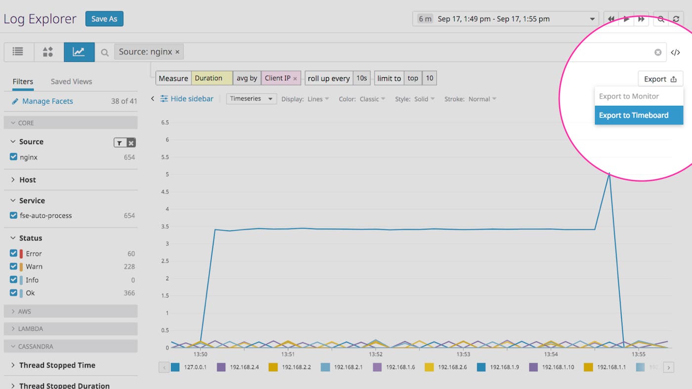
First, from the log explorer, where you can explore and visualize your log data with faceted search and analytics, all you have to do is select “Export To Timeboard”:
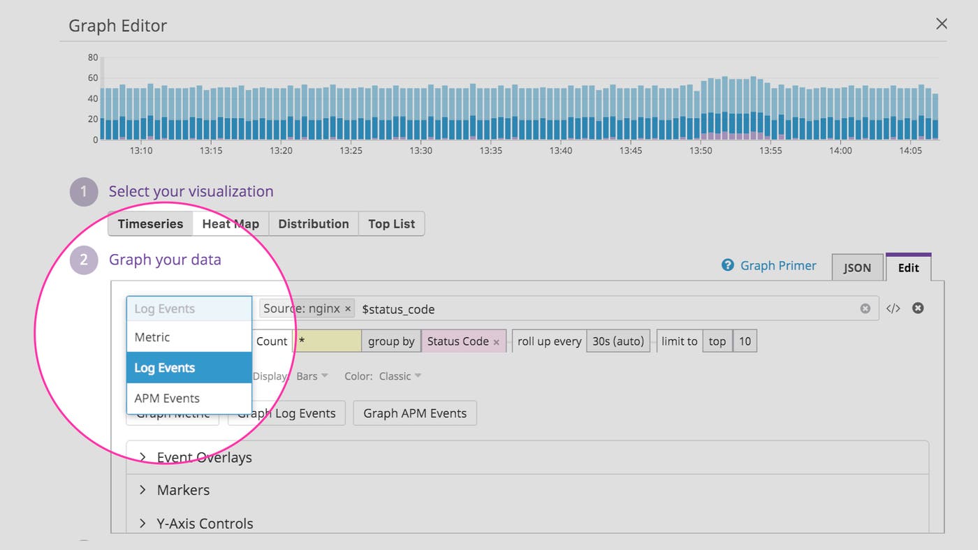
Second, you can use the dashboard graph editor to add timeseries or [toplist] widgets that visualize log analytics data. In the graph editor, you will now see a switch to select “Log Events” data:
Monitor high-cardinality data
Log analytics enables you to monitor and visualize high-cardinality data that is already embedded in your log events, and which is often invaluable for determining the impact of an issue on individual users or customers. You can aggregate data using dimensions such as customer ID or even individual request ID to quickly determine the scope of an issue.
For instance, you can graph a unique count of all client IP addresses that were served 404 errors by an NGINX server, and then group the results by the requested URL. Using those facets in your log data, you can see exactly which requests in your app served errors to the largest number of customers.

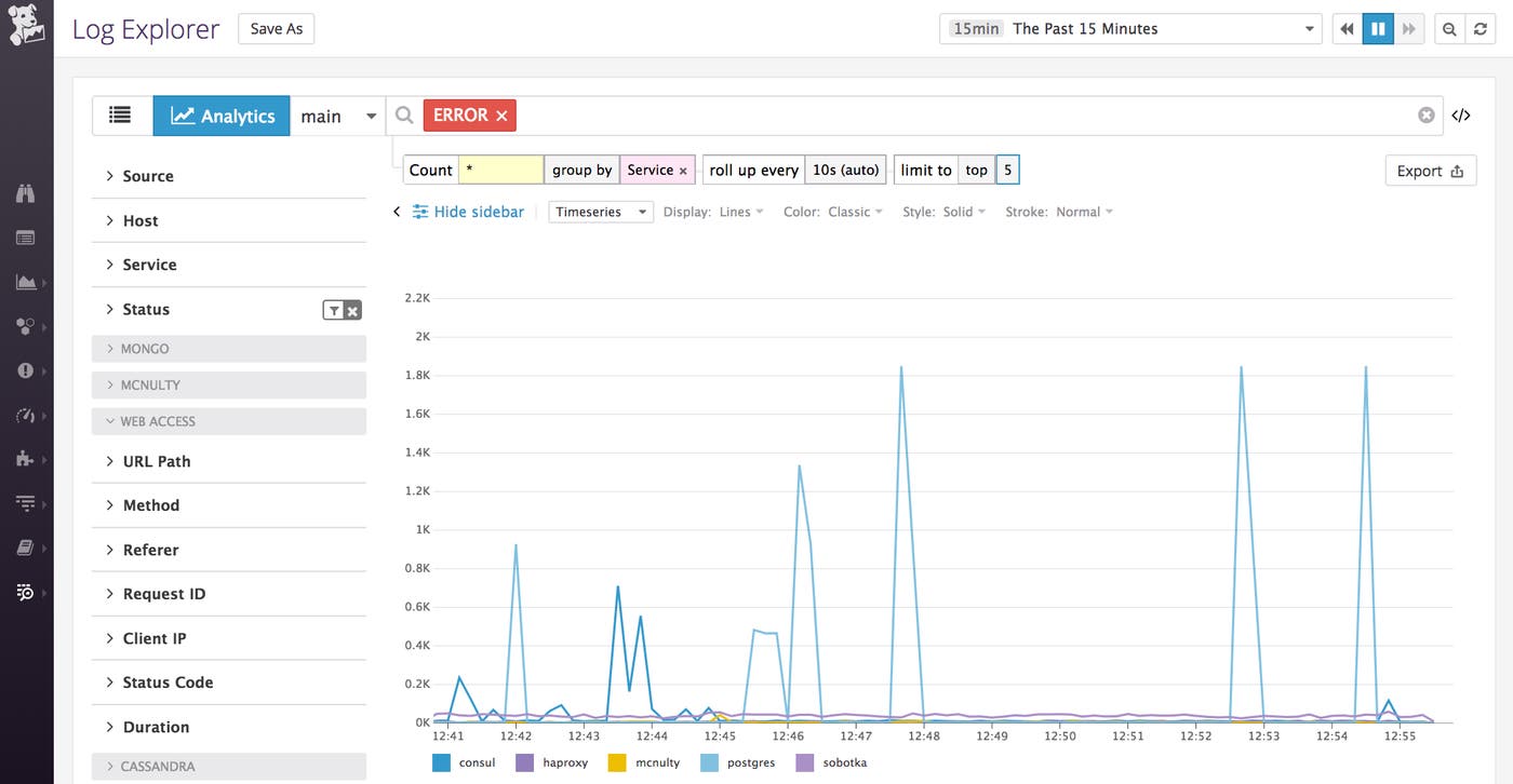
For a bigger-picture view of application health, you can graph a count of all logs that match a certain query such as status:error. You can then group those counts by the service facet to see in one place how many errors are being logged across each of your services.
Graph numerical data in your logs
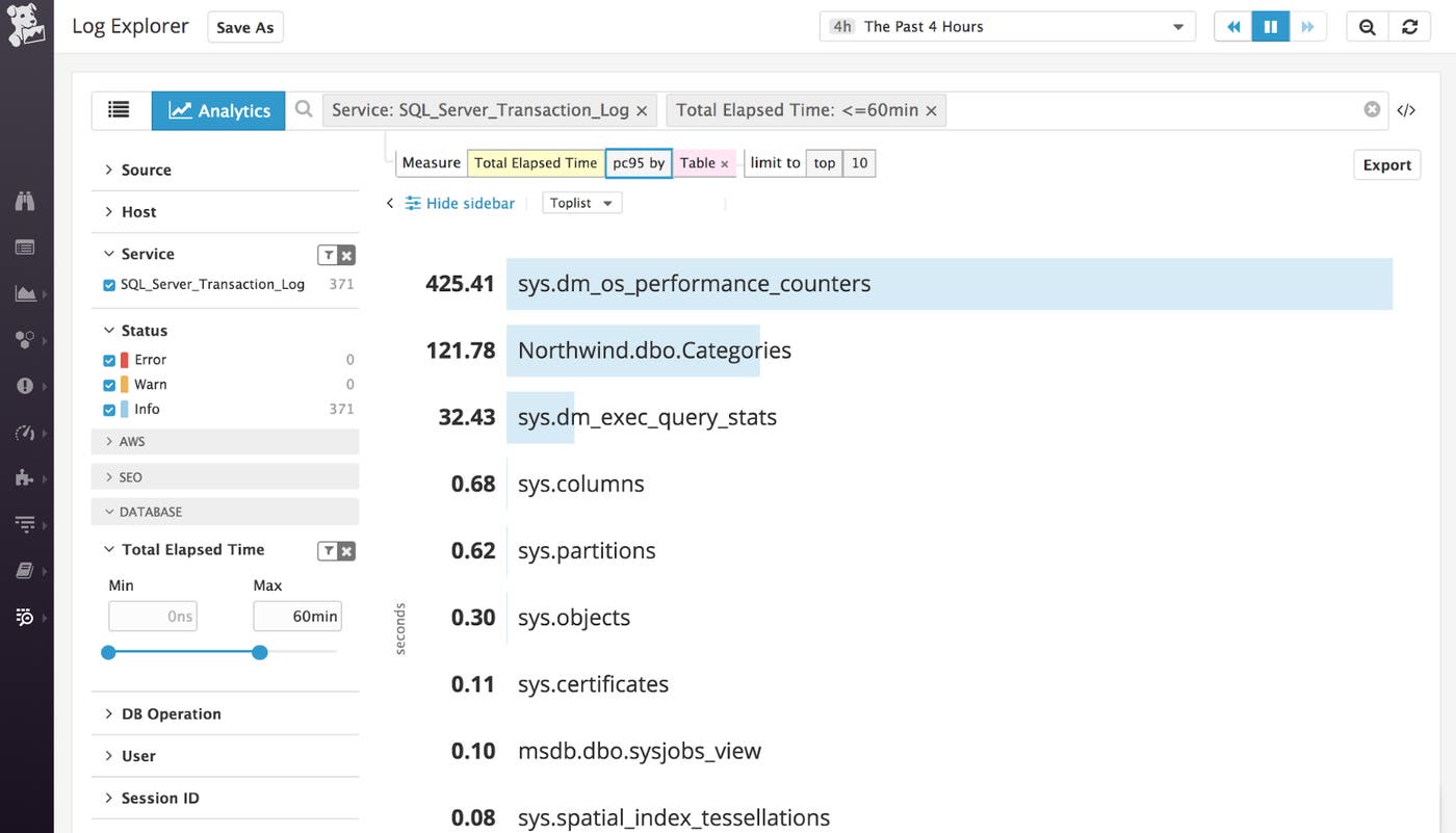
Log analytics also enable you to graph the numerical values you’re capturing in your logs, which are known as “measures” in Datadog. You can then apply different aggregation options, including percentiles, to answer questions like “what is the p95 database query time, grouped out by table?” By visualizing that data in a toplist, you can see at a glance where you might improve performance by adding an index or two.
From dashboard to deep dive
Datadog template variables enable you to dynamically modify the scope of your log analytics graphs, just like you can with metric graphs. Template variables allow you to dive from a general overview to viewing data for a specific customer, service, or any other segment by applying tag-based filters. Then, when you spot something that needs further investigating, you can pivot directly to a correlated view in the log explorer by clicking on a timeseries and selecting “View related logs.” When you click through to the log explorer from a metric graph, the resulting logs will be scoped to the same tags as the metric; when you click through from a log analytics graph, the log explorer will display the same log events that are visualized in the graph.
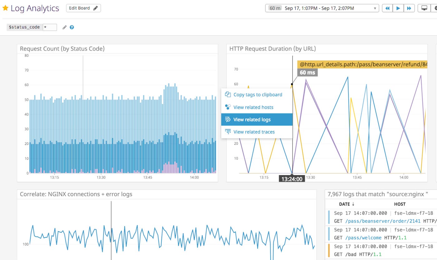
The digging doesn’t end there. Once you’ve identified the logs that contain the context you need, you can pivot from those log events to other correlated views in Datadog, like host maps and dashboards for the relevant infrastructure, as well as time-scoped request traces for the relevant service.
Fast and frictionless investigation
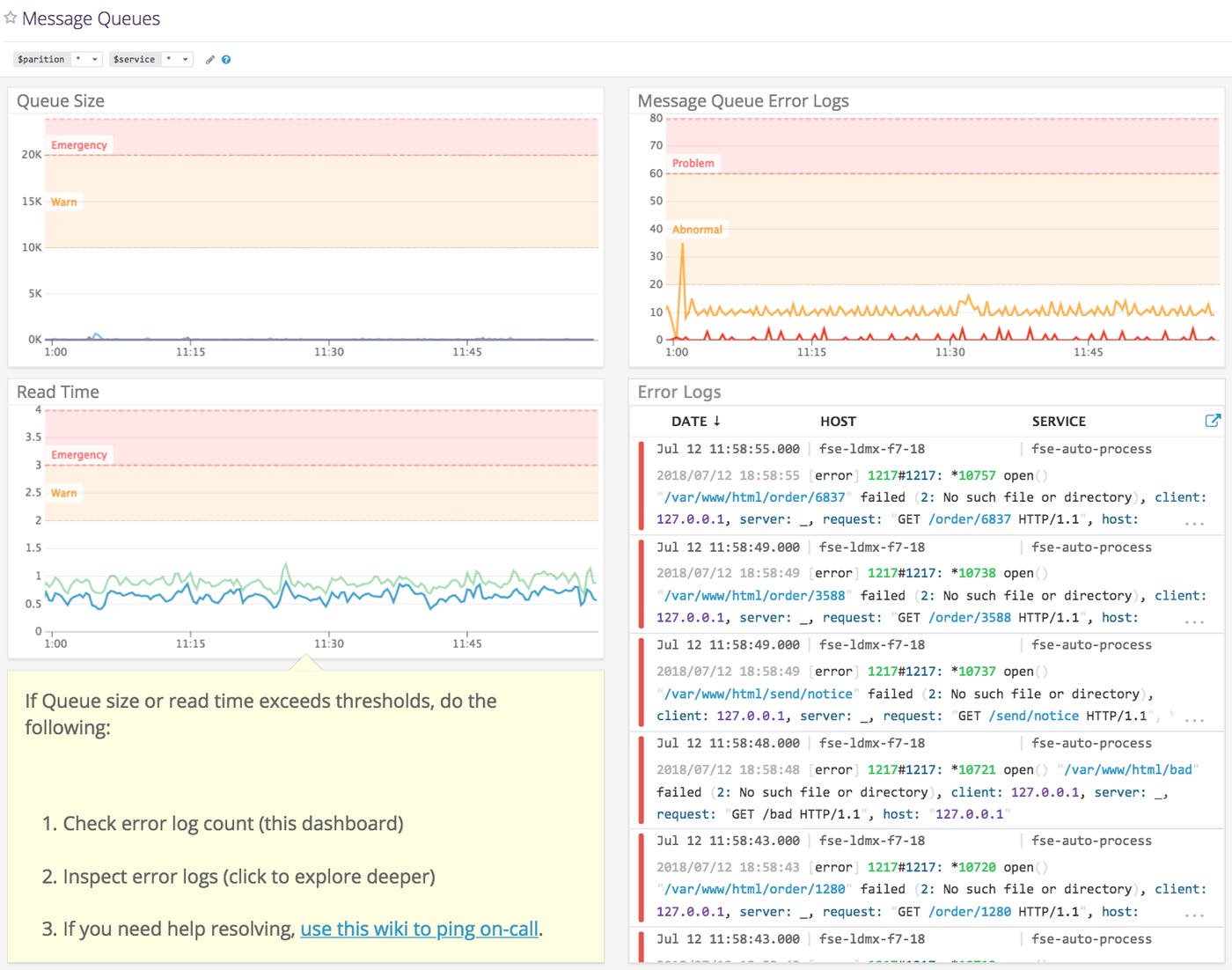
With log analytics in Datadog dashboards, you have all the data you need to investigate, build context, validate responses, and assess customer impact—all in a single platform. Better yet, all that data is available to anyone on your team who needs it. So you can better distribute the work of investigation and response across your team, and even the newest hire can be a more effective first responder.
You can build Datadog dashboards that provide high-level overviews of application performance and health as experienced by individual customers, as well as detailed “runbook” dashboards that guide a responder through the metrics and log data they need to investigate and respond to an issue.
If you haven’t already, get started with a free two-week trial to start exploring, visualizing, and monitoring all the data in your logs. If you’re a Datadog customer, you can start a log management trial from the Logs tab in the Datadog app. If you’re not yet using Datadog, you can begin a full trial of the Datadog platform today.
