We recently wrote a paper, DDSketch: A Fast and Fully-Mergeable Quantile Sketch with Relative-Error Guarantees, published in PVLDB on August 28th. This paper discusses DDSketch, a new sketch that we designed and implemented in order to tackle the challenges of working with monitoring data.
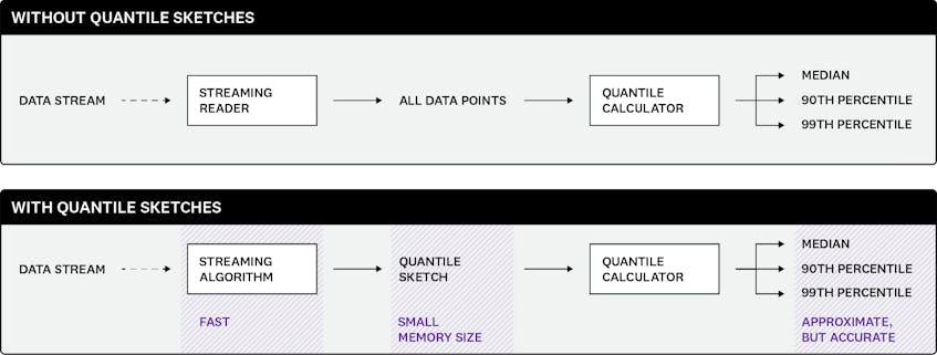
At Datadog, we handle very large volumes of distributed data every day. Analyzing this data itself—for example, calculating a quantile—would be very expensive in terms of resources, so instead, we can compute an approximate quantile from a compressed representation of that data. We first need to appropriately summarize that data without incurring an excessive loss of fidelity. We do this by creating a sketch. Sketch algorithms generate sketches: smaller, more manageable data structures, from which we can calculate some properties of the original data.
After unsuccessfully attempting to use existing state-of-the-art quantile sketch algorithms to accurately compute percentiles on noisy, large-scale monitoring data, we found that none of those algorithms fulfilled all the requirements that we had to tackle in order to compute percentile metrics with high accuracy over a huge amount of data, in a distributed fashion. We designed DDSketch as a solution to these problems.
Aggregating values
Imagine that you monitor a web application for a retail website. One metric that you might want to focus on is the latency of the requests that your application handles. Latency is a determining factor in user experience, sales, and revenue, so it’s important that it stay low for all requests. Datadog lets you plot the latency of web application requests over time by generating a single series from possibly millions of data points. Being able to aggregate those points, instead of having to look at all of them, is what lets you quickly comprehend the state of your web application.
There are various ways of aggregating values, averaging being the most common. While averages have their uses, computing an average does not say much about the extreme values—especially the worst latencies that some users are experiencing. In the case of application latency, you’ll be interested in the bad experiences, not just the average ones. Percentiles, meanwhile, can give you more meaningful information. For example, looking at the 99th percentiles ignores the most extreme outliers (which are likely due to very specific situations) but lets you know what the typical “bad” experience of your web users looks like.
Computing percentiles is challenging
It is straightforward to compute minima, maxima, sums, and counts—and therefore averages, by dividing the sum by the count. To get the maximum of a stream of values, you can simply read the successive values and keep, at any point, the maximum of the values ingested so far. This requires keeping a single variable in memory, and updating that variable when you ingest a new value.
In contrast, computing percentiles involves technical challenges. If you want to compute the exact 99th percentile of a stream of values (without prior knowledge of the number of values in the stream), you have no other choice but to retain all the ingested values, sort them, and return the value whose rank matches the percentile. This type of solution is clearly not viable when millions of values are to be aggregated.
Additionally, aggregating percentiles poses another challenge. To compute the maximum of a set of values, you can split the values into multiple partitions, independently compute the maxima of each partition, and then aggregate the resulting maxima by, again, taking the maximum. The same method works for computing the minimum, the sum, and the total count. As services become more distributed, this is a very useful approach that also lets you compute pre-aggregations without loss of information, e.g., at a host level, within the Datadog Agent. But with percentiles, you can’t do this: the 99th percentiles of the subsets are not enough to know the global 99th percentile. Again, you would need each partition to send all the values in order for the aggregated value to be exact, which defeats the purpose of distributing the computation—or would have drastic network throughput implications if done from the Agent.
Introducing sketches
Sketches are data structures that process and encode information about data. They are specifically designed as solutions to problems that would require a large amount of memory to be solved exactly, such as the count-distinct problem (e.g., HyperLogLog) or knowing if a large set contains an element (e.g., Bloom filters). While their output is usually approximate, they require far less memory than what would be needed for an exact solution. Therefore, they can be seen as lossy compression algorithms, trading accuracy for a lighter memory footprint.
Sketches also exist for computing percentiles: they are known as quantile sketches1. Instead of retaining all the values, they keep track of just enough information to compute percentiles with some approximation. This makes it possible to compute percentiles from a very large stream of values.
Some sketches also have the nice property of being mergeable: multiple sketches can be combined together to generate a new sketch that can compute percentiles over all the values that have been fed to the initial sketches. The merging operation must not introduce additional loss of precision, so that the percentiles the merged sketch produces are as accurate as the ones that would have been generated by successively adding all the values to a single sketch. The mergeability property is very powerful and allows us to compute percentiles in a distributed fashion or to pre-aggregate data.
As we developed distribution metrics at Datadog to compute percentiles, we started using a sketch algorithm that was developed by Michael Greenwald and Sanjeev Khanna, which we will refer to as GK. This allows us to compute percentiles over time but also to generate histograms as the ones that you can see on the APM service pages.
How accurate are those percentiles?
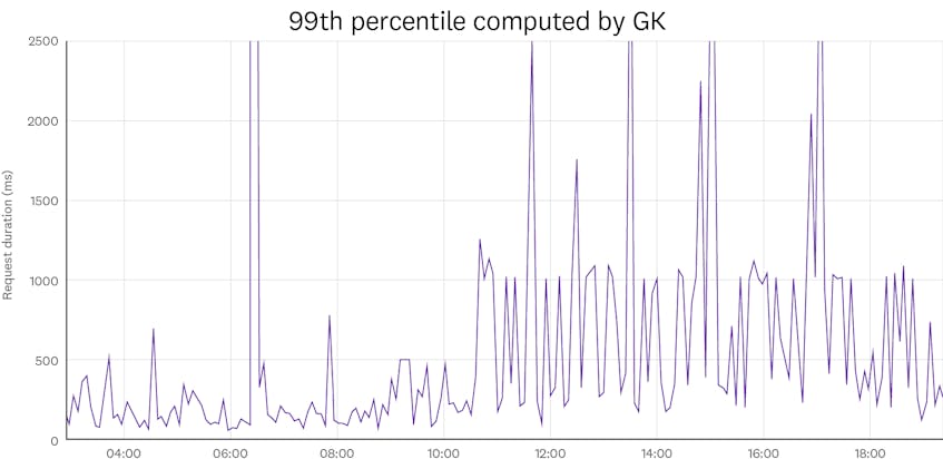
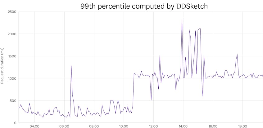
When you plot a percentile metric, you might see some noise and some spikes, especially if you work with high percentiles. For example, here is what plotting the 99th rolling percentile of the latency of a web application over time looks like:
Some of this noise is due to the actual data itself: the latency distribution is likely to slightly change over time, due to factors such as load or network degradation, which could explain some of the spikes that we see. But some of the noise is also due to the approximation with which those percentiles are calculated. Looking at this plot alone, it is hard to assess the contribution of each of those in the noise, or how accurate the percentiles are.
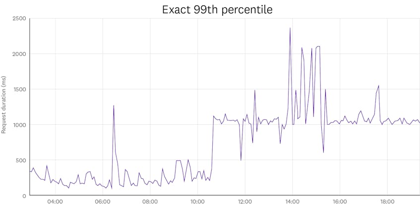
To get a better idea of the effect of the approximation, we can compare the above plot with what we would have gotten with exact percentiles:
Looking at this plot, it is clear that a large portion of the noise is coming from the approximation errors that are incurred by computing percentiles with a GK quantile sketch. The fact that those errors seem larger for the 99th percentile than for the median is also something to note. But for both of them, the approximation errors seem to drastically lower the accuracy of the percentiles and the quality of the plot, and show spikes that do not actually exist. In order to alleviate this, we need to understand and control those errors.
Rank-error vs. relative-error guarantees
Most sketch algorithms let you control the approximation error through a parameter that can be adjusted based on the requirements of the use case. However, there is always a trade-off between accuracy and memory usage: the higher the accuracy, the larger the memory size. Using the GK sketch algorithm, to get 99th percentile approximations acceptable for the monitoring use case errors, the memory size of the sketch would need to be so large that it would defeat its purpose.
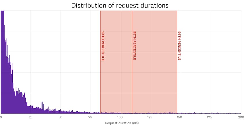
Sketch algorithms usually have theoretical error guarantees. GK, like many other sketches, has guarantees in terms of rank error. For example, if the rank-error guarantee is 1 percent, the 95th percentile that is returned by the sketch is definitely between the actual 94th percentile and the actual 96th percentile. Unfortunately, for many use cases, this type of guarantee is not as useful as it might seem.
As mentioned previously, a common use case for computing percentiles is latencies. Latency data is often heavily skewed. The median of the response time might be in milliseconds, but there could be a few outlying responses that take minutes. This is why it is common for latency distributions to have fat tails and to extend towards large values—as does the one below. In practice, this means that a rank-error guarantee is likely to generate significant errors for higher percentiles, but acceptable errors for lower percentiles. By adjusting the accuracy parameter of the sketch, you could make the error lower for high percentiles, but this would also make it unnecessarily low for lower percentiles, which makes sketches with rank-error guarantees very memory-inefficient.
We need a kind of guarantee that better reflects what users care about when looking at latency plots. A web application that begins taking twice as long to respond to requests would significantly degrade the user experience. A monitoring solution should be able to detect something like this. On the other hand, it is hard for a user to tell the difference between a response time of 500 milliseconds and one of 510 milliseconds, so we don’t need to care about variations of latency within a small percentage of its value. Therefore, we should require the error on the percentile value to be less than a small fraction (e.g., 2 percent) of the actual percentile value. This is known as a relative-error guarantee.
A relative-error guarantee of 2 percent means that if the actual 95th percentile is 1 second, the value returned by the sketch will be between 0.98 and 1.02 seconds. And given that this type of guarantee is scale-invariant, if the expected value is 1 millisecond, the returned value will be between 0.98 and 1.02 milliseconds. In other words, the error guarantee adapts to the scale of the output data. This property leads to more accurate histograms, especially in the area of low data density, such as the tail of a long distribution.
Achieving relative-error guarantees
Now that we know the condition we want the output percentiles to meet, we need to build a sketch that fulfills them. As mentioned previously, to compute the exact percentile value of a stream of values, we would need to retain and sort them, and output the value whose rank matches the percentile. If we allow some relative error tolerance in the computed percentile value, we don’t need to keep track of the exact input values. Instead, we can keep approximate values, none of which are allowed to have an approximation error greater than the relative error tolerance. Then, we can sort those approximated values and output the value whose rank matches the percentile, as we would do when compute exact percentiles. The result is guaranteed to be close to the exact percentile value, within the targeted relative error tolerance.
We can exploit this by choosing representative values that are close enough to one another so that any of the ingested values can be mapped to one of them with a loss of accuracy that still meets the relative-error guarantee. Then, instead of keeping track of all the ingested values, we simply maintain a counter for each of those representative values, which is incremented for every ingested value that is mapped to that representative value. In practice, we achieve this by bucketizing the range of trackable values and by choosing the middle values of the buckets as representative. Every time the sketch ingests a value, it checks the bucket it falls in and increments the respective counter. For instance, for a relative-error guarantee of 2 percent, we could have a bucket that goes from 0.98s to 1.02s, and any ingested value in that range would be mapped to 1s. Furthermore, by always using the same representative values, we make the sketch mergeable; merging is done by simply summing the respective counters of the sketches.
For this sketch to be efficient, we need to make sure its memory size, which only depends on the number of buckets, is low: we need to cover the full range of ingested values with as few buckets as possible. To accomplish this, we choose buckets that are as wide as possible: namely, whose relative width is twice the relative-error guarantee. At first glance, it seems that a huge number of buckets is required to cover practical ranges of values, but because the bucket width grows exponentially (the higher the bucket, the larger it can be), it’s not as bad as it first seems. For instance, to cover the range from 1 millisecond to 1 minute with a relative-error guarantee of 2 percent, we need 275 buckets, hence a sketch of about 2kB if 64-bit counters are used. Given the exponential nature of the bucket width, to cover the range from 1 nanosecond to 1 day, you would only need 3 times as many buckets: namely, 802 buckets.
Note that a relative-error guarantee of 2 percent is actually very accurate, especially when you consider that it is not uncommon for sketches with rank-error guarantees to output 99th percentiles that are more than twice what they should be, which translates into a relative error of more than 100 percent.
Let’s put it in action!
After initial benchmarks, we put our sketch, which we called DDSketch (for Distributed Distribution sketch), to the test by integrating it into our data processing pipeline and keeping a close eye on performance, memory usage, and accuracy. It was a success! Percentile metrics now look much less noisy, and histograms are smoother.
We now use DDSketch at scale at Datadog. In addition to computing accurate quantiles, DDSketch has a small memory footprint and is highly performant—i.e., it can ingest values at a high rate. DDSketch’s memory footprint is about as small as GK and multiple times smaller than that of HDR Histogram, another sketch with relative-error guarantees. In terms of ingestion speed, DDSketch is 10 times faster than GK and as fast as HDR. We show those qualities in our paper through formal proofs and benchmarks. In addition, implementations of DDSketch are available in Java, Go and Python.
If you’re interested in solving challenges like this, publishing in academic journals, and working with the open source community, Datadog is hiring.
Quantiles and percentiles refer to the same thing and we could equally use both of those terms. Percentiles however highlight the subdivision in hundredths: for instance, the 95th percentile is the 0.95-quantile. ↩︎


