Jonathan Gala
Understanding the best- or worst-performing components in your infrastructure is a critical part of monitoring. Identifying the most heavily loaded hosts, the databases with the fullest disks, or pages with the worst latency is a solid first step in solving or preventing problems.
We’re pleased to present the Top List viz, which ranks your components by metric values, shows the shape of the ends of their distribution, and makes outliers–if they exist–clearly visible.
Top Lists are another powerful way to work with our tagging system to get meaningful information from the data reported to Datadog.
Here’s how we use Top Lists graphs at Datadog
We use the Top List graph to identify our least-used database indices. As databases grow and their schemas and queries evolve, old or under-used indices can accumulate and take a toll in memory use, disk space, and write performance. Top Lists allow us to easily identify the least-used indices, clear out some dead wood, and reclaim some space and performance.
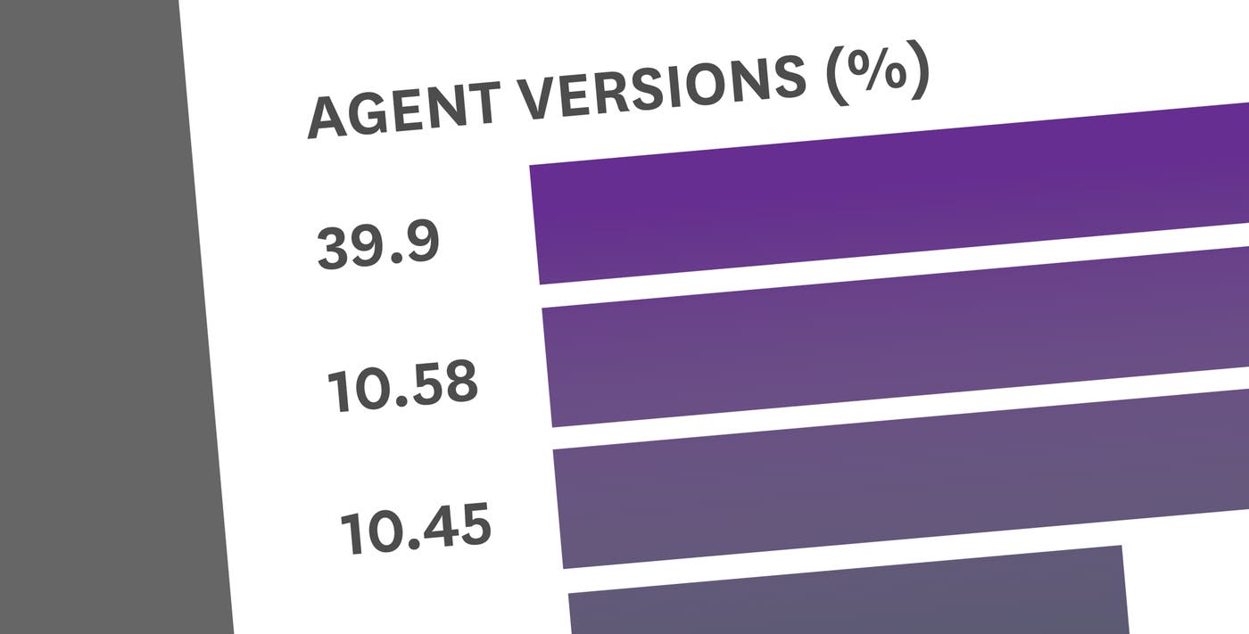
We also use Top Lists to give us a better understanding of our customers’ infrastructures. Top Lists show us the most commonly installed version of our Agent, the most commonly installed Python versions, CPU architectures, etc.
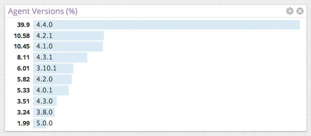
Top Lists with tagging
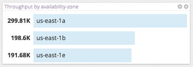
Top Lists show results based on a tag group like host, availability-zone, role, etc. Your grouping options will come from tags that are either automatically created by your enabled integrations, or defined in our flexible tagging system. If you care about specific application versions or customer types, you could create custom tags for them and do your monitoring along the dimensions you care about.
The ranking is based on a metric like load, memory use, custom metrics from your app, etc.–anything you’re already measuring in Datadog.
Let’s say you have a graph measuring server load grouped by role:
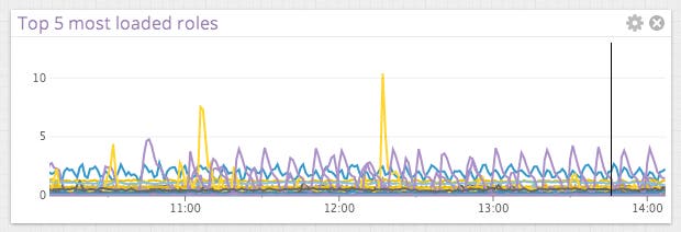
This gives you an overall picture of performance by role, but it doesn’t identify at a glance which roles are the most or least heavily loaded. The Top List widget rolls up each timeseries into a single value and shows the top or bottom values in a bar graph with clear labels:
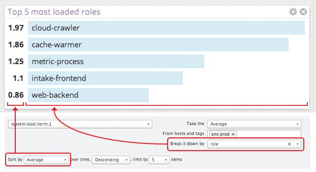
You can select the tag by which the data is rolled up, whether to use the average, min, max, or area under the line, how many results to show, and which end of the distribution to show.
Take advantage of Top Lists
The Top List widget works especially well with screenboards when you want to share information that can be digested easily and interaction may not be possible, like on wall-mounted displays.
Top List graphs also work well as a complement to a timeseries or heatmap graph. Timeseries and heatmaps show the performance of the whole group and how it has changed over time, while the Top List will enumerate which components had the highest or lowest values over the graph’s time period.

If you would like to use the Top List viz to gain insight into the best and worst performing components of your infrastructure, sign up for a free 14 day Datadog trial and check out this new feature for yourself.
