
Dashboards provide critical visibility into the performance and health of your environment. But if your organization uses hundreds or thousands of dashboards, or if you’ve recently transitioned to a new company or different team, it’s not always easy to understand the full significance of the data shown on every single dashboard.
To provide instant context around every dashboard—and to help you understand how they’re being used in your organization—we released the Dashboard Details feature. You can start exploring this new functionality by clicking the caret next to any dashboard title.
The Dashboard Details panel consists of three parts:
- a Dashboard Description that explains the intended purpose of a particular dashboard.
- a Suggested Dashboards section with an auto-generated list of recommended dashboards based on the usage patterns of your organization.
- a Most Active Users section, which auto-populates a list of people who spend the most time viewing this dashboard, so that you can easily identify subject matter experts.
We hope these features help you get more out of your dashboards by simplifying cross-team collaboration and making it easier to get helpful context for troubleshooting.
Get instant context around every dashboard
Whether you’re viewing a custom dashboard or an out-of-the-box dashboard for a specific technology like NGINX, the Dashboard Description instantly provides rich context around the data shown. When you’re creating a dashboard, you can customize the description to explain what type of information is shown, to help ensure that your colleagues can extrapolate important information at a glance. You can even include links to resources, such as runbooks or wikis that can help users troubleshoot issues with that particular service.
In the screenshot below, you can see that this dashboard is designed to help users diagnose and repair any performance issues in the web app. It also explains how to use the dashboard’s template variables to isolate specific services for more targeted troubleshooting.
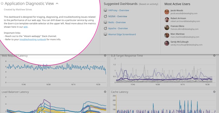
Dashboard Descriptions include support for Markdown, so you can add bulleted lists, code snippets, and links. You can edit descriptions directly in the Datadog UI or programmatically through Terraform. Whether you provide a brief blurb or a more detailed overview of the data shown, a well-crafted description can help other members of your organization immediately understand the purpose of that particular dashboard.
Seek out related dashboards for more information
After you’ve familiarized yourself with the contents of your dashboard by reading the Descriptions, you can pivot to the Suggested Dashboards tab for additional insights. This feature uses machine learning to analyze usage patterns, discovering related dashboards to help you get more comprehensive insights into your systems.
Instantly understand the usage of Datadog dashboards with Dashboard Details.
For instance, in the Application Diagnostic View dashboard below, the Suggested Dashboards section recommends dashboards for various components of this web application, including HAProxy, NGINX, Redis, Apache, and Akamai Edge. By viewing these relevant dashboards, you can build a more detailed understanding of your web application, and effectively troubleshoot issues by drilling down to view important metrics like slow queries and dropped connections from specific components of your stack.
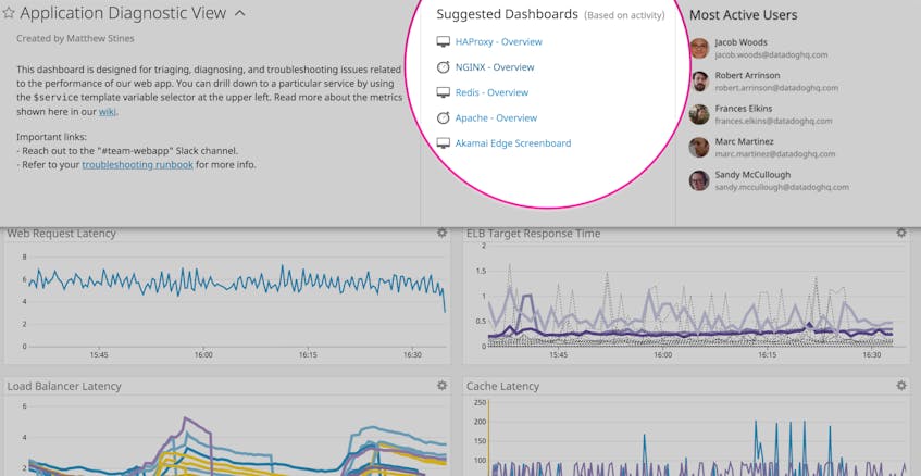
The Suggested Dashboards section can help you discover related dashboards and add them to relevant dashboard lists, either for specific teams (such as InfoSec or SRE) or important tasks (like troubleshooting your Kubernetes clusters).
Identify subject matter experts
If you’re working with a dashboard or technology that is outside your normal area of responsibility—or if you just have questions about a particular dashboard—you might wish to reach out to a power user for more information.
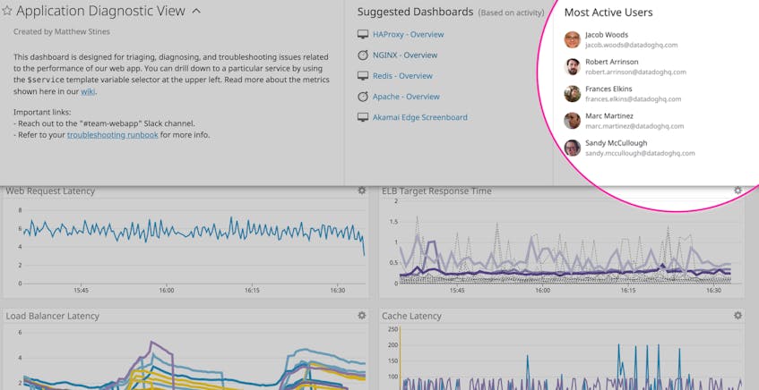
The Most Active Users section makes it easy to identify subject matter experts for each dashboard. This section is algorithmically generated based on usage patterns in your organization, so you can immediately identify the most relevant colleagues to contact if you have a question about the data shown in a specific dashboard.
Dive into Dashboard Details for yourself
If you are currently a Datadog customer, you can try out the new Dashboard Details panel by clicking the dropdown menu next to any dashboard title. To see how this new dashboard feature can help you monitor your dynamic infrastructure and applications, start a free 14-day trial.
